So here’s an utterly unnecessary question that I’ve nonetheless been grappling with for the past couple of days: what level of content is appropriate to feature in comics starring characters who are simultaneously being marketed to children? As the industry has more and more embraced its real bread-and-butter as being 20+ year old young adults who frequent specialty outlets in order to purchase their latest fix, this hasn’t seemed to be a big problem issue. And, yes, some of this is no doubt the result of the fact that I both grew up and came into the industry at a time when the Comics Code was still a thing. I’m not against having coarse language in comic books per se—there have been plenty of titles that used it successfully within the context of the material they were producing. But by that same token, there have been a few times of late that I’ve been drawn up short by the content of a particular title. And I’m sure that some of that is just me, but I admit I’m not certain about that. Do publishers have any responsibility to the broader audience that they’re courting?
This line of thought was all triggered by the recent discussion revolving around the first issue of HARLEY QUINN: THE LEGION OF BATS #1. And look, I know this is a comic book that’s set in the same universe as the HBO MAX animated series, and that it gets away with stuff like this and worse on a regular basis, and the sky hasn’t fallen. But I have to say, it feels borderline irresponsible to me to feature dialogue of the sort shown above in a comic book that is emulating at least in broad strokes the style of DC’s former animated titles, which were their all-ages books. And again, I know this thing is labeled as being for readers 17+, and I also realize that the chances of their being any real outcry, that the book will fall into the hands of some unsuspecting child and somehow permanently scar them or else bring the wrath of God down upon our industry is incredibly unlikely. That isn’t quite what I’m talking about here, I don’t think. And it’s an extremely subjective point of view. I just think this is a bad choice. Now, to be fair, the cover to this issue isn’t done in the same style, so on the racks the book doesn’t represent as a classic DC All Ages product. So on a purely intellectual level, I don’t know what the hell I’m complaining about outside of the fact that I’m old and my tastes were formed in simpler times. But I feel like this is just a bad call. For me, I think, it’s all about context. There have been plenty of books wherein super-heroic icons have said and done some relatively horrendous things, in formats and styles that were clearly designed to appeal to a different demographic. But in a book of this style, it does exactly what the creative teams wants it to do to me: it tells me right off the bat that this isn’t a Kids WB universe that we’re wading into, for all that the look may be similar. But it bugs me, I don’t know.
(Frankly, I have problems with the post-New-52 hyper-sexualized version of Harley Quinn in general, between a design that I just find somehow skeevy and the fact that this was a character that originated on one of those made-for-kids cartoons. I find that I’m creeped out enough by this “bad girl” version of the character that I can’t bring myself to read stories in which she’s featured, even when they’re produced by creators whose work I generally like elsewhere. So this whole example may simply boil down to me.)
This is a question that we grapple with all the time. A few weeks back, I mentioned how there was a moment when we felt we had to reassess what message we were putting out with Captain America by featuring him so often brandishing or using real-world firearms; that’s something that we made a deliberate effort to scale back on consequently. And while nobody is going to look at AMAZING SPIDER-MAN and feel as though it’s being produced at a more juvenile level than any other mainstay title in the line, we’re a lot more careful and aware about how we depict Spidey and what we let him do that we are for other characters in the line, simply because he is such a strong kids’ character. (The fact that we now have a very popular show aimed at the youngest audiences in SPIDEY AND HIS AMAZING FRIENDS only underscores why this is prudent.) I’m not trying to turn this into a “we’re good, DC is bad” thing—these are just the examples that come to my clearly biased mind. and frankly, I always do a double take when watching the Spider-Man films every time the web-slinger utters a profanity. It just feels wrong to me. But is it, objectively? Is there some standard that we should be following as creators, some implicit promise that we’ve made the audience over years? Or is anything goes really all right, so long as it’s done well?
(To take a legitimate shot at DC, I read the first issue of GOTHAM CITY: YEAR ONE, a book that’s stirred up its own controversies for its use of period-legitimate offensive language. I thought it was well done as Tom King’s projects typically tend to be—but I need to slap the editors just a little bit. They did run a warning in the book about the fact that it contained such dated and offensive terminology, and in fact phrased the notice as a Trigger Warning, which was wise. But rather than running it on the cover, front or back, they instead chose to contain it to the credits page—which happened to fall four pages into the book. Guess where the earliest uses of the language being warned against happened to fall? It’s not much of a Trigger Warning if you give it to people after they’ve been exposed to the triggering phrases. This was just a dumb mistake, be better about stuff like this.)
Anyway, enough about my prudish mind, let’s see what was on yours these past few days, starting with the ubiquitous Evan “Cool Guy”:
What would you specifically do with Superman? Besides removing his marriage and child and returning his secret identity.
Well, on the one hand, it’s not as though I have some specific storyline or anything that I’m bursting to do. I don’t even have the sort of “position paper” that I would typically write up to be able to put in front of prospective creators I might be reaching out to in order to inveigle them to work on the project, so they have an understanding of what I’m thinking and what in general I’m looking for. I really just have a couple of key broad thoughts and a few specific nuggets-of-flavor (As an example of the latter, in my world, the reason that Superman became a journalist, a writer, is in part due to the fact that, on the printed page, he can compete fairly against other people. No amount of super-strength or bulletproof skin is going to make your prose any more accomplished.) But beyond that, I also feel as though I don’t really want to articulate too much, because the point would be to do it, not to inspire other people to do something like it. In other words, if somebody wants me to put together my take on Superman, they need to pay me for it. I’m a professional, I don’t work for free.
A new face, Jakob Kibala, asked:
In your last newsletter you wrote about moviebob, "To be frank, I wish there was one comic book reviewer that regularly displayed this much insight and put such effort into their analysis of the material."
So what is your opinion about The Comics Journal? I read superhero comics and superhero adjacent genres almost exclusively, so I am by no means the target audience of TCJ. But I think they publish very insightful essays and criticism on mainstream comics, although the TCJ-sound is certainly an acquired taste. What do you think?
There was a time when the COMICS JOURNAL published, among other things, the best and most insightful interviews in the field. I read them regularly for most of the period when they were still a print magazine. But even there, after maybe the mid-1990s, their focused so clearly and so completely turned away from coverage of Big Two Comic-Shop-Pleasing action-adventure content that their value to me as a source of feedback has been limited. Put simply, they don’t really talk about anything that I’m working on in the moment—which is entirely their right, of course. There have been occasional articles that have overlapped into our world, but even those tend to happen well after the fact rather than contemporaneously—more of a post-op autopsy than anything that’s useful while the patient is still alive. And so they don’t really register with me as a resource for the sort of feedback that I’m looking for. On top of that, for four decades now, they’ve made pretentiousness a professional sport, and I’m a little bit old to wade through mountains of purple prose that’s mainly there to convince me how intelligent and well-read the writer is before he pronounces judgment on whatever work they may be looking at. I’m not saying that every writer for the JOURNAL is like that, but a lot of them seem to have fallen into that mold over the years—it’s practically their house style.
And to wrap the monologue portion of the program up this week, here’s one more question from Jason Holtzman:
A question came me to recently due to a little book sale in one of my college buildings, which contained the pleasant surprise of for some reason having comics -- not just those dreary textbooks. Anyways, I picked up quite a few of DC’s old Elseworld one-shots, alongside a tpb collecting Matt Wagner’s three part “Faces” story. How come one-shots like these aren’t really that common anymore? I know Marvel had some as well - I’m sure I’ve seen some Captain America/Punisher and Daredevil/Spider-Man ones here and there. Now they just aren’t that common. Does this boil down to the same issue with larger OGNs in that they are just too expensive, or has something in the publishing realm shifted? Going along with this, you don’t see to many small trade collections collecting short story arcs like “Faces” either.
The answer, Jason, is simple and it all boils down to economics. We do plenty of Specials and One-Shots, but they’re rarely in what used to be called Prestige Format any more because the cost-per-unit to produce in that format is prohibitively high without giving the release an insanely huge cover price. In a world in which a regular run-of-the-mill comic book issue typically retails for $3.99, you can imagine how much you’d need to charge for a squarebound product of greater length. And at that point, sales are impacted, to the degree that it simply doesn’t make a lot of sense to put projects into that format fiscally. The same thing is true about Trade Paperback collections. We’ve found through trial-and-error that collections of around 5-6 issues hit the sweet spot in terms of the readership feeling as though they’re getting value-for-money. Too few issues, as in BATMAN: FACES, and the cover price feels like it’s too large. Too many issues, and the cover price legitimately becomes too large. So while we’ll occasionally do books at these lengths, if we have a short run of material, we’re more likely to include something else that’s relevant in order to get the page count into that zone where most consumers find it reasonable for the amount of content.
Behind the Curtain
As some of you no doubt know, one of the many things I’ve taken to collecting over the years as they’ve turned up online is photographs of old comic books either on display where they’re being sold or being read by readers in their native era. I’ve devoted a whole section to such photographs on my TomBrevoort.com site. But I recently came across one that I’d like to spotlight here a little bit.
This photograph of the proprietors of a pharmacy dates to June 1938, and by a total fluke gives us a really good look at a magazine rack dedicated mainly to pulp magazines and to comic books. And right there at the upper right of the thing is a whole stack of copies of ACTION COMICS #2, the second appearance of Superman. Contemporaneous issues of DETECTIVE COMICS, NEW ADVENTURE COMICS and MORE FUN COMICS can also be seen (as well as a number of books from other publishers such as FEATURE FUNNIES) , but this would have been before any of them were headlining any super hero characters.
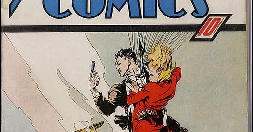
This is as close as anybody has yet come to finding an image of ACTION COMICS #1 on sale, and it’s still pretty awesome, at least to my eyes. At this time, clearly DC/National had no idea that the secret sauce in their new anthology title was the Man of Steel, and so while they did wind up featuring him on the book’s first cover, he wouldn’t be depicted there again until issue #7—and he wouldn’t be featured on the cover regularly until issue #17, which seems crazy (by that point, the publisher clearly knew they had a big winner on their hands.) Instead, readers were treated to assorted images of random action tableaus, images that were clearly inspired by the popular pulp magazines and which, frankly, made ACTION COMICS look no different in terms of its content than the other three DC books I listed. And even when it became clear that the thing that kids were asking for at their local dealer was “the comic with Superman”, the impulse to stick to the tried-and-true was still very much ingrained in the publishers’ psyche. This cover by Leo E. O’Mealia is absolutely better drawn than any of the early Superman covers that appeared on the book. But it didn’t show a muscle-guy in a skintight acrobat’s suit ripping a vault door off its hinges or lifting a car over his head or crashing through a wall. Sometimes, better isn’t better at all.
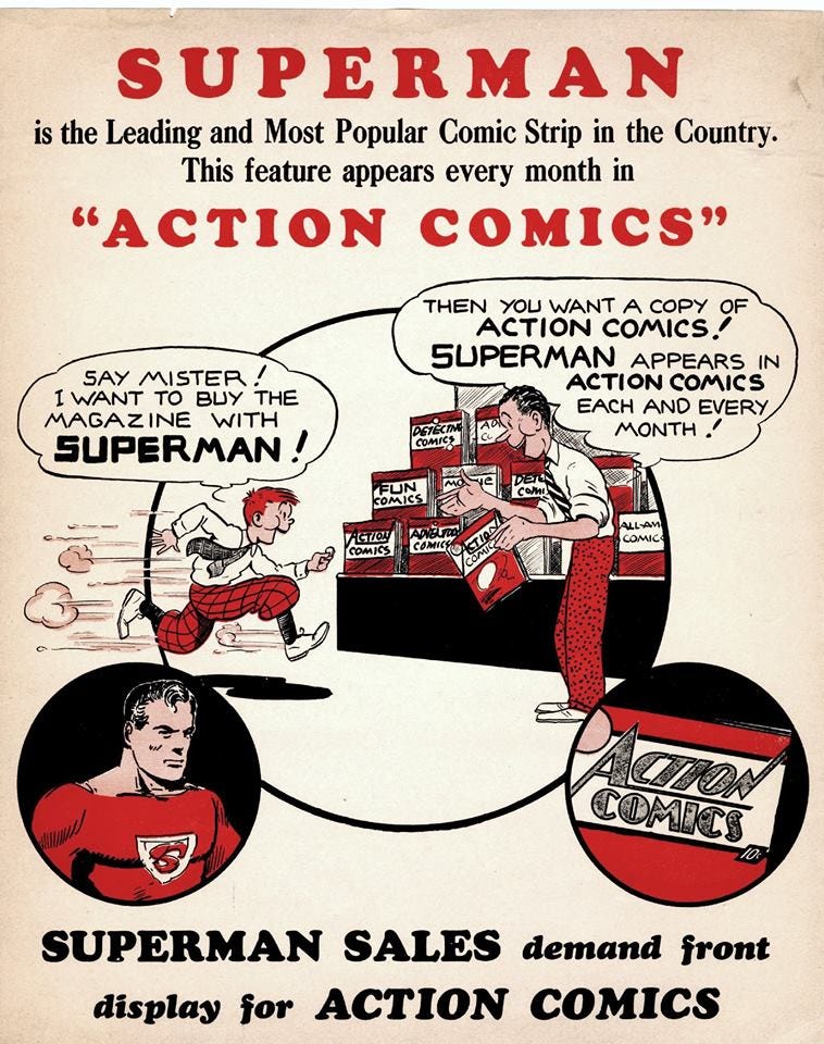
This promotional flyer was sent to newsstand and retail outlets sometime around the time of ACTION COMICS #5, indicating that somebody at DC/National had gotten the message. But it still took the firm another year before they’d put the Man of Tomorrow on the book’s cover every issue. Guys, seriously, get a clue here.
Pimp My Wednesday
I hope you’ve been saving up your lunch money, folks, because this week is a mother lode of assorted triumphs from the Marvel Heroes office, all of which will be dropped upon you this coming Wednesday:
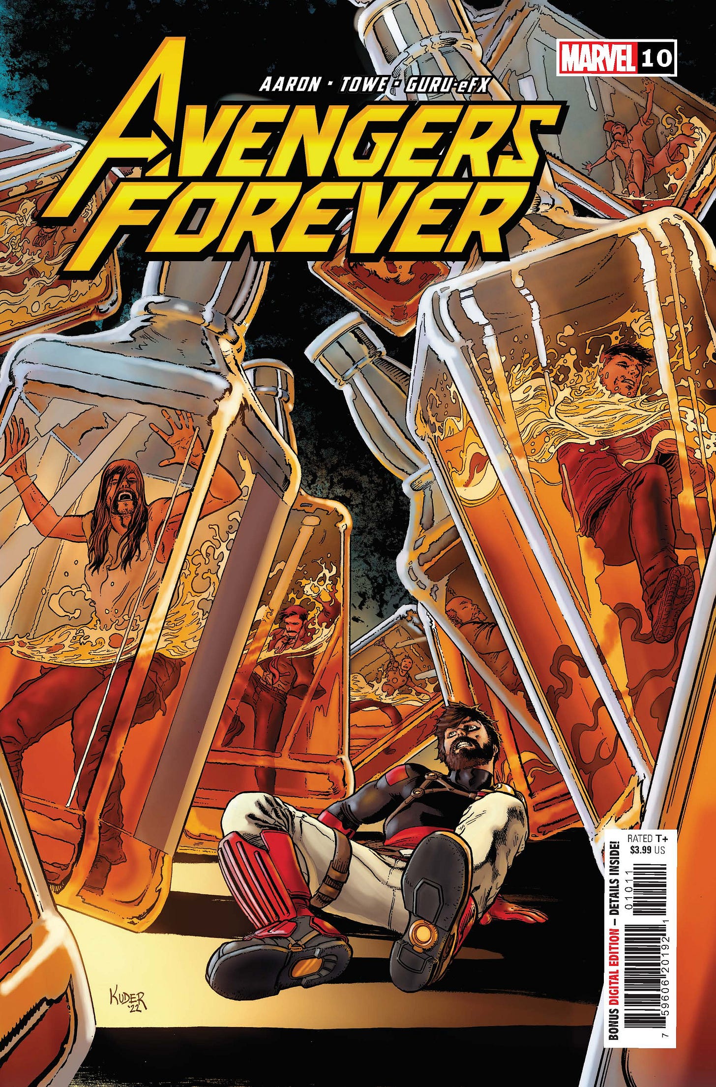
AVENGERS FOREVER #10 continues the “Pillars” cycle, this time focusing on Tony Stark, the Ant-Man, and many alternate versions of himself, all of whom suffer from the same affliction. It’s the work of Jason Aaron and Jim Towe behind this lovely Aaron Kuder cover—Aaron has really been hitting well on his covers for the series recently, I’ve thought. This one has a great concept and a great design, well executed.
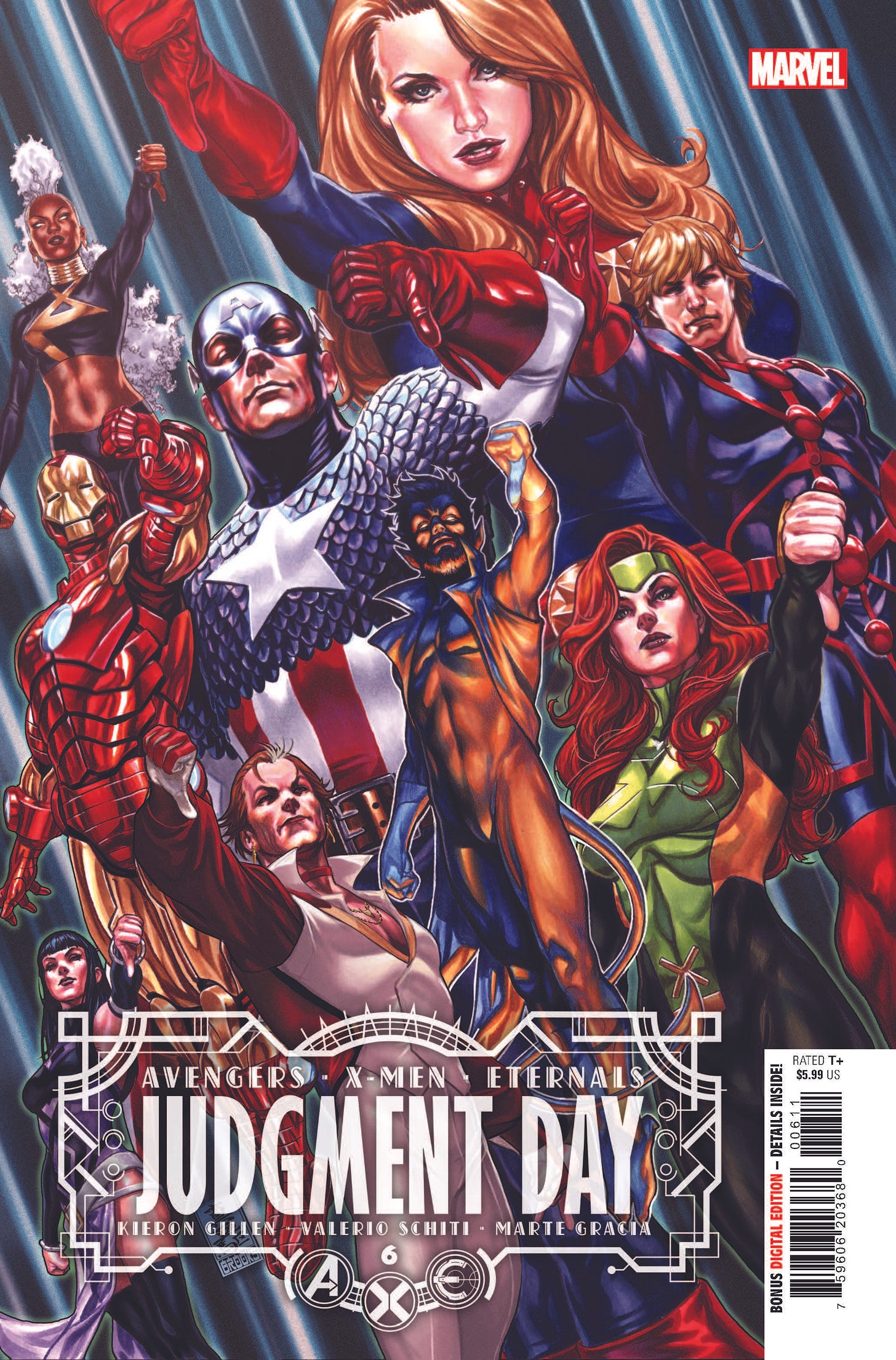
For all of you Event-haters, get ready to celebrate because AXE: JUDGMENT DAY is just about ready to come to a conclusion with the release of its sixth and final issue. (There will be an AXE: JUDGMENT DAY OMEGA epilogue issue, though, so don’t celebrate too quickly. ) Anyway, it’s a fine wrap-up that I think gets across and nails the larger themes of the story, written by Kieron Gillen and illustrated by Valerio Schiti with a helping hand from Ivan Fiorelli on the denouement. You can see how well all of the heroes have liked it—but make up your own mind this Wednesday!
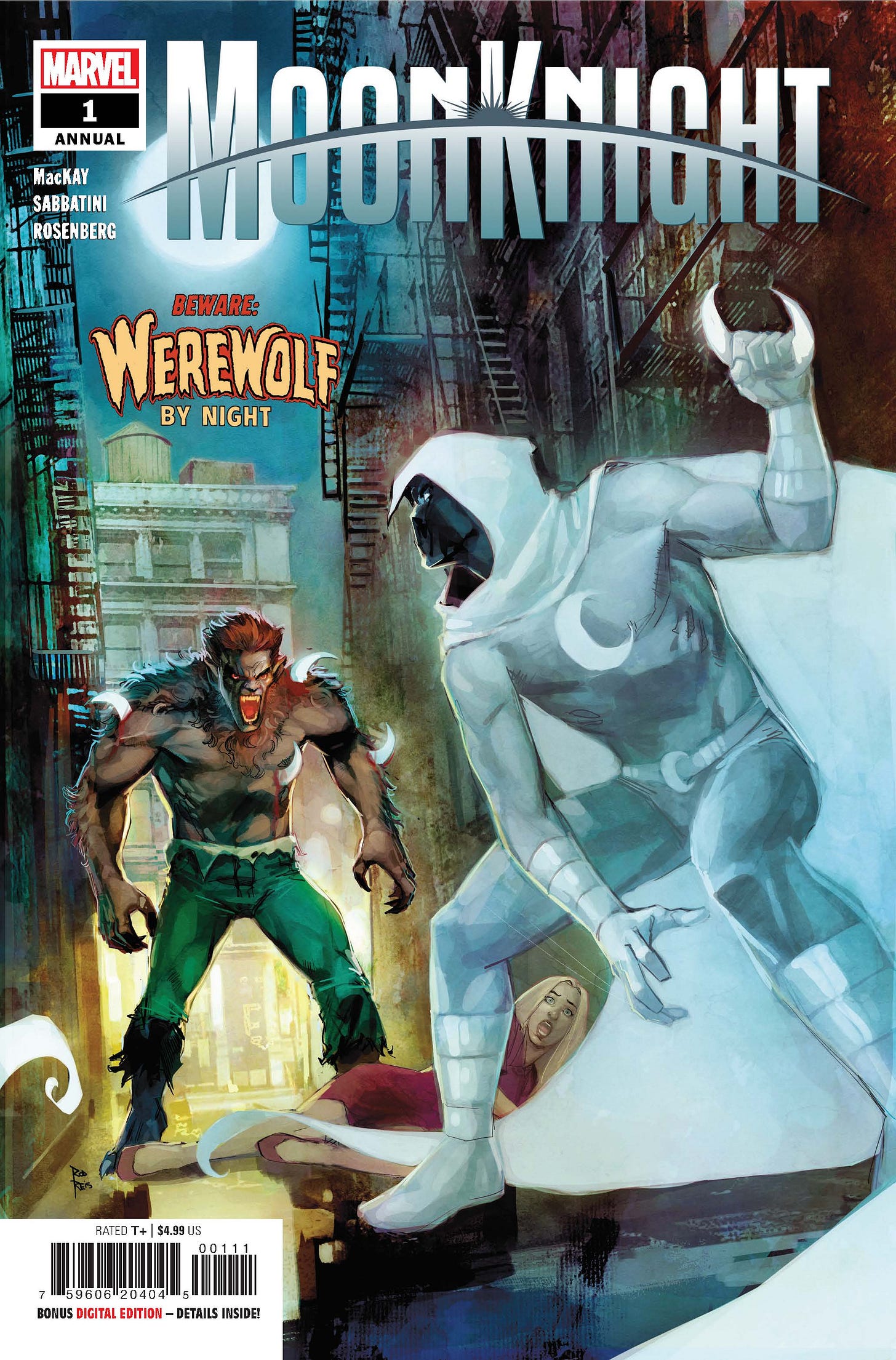
And just in time for his recent Disney+ Halloween Special, Jack Russell is back in the pages of this MOON KNIGHT ANNUAL. It’s written as usual by Jed MacKay and illustrated by the series’ regular swing artist Federico Sabbatini. And yes, that Rod Reis cover is a deliberate callback to the Moon Guy’s first appearance in WEREWOLF BY NIGHT #32. I was a little bit pressed for time when this cover was being set up—looking at it now, I wish we had made the word BEWARE fill gold like the rest of the lettering rather than red, which makes it a bit tough to read. This will bother me about this cover for the rest of my days, seriously, and all because I made an ill-advised snap judgment in the moment. But look at how many books we had going out this week, you can understand, right?
Another cover that showcases some cover copy in red, this set just a bit more legible, is this middle issue to ULTRAMAN: THE MYSTERY OF ULTRASEVEN. I would imagine that the audience for this series is relatively slim among Marvel readers, mostly encompassing readers who themselves watched one or another of the Tokusatsu ULTRA shows over the years. Which is too bad, because even apart from its televisual legacy, it’s a fine monster-fighting super hero comic book in and of itself. It’s been written by the tag-team of Kyle Higgins and Mat Groom and illustrated by Davide Tinto.
Next up is this fun-but-serious penultimate issue of THE VARIANTS, for which artist Phil Noto put together this throwback-style cover, including its Approved by the Brevoort Code Authority stamp. Which is utterly self-indulgent, but I wasn’t going to stop him. This is the issue in which the architect behind Jessica Jones’ woes is revealed, and I can honestly say that I was surprised by the reveal when Gail Simone handed in the script—something that doesn’t typically happen. I suspect this series has been flying under the radar a little bit, but it’s one of the best things we’re putting out at the moment, so I heartily encourage you all to give it a look and see what it’s made of. (Plus, there’s a cool guest appearance from the world of Krakoa!)
In the world of projects that I started but other people finished, editors Wil Moss and Michelle Marchese have DAMAGE CONTROL #3 hitting the racks this week, still written by television writers Adam F. Goldberg (I’m looking forward to his upcoming MUPPET MAYHEM series) and Hans Rodionoff and drawn by Nate Stockman. This cover too has a bunch of cover copy adorning it, and I like the way all of this has turned out. So Wil and Michelle have bested me in this arena this week. But the war goes on…
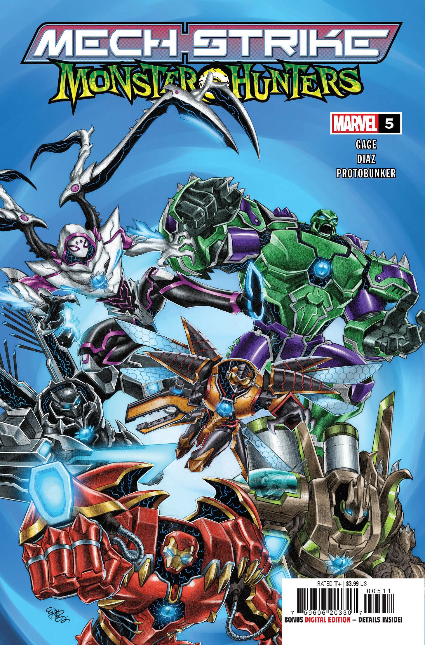
What, there are more? Yes! Because not to be outdone, assistant editor Martin Biro pulled together this concluding issue of MECH STRIKE MONSTER HUNTERS as well! It showcases a broad variety of Marvel heroes and villains all wearing powered Mech Armor, some of whom have been transformed into strange techno-organic creatures as well. Christos Gage wrote it and Paco Diaz drew it, and if you suspect that it might be an adjunct to the recently-released toy line, well, give yourself a gold star for perceptiveness!
The triumphant team of Wil Moss and Michelle Marchese also worked to wrap up THUNDERBOLTS #3, another project that began with me but which I had to hand off to them. As the cover showcases, this one features the Red Ghost’s Super-Apes, and I don’t understand why I would need to tell you a single additional thing in order to guarantee your sale. Jim Zub wrote the story and Netho Diaz and Victor Olazaba did the art. This THUNDERBOLTS series is a bit different than the many others we’ve done in the past, but it still feels quintessentially like THUNDERBOLTS to me despite that. Maybe it’s the presence of Hawkeye, maybe its the team’s status as underdogs, I don’t know. But if you figure it out, drop me a line.
And finally, we’re also releasing the latest AVENGERS UNLIMITED Infinity Comic on MARVEL UNLIMITED this week. In this case, it’s the concluding chapter of Tony Stark’s mental duel with the forces of A.I.M. deep within the subbasements of Project: PEGASUS. Jeremy Adams devised the scenario, Dante Bastianoni supplied the graphics, and it’s all designed to be read on the screen of your choice.
A Comic Book On Sale 20 Years Ago Today, October 23, 2002
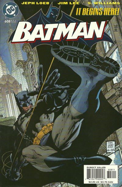
This was such a big deal when it dropped that there’s really no way that this couldn’t be about the start of the “Hush” storyline in BATMAN #608.
“Hush” united the talents of two of the most popular creators in comics at the time, writer Jeph Loeb and artist Jim Lee. In particular, Lee’s output had shrunk a bit over the years as more of his time was spent focusing on internal Wildstorm/DC matters (and when he did draw a project, it was typically focused on characters that he had created rather than the big DC icons.) But this would be Jim unleashing on DC’s most popular character for a story that would run for an entire year, and it got everybody to sit up and take notice. BATMAN was always a popular series, of course, but this run took the top sales spot in the industry virtually for the entirety of its run. Loeb cannily took full advantage of Jim’s specific skill set, crafting a storyline involving a new mysterious villain with a true identity shrouded in mystery, the eponymous Hush. What’s more, he made the entire adventure a walk through Batman’s rogues gallery, showcasing each of the Caped Crusader’s most popular villains one by one. In effect, Loeb took the skills he polished on projects such as BATMAN: THE LONG HALLOWEEN and applied them to a more populist and mainstream-appealing super hero adventure. He also gave Lee the space to work big—Lee’s Batman filled the pages, making a strong and kinetic visual statement throughout. After a couple of years of the Bat-titles focusing more on noir and hard-boiled crime detection, this oversized adventure was like a breath of fresh air. And readers came out for it in droves. Probably the thing this story is best remembered for, however, is its tease of a resurrection for murdered Robin Jason Todd, who seems to be revealed as the mystery mastermind behind Hush about 2/3 of the way through the story. This turns out to simply be a ruse on the part of Clayface, but as I understand things, Loeb had wanted to make Jason’s return genuine, but couldn’t get permission from DC editorial. Which is somewhat funny, because as soon as the story saw print, pretty much everybody wanted it to be true—to the degree where new DC honcho Dan Didio had to set up another storyline to bring Jason back from the dead for real—a storyline that was a lot more absurd and a lot more of a stretch than what Loeb and Lee posit here. But sometimes, that’s the way things go—you never know what’s going to click until the rubber meets the road. Anyway, this story has been collected multiple times, including a new impending hardcover that’s going to include some new material from Jeph and Jim.
A Comic I Worked On That Came Out On This Date
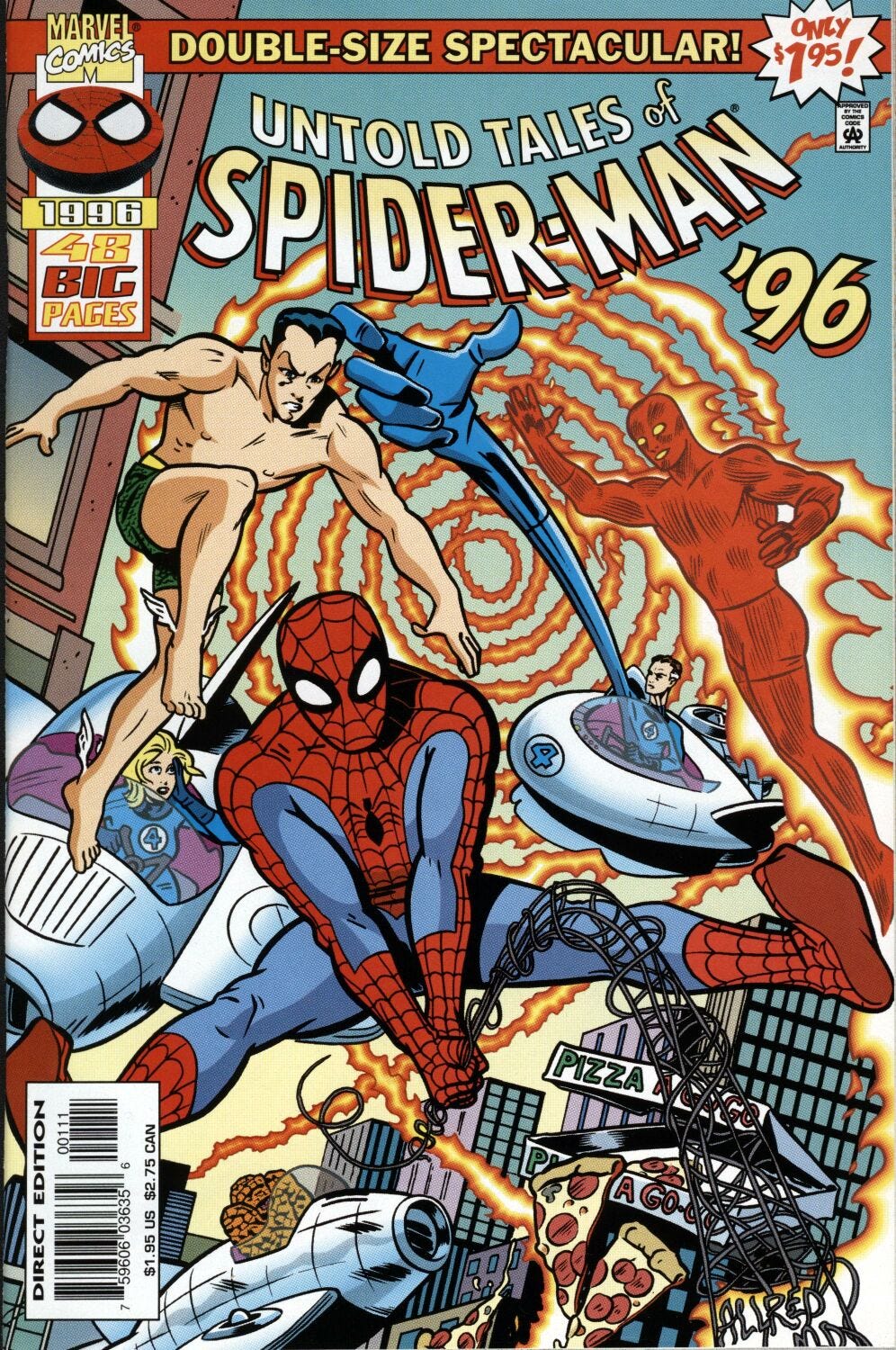
This UNTOLD TALES OF SPIDER-MAN ANNUAL came out 26 years ago, on October 23, 1996, and is one of the best single issues I ever put together.
But while there are certainly stories to tell about the making of this book, they’re stories that I’ve all pretty much told already over at the TomBrevoort.com site. That piece can be accessed directly at this link. There’s also a response from writer Kurt Busiek in the comments section of that piece where he provides some additional background and clarity. So this one’s important enough to me that I couldn’t let the occasion go by without calling it out, but I’ve already said just about all there is to say about it. So instead, let’s move on to…
A Comic I Worked On That Came Out On This Date
…a much more recent Spider-Man comic book that I put together, this one of a much more recent vintage, having seen publication on October 23, 2019.
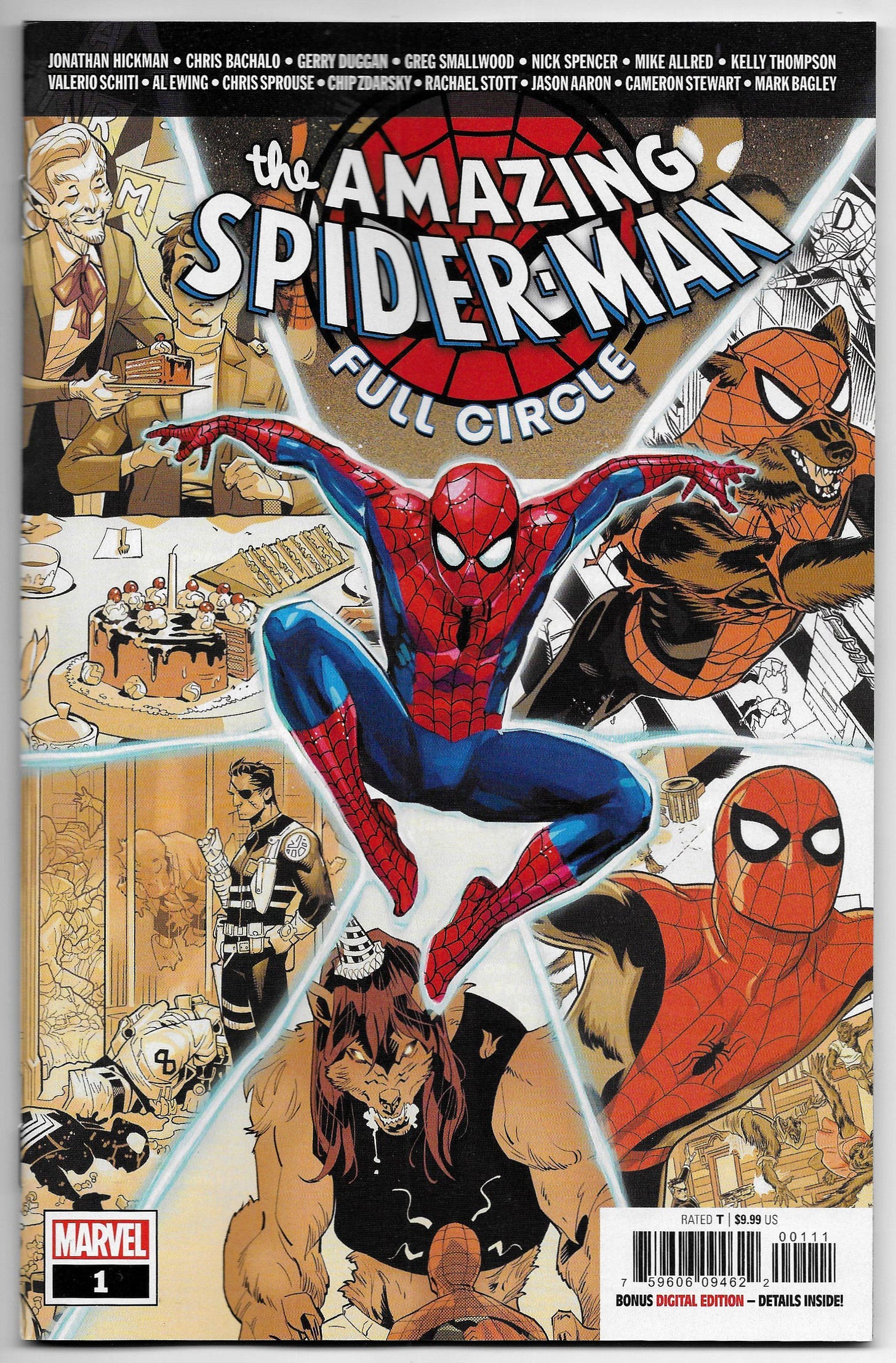
AMAZING SPIDER-MAN: FULL CIRCLE #1 was the culmination of a project that I had wanted to do for many, many years and had simply not found a way to crack. You see, years before, in 1985, DC published a series called CHALLENGE! It ran for twelve issues, and the conceit of the series was that each issue was done by a different creative team round-robin style. There wasn’t any guiding plot or outline, each successive creative team was obligated to pick events up from where the last creators had left them, get the heroes out of whatever fix they were in, advance the ongoing plot, introduce a bunch of new complications, and then climax with a cliffhanger ending that their successors would have to grapple with. in essence, it was an improv game in the guise of a comic book, and I always loved the idea of it. Unfortunately, the reality wasn’t as good as the version that lived in my head. For one thing, it was just too long, and too uncontrolled, with characters drifting into and out of the extremely loose narrative almost incidentally, and with the thread of the overall plot getting completely lost along the way. The idea couldn’t sustain itself over twelve months either creatively or in sales. Still, there was something about the concept that I liked, and I thought that I could maybe build a better mousetrap using the same overall design. Another person who was really into the idea was writer Jonathan Hickman, and he was the one to really kick this project into high gear when he suggested doing a DC CHALLENGE-style project of our own. (In the interim, DC had started work on the KAMANDI CHALLENGE, a similar 12-issue series with a different creative pairing on each issue. But that one was an improvement by simply focusing on a single character—in that case, Kamandi, the Last Boy on Earth.) The big difference here, though, is that when Jonathan suggested doing something like this at one of our Editorial Retreats, I had just about wrapped up work on MARVEL COMICS #1000, which was by far the most complex single issue I’d ever put together. So I was both kind of looking around for a new challenge and had the example of MC #1000 fresh in my head. And suddenly, I knew exactly how to do it. The trick was simple: rather than making it a limited series, we’d do it all in the space of a single oversized issue in the way MARVEL COMICS #1000 was. And we’d keep the focus to just one character, our most popular character, as a way of avoiding the amount of story drift and character accumulation that had become an impediment on the original DC CHALLENGE! So with Jonathan as the anchor man, I went about recruiting a total of seven of our mainstay writers, explaining the concept to them as well as the rules that I had in mind: everybody would get their order in the story rotation completely randomly, and wouldn’t be appraised of where they’d be jumping in until it was time for them to work up their chapter. Each writer had to pick up on what the previous creative team(s) had done, resolve any cliffhanger situation from the end of the prior chapter, move the plot along materially in some direction, and give the next creators a challenge in terms of the situation Spidey or another member of the cast would find themselves in as their portion ended. The eighth and final chapter would be gang-plotted by everyone—so any nonsense that you put on the page was something that you were going to need to help resolve by the ending. We also had a long lead time, so I was able to ask each creator who they wanted to work with artistically, and was able to fulfill pretty much all of those requests. Accordingly, the issue had a murderer’s row of great talent: Jonathan Hickman and Chris Bachalo, Gerry Duggan and Greg Smallwood, Nick Spencer and Mike Allred, Kelly Thompson and Valerio Schiti, Al Ewing and Chris Sprouse, Chip Zdarsky and Rachael Stott, Jason Aaron and Cameron Stewart, and all of the writers (but primarily Ewing, Spencer and Duggan) and Mark Bagley. Rod Reis contributed the Spidey figure on the cover, with each of the vignettes within the web culled from the different story chapters inside, so almost all of the artists were represented on it as well. I will confess that I rigged things just a hair: while the draw-for-position was legitimately random for every succeeding chapter, I decided that as it had been his idea in the first place, Jonathan should kick things off. I’m not sure whether that was wise or not in retrospect, as he proceeded to turn in a wildly imaginative opening chapter featuring Spidey and Nick Fury on a space station in orbit that was about as far removed from a typical Spider-Man story as you might expect. But it definitely set the tone, and allowed the assorted writers and artists to really push their imaginations down some strange avenues along the way. That all said, I don’t really know that it narratively works any better than the DC CHALLENGE did. It is all over the map, with changes of tone and style that whiplash all over the place. But of course, it’s all self-contained to a single issue, so it definitely had that going for it. In the end, especially considering the caliber of talent we had on the book, AMAZING SPIDER-MAN: FULL CIRCLE #1 didn’t sell anywhere near as well as I would have hoped that it would. In part, I expect that’s due to the fact that we seemed to be actively reluctant to explain or clarify what the book was, for fear that readers or retailers would avoid it assuming that it was outside of regular continuity and therefore not important. But as it happened, they pretty much did that anyway as we didn’t give them a clear enough understanding as to what we were doing and why they should be paying attention. So it was a lot of effort for relatively little return. But I enjoyed doing it and I enjoyed the result, so I wouldn’t call it either a waste or a failure. But I still feel as though there’s some way to improve even further on this iteration of the idea. Maybe it would work better as an Infinity Comic on the MARVEL UNLIMITED service, or something similar.
Monofocus
I started on the new second season of MISMATCHED, a teen romance/coming-of-age dramedy series out of India whose freshman season I had enjoyed. It took me an episode or two to remember who all of the characters were and to recall where everybody had been left at the end of the last season, but with that accomplished, I’ve been enjoying it—it helps that the cast is pretty engaging and personable. The show is about Rishi Singh Shekhawat, a traditional young Indian would-be animator who has come to study at the Aravalli Institute in pursuit of his “Future Wife” whose photo he saw on a matrimonial website. That woman is Dimple Ahuja, a geekish coder who dreams of making it big in the tech world and who has no truck for the rules of love and marriage that guided her parents’ generation (her mother is the one who posted her photo in the hopes that her daughter would get married and lead a more traditional life.) So it’s a Rom-Com with a geekish edge set in a foreign country—what’s not to like? In fact, setting the show in India was a change that the production team made when they went to adapt the book the series is based on, which was set in America.
Having now watched the second episode of the new URUSEI YATSURA anime, I remember exactly why I could never connect with the original: none of the characters are sympathetic enough. Our luckless lead, Ataru Moroboshi, should elicit sympathy from me, but he’s such a letch, such a creep and a stalker (even with his behavior toned down considerably for this new 21st century production) that I find it impossible to like him, to root for him. And the characters around him are all similarly flawed in this respect. Maybe this is a byproduct of URUSEI being Rumiko Takahashi’s first big success—certainly Godai in MAISON IKKOKU is flawed and lazy and a bit irresponsible, but he’s also genuine and loyal and his problems and the misunderstandings that surround him and Kyoko aren’t entirely his own doing. The same thing is true of Takahashi’s other later works such as RANMA 1/2 or INU-YASHA. The point being that after only two episodes, I suspect that I may have fallen off following the new show already. it probably doesn’t help matters that I’m at the same time watching the new seasons of SPY X FAMILY, MY HERO ACADEMIA and MOBILE SUIT GUNDAM: THE WITCH FROM MERCURY, so I’m already relatively full-up on anime content for the moment. We’ll see if I break and try next week’s episode once it goes live.
In the world of print, I bought and quickly consumed the third and final volume of HAKIM’S ODYSSEY, graphic novelist Fabien Toulme dramatization of the hardships faced by a former Nursery owner turned migrant who was forced to flee his home in Syria and who gradually over the course of several difficult years made his way to France, where he was able to receive refugee status. It’s a great real-world drama, and Toulme’s telling of the story—always showcased through Hakim’s eyes and based on his first person narration—is wonderfully drawn in a deceptively simple style. I picked up the first volume on a whim on a light week and wound up enjoying it a great deal, and the subsequent two volumes have been just as good. And as is our way around these parts, if you’re interested in checking it our for yourself, an Amazon link to the first volume is right here.
Posted at TomBrevoort.com
Last weekend, I wrote about a piece about the very first parody of the Hulk and the Avengers in an issue of SHOWCASE starring the INFERIOR FIVE.
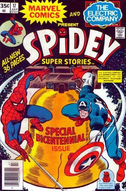
And five years ago, I wrote about this special bicentennial issue of SPIDEY SUPER STORIES!
And as night turns into day, we’re at last at the close of another never-to-be-forgotten installment of this crazy Newsletter. As always, keep your head up, be careful out there, and we’ll see you back here next week for more of the same brand of nonsense. And hey, maybe don’t forget to tune in for the finale of Jodie Whittaker’s time as the Doctor on DOCTOR WHO tonight at 8:00 on BBC AMERICA. As usual, I’ll have my reactions up at the website after it airs.
Tom B








I'll be honest, Tom. I'm more put off by the use of "dildos" as an insult when in fact dildos are wonderful
Yeah, if asked I'd have surely said yes to being part of Full Circle, Tom. I love challenge writing.
On the trigger warning thing, I can see your point, but I also don't see James Ellroy books with trigger warnings about how people talked in 1955, so I'm not sure why a comic sold only to adults needs one. Also, I'm not sure trigger warnings don't just increase the stress on the reader, as they wait for the thing they've been warned about. It's like Hitchcock said, about showing the bomb under the table. And there was this interesting article last year: https://www.newyorker.com/news/our-columnists/what-if-trigger-warnings-dont-work
Great post as always, Tom.