I posted about this online the other day, briefly. But this week, I read my first X-Men script.
It was weird.
It wasn’t just that I was venturing into some untested waters, but also that the scale of the venture is so great in scope. This is a far cry from building a new relaunch for AVENGERS or FANTASTIC FOUR, it’s relaunching an entire line of titles—creating the infrastructure between them that will make up the new parameters of their world and how they’ll all interact (and to what degree) as well as deciding what characters will end up where, in whose hands. I’ve done a lot of things in my years on this job, but I’ve never had to think so broadly about so many characters and books at one time.
There’s a line that Miracleman’s daughter Winter says when she returns from space to see how Miracleman has changed human society in her absence: “You decided to keep the sky that color, did you?” That’s what every choice feels like.
It can be a terrifying thing to face. I’m basically making it all up as I go along, trusting to my instincts and my experience to find a path to victory. Already, I’ve made a couple of non-traditional choices that have made some of the folks around me a little bit edgy. And I can’t even say with a certainty that they are the right choices. All I can go on is that my gut tells me that’s the way to go. But it really is working without a net.
X-MEN fans cover a wide spectrum, depending on when they first encountered the characters and their world. Every character is the favorite of somebody that’s hugely vocal about them, and who likes them in a particular idiom. I’ve been looped into conversations on social media that are about how absolutely essential it is to keep Storm’s hair the way it is now, rather than going back to the earlier straighter depictions of earlier artists. And that depiction is the least of my worries concerning Storm, but it is of vital importance to those fans who are talking about it and campaigning for it.
Everybody is not going to be happy. It’s impossible. There isn’t that much consensus among X-MEN fans. (I got a message from somebody else who begged me to maintain the current Krakoa status quo, who stated without hyperbole that “99% of X-Men fans love Krakoa.” I didn’t respond to this—I don’t really respond to any of it at this point—but my answer would have been, “Yeah, maybe 99% of the X-Men fans that you hear from. My polling data is a little bit more divided.”
And it’s also strange to be thinking to this degree about an entirely different set of characters. I’ve lived with Thor and Iron Man and Captain America and so forth for a quarter of a century, my understanding and opinions about them are very fully-formed, to the point where I don’t really have to think about it any longer. But here, every choice requires constant analysis: do we have enough marquee characters in this book? Is this character better served in this title with this author or this other one? Is there some way to split the difference so that these two people can both get some of what they want and walk away satisfied? And so forth.
It’s a lot.
I mean, I am having fun with it all, too. But I’d be lying if I said there wasn’t a certain existential dread that crops up here from time to time. I really do not know what I’m doing in a manner that would comfort those X-readers who are the most trepidatious. But we’re double and triple-checking the math as much as possible, and trying not to let ourselves be held back by indecision. part of being an editor is making choices and then living with the outcome.
That first script needed a revision to its finale, the last two pages or so, and now it’s off in the hands of an artist. So this is becoming very real very fast. I’m going to continue to hold back from saying much of anything about the specifics for some time yet, as really the spotlight should be on the efforts of the current crew as they build the ending to their time on the franchise. So please be patient and try not to ask me too many questions about what costume Wolverine is going to be wearing or what book you can find Rockslide in or anything. It’s not my time yet. And by the time we get there, like it or not, we’ll be ready.
We’re just not there yet.
But in terms of questions that I hopefully can answer, let’s go to this week’s mailbag section:
Cathal
Something I really enjoyed about the first issue of GODS - besides, of course, the actual comic - no ads! And likewise with Ultimate Invasion. Is this something that’ll be replicated across the rest of the series, or is it just for the bigger issues?
I don’t know that we’ll be making an absolute habit of it, Cathal, but we’ll do this when it’s necessary. Incredibly, the first draft of the G.O.D.S. #1 script was several pages longer even than what was printed, and Jonathan and I were able to scale it back to what you saw with some judicious wrestling. But the lack of ads there was down to the lack of space—there wasn’t anyplace to put them in that issue.
Tom Galloway
'Fraid you made a minor mistake. The publisher of the For Better Or For Worse hardcover collections isn't Fantagraphics as you wrote, but IDW. As I understand it, this is the penultimate volume of their collaboration on strip reprints with The Library of American Comics, the last being v.8 of FBOFW that I believe is scheduled for March and finishes the strip's run.
You are correct of course, Tom, that it’s been IDW who’s been releasing those great FOR BETTER OR FOR WORSE collections. But wrong, I believe, in this one being the penultimate edition. By my calculations, there are definitely two more similarly-sized books needed to encapsulate the remainder of the run.
JV
Interesting to note that sequences in timeless was for the MM Silver age series (I also though it would lead to MM in the Marvel U) - do you think that would be appropriate? or does MM need to stand on its own (I'm LOVING the silver age series by the way)?
I think Watchmen is the best comparison - a singular work where the sequels/prequels left me cold - decent books (Watchmen is timeless and the sequels/prequels are of their time in my opinion). They do no detract from the original but also add nothing and maybe for some detract from the mystique of the original series.
That being said I also loved the HBO sequel series - a masterpiece that moves the world forward with a unique POV.
your thoughts on Miracleman mingling with the main Marvel U? Your thoughts on Watchmen prequel/sequels/adaptations?
As I’ve said in the past on occasion, JV, I think that it’s inevitably only a matter of time before Miracleman and his world mix in some fashion with the Marvel Universe. By that same token, I’m not especially in any hurry to see that happen—primarily because, within the Marvel Universe that has its own rules and vast mythology to it, Miracleman just becomes another Sentry. The stuff that makes that series so compelling isn’t the character and his costume and powers and such, it’s the thorough scrutiny under which the idiom of the super hero concept is placed. And none of that can really survive contact with the MU. I had a similar problem with the use of the WATCHMEN characters over at DC: I simply do not believe that it’s possible, given the structure of their cosmology, that a character from the WATCHMEN universe can get into a ship and travel into the DCU. And even once you get them there, they feel somehow uneasy standing beside and interacting with Superman or Batman. In both cases, Alan Moore treated these works less as super hero stories and more as speculative fiction, which implied certain rules to the universe and narrative. Mixing them with other universes steals away that consistency of vision, and makes the characters simply another bunch of action figures with different costume lines.
JV
Also would love to know more about that Starhawk issue? Was it the same character Gerber introduced into the Guardians in his Defenders run? or another creator/concept?
That version of Starhawk was a completely different character from the one later introduced into the Guardians of the Galaxy by Steve Gerber, JV. Only the name was the same. As I mentioned, the earlier Starhawk was much more of a science fiction series than a super hero one, despite the lead character having a costume. . I believe we collected all of the finished work that we could find on the strip in the MARVEL MASTERWORKS volume devoted to Rarities that we put out several years ago. Alas, it’s probably a pricey volume to track down today.
Craig Byrne
Has there ever been a temptation to print that Starhawk story somewhere (whatever exists of it)? Also, I seem to remember a Roy Thomas thing with Quicksilver and two other characters called The Protectors or something - I think some pages were drawn by Barry Windsor-Smith before he really hit it big and was still drawing like Kirby - any chance of that, either?
Neither of these projects were completed, Craig, so no, there really isn’t any hunger to finish them and release them fifty-plus years down the line. That other book you mention was going to star Quicksilver, Red Raven and Rick Jones in the Bucky outfit, which clearly gives you a sense as to when it was being worked on. Once Rick became bonded to Captain Mar-Vell, an act initiated by Roy himself, there wasn’t any chance that the earlier series was going to reach completion.
Patrick Brower
In regards to the cover of Avengers #71, along with Lysa Hawkins, I'm pretty sure the main figure (rolling the dice) is long-time DC Comics convention guru (with stints at Wizard and Marvel and currently Fletch Forward) Fletcher Chu-Fo
That’s certainly possible, Patrick.
Michael Perlman
Since you mentioned MIRACLEMAN SILVER AGE this week, can you say if DARK AGE is still planned to be published? If so, is there a target release date for its release?
Yes, Michael, there is still every intention for us to roll on forward into THE DARK AGE once THE SILVER AGE is completed. But I think we need to do the latter before we can seriously start talking about when the former might be scheduled. Those SILVER AGE issues are getting done, but at a much slower pace than anybody anticipated. Which is the Miracleman story all over, isn’t it?
AJHarper
Hey Tom: You are definitely a straight shooter, so I must ask, How did John Ridley's run on the Black Panther ever get off the ground, was it presented at a Marvel Retreat? His depiction of the character was so off brand, and created more than a few animated discussion to say the least
I’m sorry that you didn’t like it, AJ. All I can tell you on that score is that we did.
David Brazier
Surely, while we still have a talent, as Alan Davis Marvel should give him a free hand to return to these characters under the Xmen banner and perhaps extend his remit into those underused Mystech characters that he used so beautifully in his final Excalibur issues. Such work would make money for Marvel for many years to come.
I answered a version of this same question a week or two back, David. But to reiterate, sure, it’d be terrific to have Alan come back to do something. But first, he needs to want to, and secondly, all involved have to agree on what that might be. And really, nobody gets an absolutely free hand—especially not while I’m trying to set up a new array of X-Men dominos right this moment.
Mortimer Q. Forbush
It was a treat to Eliot R. Brown's name pop up on that Romita event. I have been a fan of his technical drawings ever since the first issue of the Official Handbook back in the day, back when the focus wasn't on tedious character histories. The detail and realism Brown brought to the inner workings of equipment, architecture and maps brought a wonderful level of worldbuilding verisimilitude to the comics.
I'd sincerely love to see more of his technical drawings of the newer places and things in the Marvel Universe. If not as part of a new edition of a Handbook, then as bonus content in a special issue of a particular comic — something not unlike the way Hickman would incorporate data and diagrammatical excerpts into his storytelling. In a way, this kind of content stretches back to the earliest years when Kirby would do a diagram of the Baxter Building or Ditko would show a detail of Spidey's web shooters.
Any chance for more of this kind of content from Brown or other artists similarly talented with technical drawing?
There’s always a chance, Mortimer. By that same token, the sorts of detailed schematics that Eliot used to do somehow feel to me like a product of a different, earlier era. Maybe there’s a way to modernize the approach, but I also don’t know that we have a ready place to publish such things as we used to in the OHOTMU.
Jeff Ryan
You mentioned Marvel's first in-person editorial retreat this week. Have any reporters ever been allowed to be a fly on a wall at one of these past retreats?
There have been one or two occasions over the years where, for one reason or another, we’ve let reporters and other outsiders sit in for some or all of our meetings, Jeff. But in general, as it’s tough enough to keep our story plans a secret even when it’s just our creators and editors in the room, it’s way harder when there are a bunch of additional people for whom those secrets aren’t of any tremendous importance. So I don’t know that the result is entirely worth the risk in most instances.
Carlos
Last week, before of NYCC was a Marvel retreat, was there anything about Spider-Woman for the next year?
Caleb Wong
Hello, Tom. Remember the last post when u said there is a Hawkeye project coming in 2024? I expect this announcement to come from the NYCC. But much to my disappointment it didn't happen.
I’m grouping these two questions together, Carlos, Caleb, because they’re effectively the same question, just about two different characters. And my answer will be the same in both cases: have patience. If we did come up with some plans in our Retreat for these folks, you won’t hear about them, let alone see them, for several months to come yet. And if we have a project on the way featuring them, that project may not yet be at a state where it’s advantageous to announce it yet, at NYCC or elsewhere. I love that you’ve got such passion for your favorite characters, and you’ve certainly evidenced your support over the years. But the gears only grind at the speed that they grind—let ‘em do their job.
Kek-W
I'm kinda curious about the evolution of the original FF logo - which I'm guessing was created by Sol Brodsky and / or Artie Simek? This is a long shot, but is there any historical documentation - memos, letters, interviews - that might describe its genesis or the thinking that went into its design. It strikes me that it looks very different to the logos of its in-house contemporaries - I'm thinking of the 'spooky' style lettering of logos like Strange Tales. The FF's logo is very angular and jaunty-looking by comparison - which I guess was the point: to make it stand out on the news-stand - with those fluted, almost trumpet-shaped serifs on some of the letters. It's cool and iconic, but do we know much about its origin?
The logo for FANTASTIC FOUR was designed by Marvel production man Sol Brodsky—and that’s really about as much as we know about that, Kek. Well, there are a couple more things that can be said. For one thing, the typeface approached that was used on it was also used for AMAZING ADULT FANTASY, which was launched at around the same time, and both titles were advertised together. So it seems that they were both part of an overall effort together, even if only one of them proved to be a lasting success. That also implies that probably editor Stan Lee and publisher Martin Goodman have have had more input or oversight into their look and design. then again, they may not. The FF logo on issue #1 seems like a pretty on-the-fly sort of a design, which is partly why, I would guess, it got refined a couple of times over the next batch of issues. Readers of the day have often said that it didn’t look like the logo to a super hero title at all, but rather evoked something like a circus in their minds. And this may have been deliberate, as Goodman was seemingly trying to keep DC/National Comics from noticing that his new series was a super hero book until it was too late to prevent it from being distributed.
Behind the Curtain
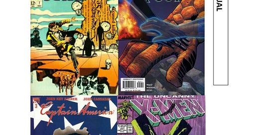
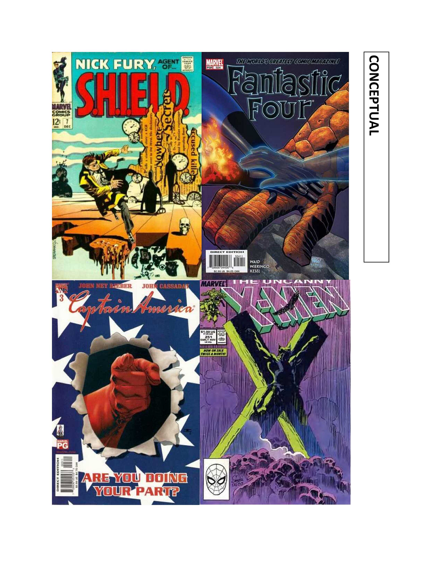
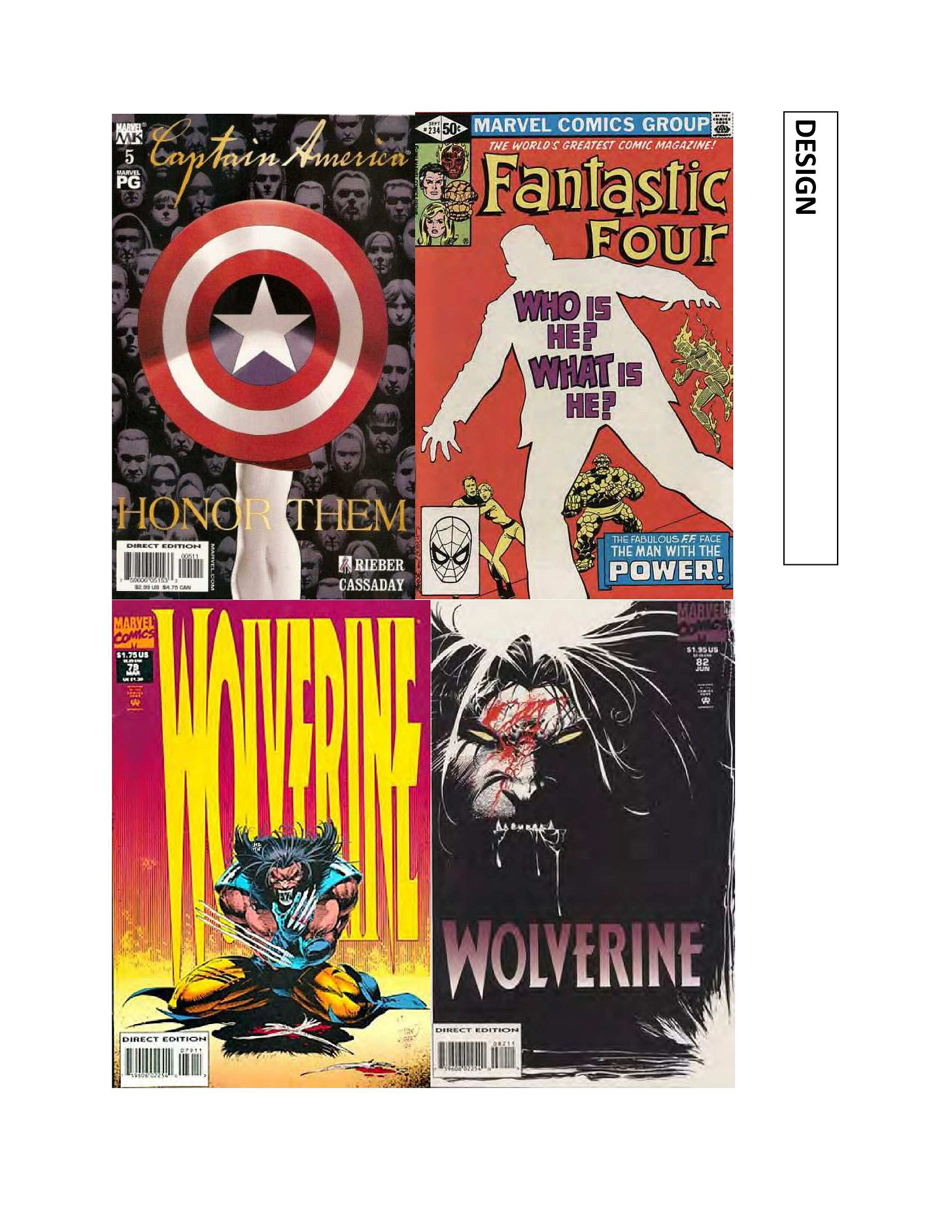
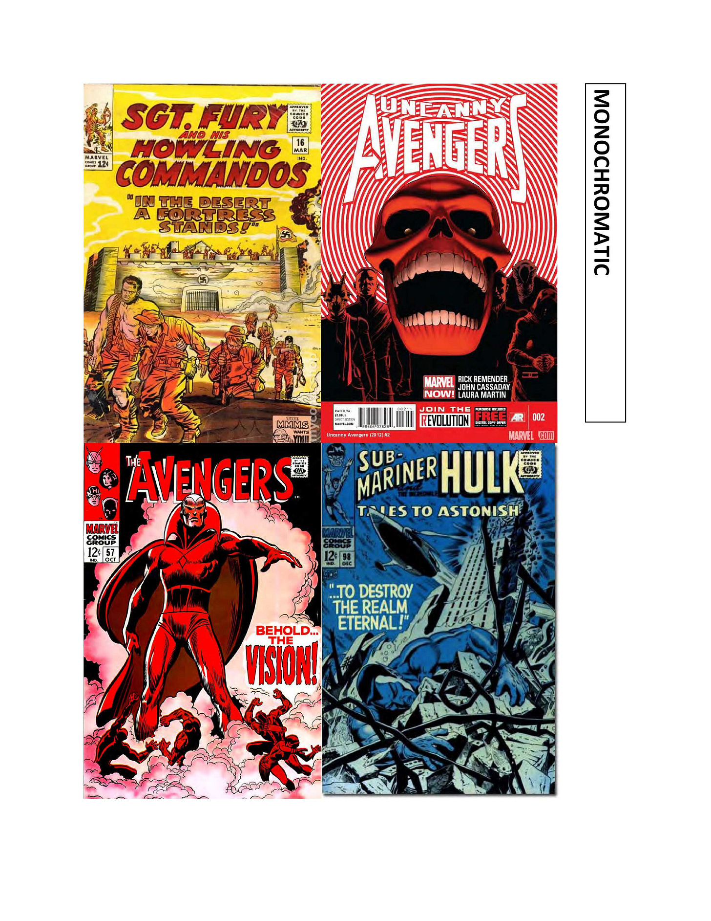
.Diving into another section of pages from the cover concepts prompt booklet that I put together for Marvel’s editors as a thought-started towards more interesting covers.
Conceptual covers are covers that are built around a graphic idea, rather than a specific story element or an iconic image. These tend to be graphic and punchy in one way or another.
Design-oriented covers take that one step further, where the image is more about the graphic treatment than it is about any sort of literalism. These pieces are about design and grabbing the eye through a strategic use of image and color.
Black and white is just what it says, covers that are largely if not entirely rendered in stark contrast black and white, with other colors used to give accent or to pop crucial elements. These can be very effective, white covers stand out on the racks like crazy.
Monochromatic covers do the same sort of thing but with a central color theme rather than either black or white. In the 1960s, Marvel would occasionally use this type of color approach to try to save covers that weren’t especially strong otherwise or which lacked a central focus. (They also screwed up a couple of otherwise-fine covers by using this manner of treatment.)
We’re not quite done with this pamphlet yet—but that ought to be enough to hold you all for now.
Pimp My Wednesday
Insert your own pithy lead-in remarks here, and then let’s take a look at what’s coming to a store near you this Wednesday.
Despite the miscrediting on this cover, this issue of UNCANNY AVENGERS features artist Emilio Laiso subbing in for Javier Garron on the artwork. Javier did do this cool cover of Deadpool getting aerated, working from a crude sketch that I sent over to him. As usual, writer Gerry Duggan leads the charge as Captain America and the Unity Squad take the fight back to Captain Krakoa and the new Mutant Liberation Front in the public arena, as well as in a high-end boutique! What other comic book can promise you a good time like that?
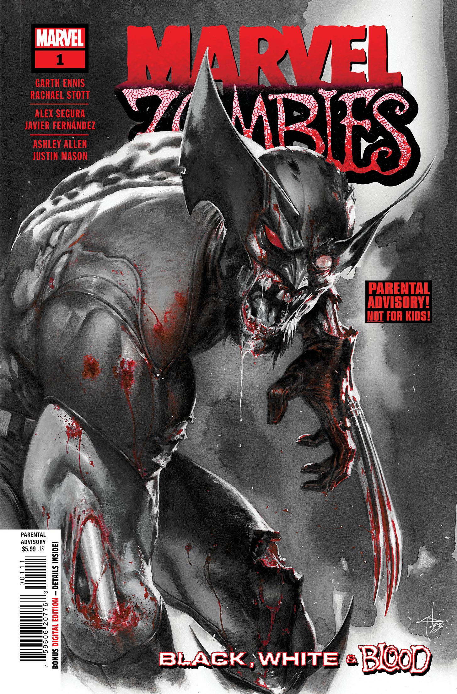
And under the watchful eye of Associate Editor Annalise Bissa (Hi, Mr. Bissa!) comes the first of four issues of MARVEL ZOMBIES: BLACK, WHITE AND BLOOD. the pitch to do this project came from me, but I very quickly realized that it wasn’t something that I needed to be so intimately involved with, and so I turned it over to Annalise to run. The big news here is that Garth Ennis came back to do a Daredevil story, with artwork by the great Rachael Stott. And Alex Segura got to live out a childhood dream by writing a Spider-Man adventure illustrated by Javier Fernandez—though I don’t think Alex’s dreams were quite this dark. And finally, relative newcomer Ashley Allen pairs with Justin Mason for a tale featuring Moon Knight and Iron Man. Even if you’ve never read a MARVEL ZOMBIES story before, we’ve kept the entry here as clean and simple as we could!
And is it time for AVENGERS UNITED #3 already? Seems as though we were just launching this new Infinity Comics, and already writer Derek Landy is testing Earth’s Mightiest Heroes with a new and dangerous threat from the stars. Artwork is provided by Marcio Fiorito. And there are only 22 more chapters to go in this story!
A Comic Book On Sale 20 Years Ago Today, October 22, 2003
I’m not going to be speaking so much about the contents of this issue of BATMAN, #620, as I am its significance in my own life. But this was the beginning of an extended storyline by Brian Azzarello and Eduardo Risso, the creative team on the well-received Vertigo series 100 BULLETS. So the team had a pedigree, but a very different one from the creators whose tenure they were following. And that’s where we get into my part in all of this. I’ve spoken in other recent pieces about how life at Marvel under President and Publisher Bill Jemas had grown steadily more intolerable to me over the course of around 18 months or so. This all led to a crescendo when Bill decided that he wanted to bring in a new approach on FANTASTIC FOUR that he’d conceived and ordered me to fire Mark Waid from the series. Bill had also indicated that I wouldn’t have to edit this new direction if I didn’t want to, a statement that he reneged on after I told EIC Joe Quesada that there wasn’t any power on Earth that would get me to helm the follow-up. When Bill told me that I had, in essence, “failed the test” and that I’d be editing that series like it or not, I finally did something that I had resisted doing for several years: I called up Mike Carlin over at DC about playing for the other team. Fortunately for me in the long run but unfortunately for me at the time, while Mike had made it plenty clear that he’d scoop me up in an instant if the opportunity arose, by the time I made my reach-out, he wasn’t running DC Editorial any longer—Dan Didio was. But Mike did me a solid and arranged for me to have lunch with Dan, putting in his good word with him about me. It was, frankly, a bit of a strange lunch, because while dan gave me his time and attention, it seemed that he really didn’t have any particular interest in hiring me at that moment. That said, he was perfectly pleasant and jovial throughout our interactions—and, frankly, he didn’t owe me a thing, so if he didn’t have room in his staff or interest in my skills, that was entirely his purview. But speaking frankly, if he had offered me half what I was making at Marvel at that moment, I’d have jumped for it—and likely regretted it either virtually right away or within a few years when DC relocated to the west coast. Anyway, the big question that Dan was wrestling with on that afternoon was in deciding what creative team should come on to BATMAN after Jim Lee and Jeph Loeb wrapped up their hugely successful storyline “Hush.” It was a tricky question without an easy or obvious answer. So that afternoon, once our meal had finished and we’d gone our separate ways, I brainstormed on this question for a it and sent Dan over a list of suggestions, hoping to prove my value as somebody who could think outside of the box and come up with a workable answer that he hadn’t already considered. This long after the fact, I don’t remember exactly who I suggested, only that I rattled off a list of maybe five creative team possibilities. None of them were Azzarello and Risso—and when that team was eventually announced as taking over the book from Jim and Jeph, I was a little bit flabbergasted. See, Jim and Jeph were about as popular a mainstream super hero team as it was possible to find, and so following up on that, my instinct was to try to pull in creators who might appeal to a similar audience in a similar way, to maintain the huge sales gains that BATMAN had seen. Dan and his editors, it seemed, had gone a different way, bringing on board a creative team that had some renown but in different circles than the type of readers who were then following BATMAN. It wasn’t a bad cast particularly, it just took an approach that slightly baffled me. All that said, though, it sold fine, and it certainly didn’t hurt BATMAN in the short or long run. Which just goes to show that, in comics casting, there’s never any one right answer, there are just a series of choices that you make and see what the results turn out like.
A Comic Book On Sale 15 Years Ago Today, October 22, 2008
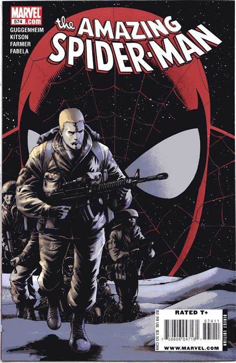
I was around and involved in an oversight capacity at the time this issue of AMAZING SPIDER-MAN was put together, but it’s in no way my work. Rather, it’s Stephen Wacker who should get the editorial credit for this one, and who both championed it and did the extra legwork to get it all right. It was produced in the era in which AMAZING SPIDER-MAN was being released three times per month, with a team of four writers alternately called the Spidey Braintrust and the Web-Heads charting out the series and switching off on writing the issues. One of the best things the crew did during the course of this period was to bring back an extended circle of friends and co-workers to surround Peter Parker and make his life more nuanced and textured. Additionally, the 3X a month shipping schedule allowed for an occasional issue to be somewhat experimental in a fashion. Unless I’m misremembering, this issue of AMAZING SPIDER-MAN doesn’t feature an appearance from either the web-slinger himself nor his photographically-inclined alter ego in the flesh. Rather, it focuses entirely on longtime supporting character Flash Thompson, who had once been Parker’s bully and tormentor before the two struck up a friendship later in life. Flash had served in the Vietnam War back in the 1960s in the strip when that conflict was a regular feature on the evening news every night. By 2008, there were other conflicts that were appearing regularly in those outlets. and so, Flash Thompson enlisted to serve his country once again. His earlier service couldn’t have taken place in Vietnam at this point any longer—Flash simply isn’t that old. But it was an established bit of his backstory that he had served in the military, so we saw him sign up for duty again. Only this time, Thompson wasn’t so lucky. Inspired by his hero Spider-Man to not sit on the sidelines and to take action to protect others, Flash was wounded in the line of duty and lost both his legs, a status quo that persisted for years hereafter. Writer Marc Guggenheim provided a sensitive and compelling script, one that did its homework on the experiences actual servicemen who had experienced what Flash now would had been through, and artist Barry Kitson made the characters all look heroic but not super-heroic. He maintained the humanity of all involved. It really is a very fine piece of work, and the revelation that Flash has lost both of his legs hits like a cannonball if you don’t know that it’s coming, so deftly has the story been laid out. It’s a stand-out issue in a run where many of the issues were stand-outs in one way or another, and is well worth seeking out.
A Comic I Worked On That Came Out On This Date
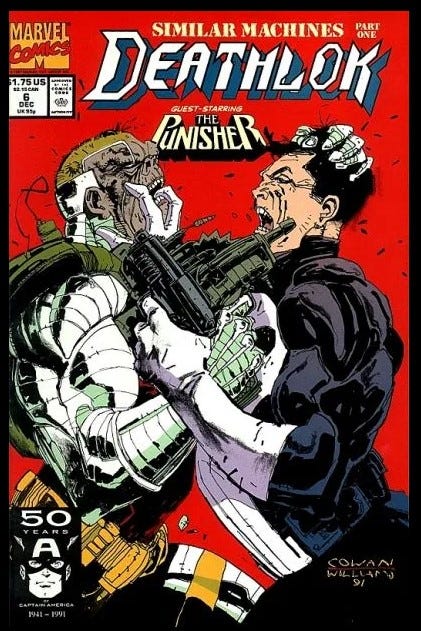
DEATHLOK #6 was released on October 22, 1991. This was the first ongoing Marvel series that I edited, and there are columns to be written about how, through my inexperience and some bad instincts, I ran the book right into the ground. But that isn’t really what I’m here to talk about this time out. Rather, everything I’m about to say here is about this cover, one of the best that we did during the run. It was penciled by regular series artist Denys Cowan, and inked by Denys’ buddy painter Kent Williams. As I recall, Denys had been visiting Williams when it came time to do both this cover and the one to the next issue, and Kent volunteered to ink them —Denys brought them in to me fait accompli, but I was happy to have them both. The excellent color approach was the work of Gregory Wright who was also the writer of this issue. That killer red background makes both figures pop like crazy and dulling down Deathlok’s own colors is very effectively done here. But the reason that I’m spotlighting this cover is because it’s an instance of EIC Tom DeFalco being right and me being wrong. You see, when the cover was initially set up, I’d had that PUNISHER logo placed down towards the bottom, so as to not interrupt the eyeline between the two clashing figures. DeFalco kicked the cover back to me, indicating that I should move the logo to where it current sits. I explained my reasoning to him, and unmoved, he told me to make the change. I’m pretty sure that I grumbled about it a little bit, but I carried out the instruction. And as I said earlier, he was absolutely right. In this position, that logo sits within the Dynamic Live Area, the parts of the cover most likely to be seen when the book is racked. Down at the bottom, it would have been overlooked, and ineffective. And if anything, its placement where it is now brings more attention to the gazes of the combatants, so it doesn’t really get in the way at all.
A Comic I Worked On That Came Out On This Date
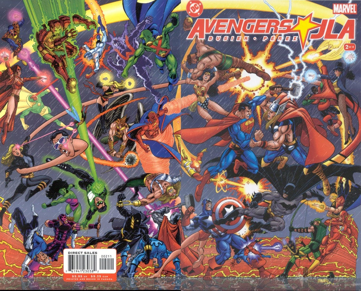
This was the first DC comic book that I ever edited. Well, co-edited, along with DC editor Dan Raspler. This was AVENGERS VS JLA #2, which came out on October 22, 2003 and which was published by DC—the way this project was structured, Marvel published issues #1 and #3 (which were titled JLA VS AVENGERS), and DC published issues #2 and #4 (which carried the AVENGERS VS JLA logo). In reality, however, all four issues went to the printer leaving out of my office, so they were really delivered by Marvel regardless of which outfit got the credit for them in the indicia. I’ve talked in the past about how I feel like we loused up and let the story in this series get broken in issue #3, and I still feel that way. But the first two issues are a cracker and really live up to the promise of the premise and I’m still very happy with them. This entire project was a labor of love from start to finish from virtually everybody who was involved with it, but especially my friend the late George Perez, who both penciled and inked 192 insanely-detailed pages as well as four wraparound covers in the making of this epic. It took him more than a year to do. After the first issue set up the situation and the stakes—both the League and the Avengers were going to have to vie for possession of a number of key objects of power from across both the Marvel and DC Universes, this issue was dedicated to the matches that fans wanted to see most of all. When we first announced the project, writer Kurt Busiek set up a special e-mail address where fans could send their requests for match-ups or ideas for the project; Kurt and I got stranded in Florida when a snowstorm hit New York, and so we spent 26 hours renting a car and driving up the coast, with Kurt scrolling through that mailbox and us discussing the assorted ideas and options as we went. The two most requested throwdowns that the fans wanted to see were of course Superman vs Thor and Batman vs Captain America. And consistently, those fans told us that what they really wanted was a clear-cut victory in which one character came out on top of the other conclusively. Now, of course, when they were asking this, they were imagining their favorite character as the victor, because of course their guy wound win. But we took those requests seriously. So when we sat down to plot out the series, we all resolved to do just that, Marvel and DC folks alike. And when this issue came out, man did all hell break loose! For the most part, people seemed happy with the Captain America and Batman conflict, in which Cap and Bats are so skilled that they make a series of slight move-and-counter-moves before Batman declares that in all likelihood Cap wound best him, and then the two heroes instead head off to deal with figuring out what’s behind what’s going on together. There were possibly some unhappy Batman fans with this, but we didn’t really hear from many of them (maybe Raspler did.) But the Thor fans were absolutely outraged when Superman proved to be even mightier than the God of Thunder, and they weren’t shy about saying so. The responses were, frankly, nuts, with some claiming that Kurt had made Superman win in an attempt to curry favor with DC and thus pick up work there, as though I wasn’t present to safeguard Marvel’s stake in the story. The loudest fans, of course, were the ones who’d asked for a decisive victory, who were now hoping that there’d be a rematch in which whatever duplicity Superman used to achieve his win was found out, and Thor was anointed the rightful champion. This went on for literally years (and started up again, in microcosm, for a little bit when Marvel and DC teamed up to do a new limited printing of the crossover a few years ago.)
Monofocus
After a long hiatus right in the middle of its final season, DOOM PATROL returned to HBO MAX a week or two back, and it remains as strange and wonderful a series as before. It’s an absolute miracle that something this bizarre and non-mainstream ever got made in the first place, and it captured the bizarre essence of the World’s Strangest Heroes pretty perfectly, in particular the era of writer Grant Morrison. I’m told that this past week’s musical episode was pretty divisive, but I loved it. I do suspect that the show’s best days are likely behind it, so I’m not terribly sad that this will be the final season. But I am glad to be able to experience the balance of this final set of episodes. Who would’ve eve thought that Brendan Frazier would be an absolutely perfect Robotman? Not me, that’s for certain.
I also took in the first episode of the new revival of FRASIER, largely out of some sense of nostalgia. I had watched the original pilot again not too long ago after soaking up a retrospective on the show. But this new iteration, I’m sorry to say, isn’t very good. It’s always possible that it could still grow into something, but the script seemed weak, most of the new characters came across as thin, and the whole affair felt somehow entirely too sitcommy to me, lacking the plausibility that the original series had in even its most ludicrous episodes. The best part, no surprise, is Kelsey Grammer, who I’m sure could play Frasier Crane in his sleep by now. But he’s at the mercy of a script that just doesn’t give him a whole lot to work with and performers who aren’t quite at his level. Like the new NIGHT COURT before it, this new iteration feels like a pale imitation of the original, remaining afloat simply out of nostalgia and familiarity.
In print, I read LOST IN TAIWAN by Mark Crilley this afternoon, which was quite good. I’ve been a fan of Crilley’s work since following his AKIKO series back in the late 1990s. These days, he’s turned to less fanciful works, and LOST IN TAIWAN is a story that doesn’t contain any elements of fantasy whatsoever. Rather, it’s almost a tourist advertisement for the country of Taiwan, a place where Crilley spent a couple of years in his own youth. But it’s wonderfully drawn, beautifully paced, and conveys the natural beauty of the environment almost tactilely. it isn’t a hugely deep book, but it is lovingly put together.
And because it was just reissued in a single volume as an Epic Collection, I also took the opportunity to revisit Alan Moore’s run on MIRACLEMAN. I read these stories in real time (and the first third or so as MARVELMAN) and they were truly genre-breaking at the time they were coming out. Today, some forty years later, much of what they do has been copied and duplicated and built upon by later works. But simply taken as a deconstruction and examination of the entire super hero idiom, they still work incredibly well. It’s also still amazing to see how much Moore and his collaborators Garry Leach and Alan Davis are able to squeeze into six-page chapters for the opening portion of the book. The middle section, “The Red King Syndrome”, is hampered a little bit by some inappropriate artwork that loses the slick and casual elegance of the earlier chapters. Fortunately, once the story goes into its third act (most of which was produced after Moore and Dave Gibbons had done WATCHMEN) the entire production becomes more polished and ambitious, and John Totleben produced some absolutely stellar pieces. It really is a classic that should be considered on the same level as Moore’s other great works of the era, SWAMP THING and WATCHMEN and V FOR VENDETTA and his Superman stories. But thanks to the fact that it was out of print for so many years, many people have overlooked it. So if you’ve never experienced this saga, stop what you’re doing and immediately order yourself a copy. Seriously, you won’t regret it. It gets my highest personal recommendation.
Posted at TomBrevoort.com
Yesterday, I wrote about what I believe is the very first letters page in comic books.
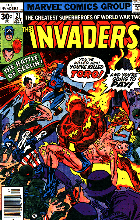
And five years ago, I wrote about expanding my tastes further into Marvel books with my purchase of INVADERS #21.
That’ll bring us to another good stopping point, folks! Hope you enjoyed the ride and glad you were able to come along. Let’s do it all again a week from now, eh? Maybe we can make this a regular thing!
Hat’s All, Folks!
Tom B









if I were to write a SUPERMAN VS. THOR fight I'd have them start by saying "Who would win in a fight between us?" and then trade blows for dozens of pages before finally turning to the reader and saying "You, the fans!"
I'm delighted to hear that you're making "non-traditional choices" with the X-books. As a megafan of the Krakoa period and a longtime X-reader, my experience has generally been that the more the line moves forward and the less it moves backward, the more I enjoy it. I'll be sad to see Krakoa go (if indeed it's going), but I hope something we've never seen before replaces it.