It’s been funny this past week to see all of the mail that’s started to come in through the typical Marvel e-mail addresses. Funny because none of it is about comic book publishing at all, but instead in response in one way or another to VARIETY’s recent clickbait story concerning the status of Marvel Studios. And as you might expect, there is no shortage of people who are eager to tell the folks there how to fix it all. Of course, I might have more faith in whatever magical solutions they might have to offer (all of which inevitably break down to, “Make movies I would like!”) if they were able to locate the proper addresses to send this stuff to. But then, I can only imagine how much similar correspondence the actual Studios people get if this is what arrives in my mailbox each morning. Rule One of showing that you’re a competent professional: make sure that you’re pitching to the right people.
And all of that mail is really no different from the stuff we often get that’s actually about our efforts. Typically, you can see when a couple of folks set up an effort to convince us of something by bombarding us with e-mails. Suddenly, for a day or two, in come bunches of communications, all of them checking off the same talking points, typically in the same sequence, all of them personalized to some degree but clearly the product of an organized effort originating somewhere. And all of which wind up sabotaging their premise that “everybody feels this way!” by making it apparent that their forces are all drafting from the same script at the same moment. A word in your ear about this sort of thing, it’s good to express yourself and make an effort, but you should probably be slightly more clever than this if you want to be seen as representing the whole of the audience rather than just one small part of it.
I love the fans, and I love the ease and directness of communication that we can share. That’s surely part of why I put so much effort into these stupid Newsletters every week. But it becomes difficult to take any of it seriously when the people with complaints are so utterly bad at expressing them. You don’t need to convince everybody on Earth to join your crusade, just express your feelings clearly and directly and without being abusive, and that’s all it really takes. I mean, I dislike Nick Lowe as much as the next person, but some of these efforts to disparage his efforts on AMAZING SPIDER-MAN by looking big are pretty embarrassing. You can do better than this.
And thinking about more reasonable communications that actually came to the right place, let’s get on into this week’s smattering of questions from the audience:
JV
Quick question this week: any future interior work by Stuart Immonen ? Those Avengers cover as amazing!
I agree that Stuart’s covers are terrific, JV. No idea whether he’ll ever return to do more interior work, though—Stuart has projects of his own that he’s involved in. Still, you never know.
Jeff Ryan
Who decides what issues merit a house ad? I’m assuming Fantastic Four #700, an extra-sized anniversary issue, got one…but that Fantastic Four #699 did not. Has anyone tracked if house ad-boosted issues get a sales nudge? Is it more of a reminder that it's coming out, the way Coke isn't buying ads to tell you about this thing called "soda" you might not have heard of before?
Typically, the number of House Ads that we run in a given month fluctuates a bit from month to month, Jeff. But it’s our Sales and Marketing team that typically decides what to devote an ad to. And usually, it’s a combination of projects that are large or important enough to warrant one coupled with a desire to also support less critical but no less deserving efforts across the line. And I don’t know that having a House Ad necessarily has a huge impact on the number of copies that we sell. I can only tell you that more promotion of any sort is always a good thing, and that the place where an awareness of an upcoming release is likely to do the most good is in the pages of the books themselves. That’s where the greatest number of people who are likely to sample whatever project it happens to be are the most likely to see it.
CG
Kind of a side bar question. You're an OG Marvel editor with A LOT of experience under your wings. When it comes to mutants and DE&I its come with a lot of expectations baked in. You have one side thinking that its woke and pandering and you have the other side that genuinely wants to see themselves represented on panel. For example, I am Hispanic/Latino and I've wanted the X-Office to really elevate a Hispanic/Latino character for a long time by spotlighting and giving them that character arc to get to A-list levels. (I know writer/artist combos are also vital in this). But to get them to the level of Cyclops, Storm or Jean would be great. IMO. They did this with Synch in this current era in a great way. How do you find that balance of wanting more diversity but making sure it doesnt come off forced. Is it working closely with the writers? Looking through your catalog of latino/hispanic mutants to see who has the potential and the blank slate to be properly explored? Or is it just bring in more writers that are Latino/Hispanic to get that perspective? Is that just not something that is really thought about? I know its not great to think "oh we need an asian character a black character a gay character" like your checking off boxes but if Marvel is the world we see outside our window it would make sense for those types of individuals to be vital in the X-Men line. We have Wind Dancer and Magma that could be spotlighted and elevated in new ways. Rictor is around. As well as a few others. But it would be awesome to have a Latino/Hispanic character elevated and spotlighted in a way that can have a lot of us reconnect with them. But that’s all. Just some thoughts I wanted to write out.
This is a complex and complicated question, CG, and I’m not sure that I’m going to be able to do it justice here. But let me at least take a run at it. I think the first thing you have to realize in a situation such as what you’re talking about is that as much as you might like to, you can’t be all things to all people. As you correctly point out, there are only going to be so many slots in any team roster—let’s say 6 just for the sake of argument—and some of those slots are going to be taken up by the most established and popular and long-lasting characters in the franchise. So you may want to be as widely diverse as you possibly can, but if you’re starting with Cyclops and Storm and Jean Grey, you only really have half as much space to work with. Beyond that, though, this typically comes down to which characters the writers that you bring on board want to write about—which ones speak to them, which ones they want to tell stories about. To use an example: when we were last lining up a new AVENGERS roster and writer, I had certain feelings about what the team make-up ought to look like, but they weren’t absolute. And in the end, Jed MacKay put forward a team that mostly colored inside the lines of what I’d laid out (I suggested that it was time for Captain Marvel to take on a leadership position, for example) but also put forward some characters that hadn’t been among the ones I’d initially spoken about. So I think this is the only way to be successful at this. And I’m following a similar approach on the X-Books. I have some specific thoughts, but there’s plenty of room for the creators I and my crew are reaching out towards to rebut and put their own spins on things. And just because there are some particular types of characters that I see a deficit of in the X-Line (I wish there were more viable black male characters, for example) that doesn’t mean that those deficits are going to be immediately addressed. They become more of a general guidepost for development as we go. And so long as the casts that we feature showcase a decent amount of diversity of background—which, let’s face it, with the X-Men isn’t all that hard a bar to clear—then everything will be fine in a general sense. There’ll always be more work to do, but you can only do so much at any one time.
Alex Dee
what sort of thinking went into choosing the new team of X-Men writers? Were you looking for any particular skillset, background, experience for example?
Despite the stuff that I just wrote above, Alex, I’m not really ready yet to talk about any of this. Let’s wait until we’ve gotten to the point where we’re ready to announce who any new writers might be before we get into the particulars of why them, yes? And besides, the existing X-Creators still have a lot of story left to tell, and I don’t want to be stepping on their toes by speaking about what comes next until it’s the proper time to do so. Sorry.
John Trumbull
I enjoyed your look at the various types of comic book covers, with examples illustrating each kind. Could you talk a bit about how having cover featured in catalogs like Previews months in advance have affected covers, for better and for worse? I personally feel that the advance market has killed the impulse buy to a degree, as you can't really reflect last month's big plot twist on the cover anymore, lest you spoil the surprise a month or two before the book comes out. As an example of what I mean, the cover of Amazing Spider-Man #122 in 1973 reflected the previous issue's death of Gwen Stacy, as ASM #122 wouldn't be seen by the consumer until it hit the stands. Whereas in 1997, when Thunderbolts #2 came out, the cover couldn't reflect the big revelation at the end of issue #1 that the T-Bolts were really the Masters of Evil in disguise.
I've also noticed that because covers are shown in the soliciting months in advance these days, covers have become less representative of the stories inside as a result. Word balloons are a rare sight on covers now, and you also see a lot more generic pin-up style covers, so as to not give away any of the story points.
There’s a bunch of stuff to unpack here, John. So let’s begin. Yes, the purpose of a cover these days, while it’s the same as it ever was—to attract the attention of a prospective buyer—doesn’t actually get deployed in the same manner that it used to. Which is to say that, in the days of the Newsstand market when books would just show up on a spinner rack in your local store haphazardly, most consumers had no idea of what would be appearing in a given issue until the moment they laid eyes on it. So at that time, a provocative cover image that was more story-centric was more critical. But ever since the 1980s and the advent of the Direct Market, the place where many if not most consumers first see a cover isn’t on the stands at all, but rather in the Previews catalogue. And as you say, those are published about three months ahead of the current issues—so when you’re buying issue #12 off the racks, you can see the cover and get a description of the contents of #15 in the concurrent Previews catalogue—to say nothing of #13 and #14 the previous months. That definitely changes the game a bit, and also impacts on what covers are the most effective in attracting eyeballs and making sales. In some ways, it’s a different audience—the ultimate person whose actions you’re trying to impact isn’t the reader any longer, it’s the Retailer who needs to order the book before the readers even get a shot at it. The loss of cover copy and story-specific covers isn’t just down to this, though. While it may be a part of that impetus, the fact of the matter remains that for a significant portion of the reading audience, cover copy and balloons on covers makes the work feel more childish. This maybe wasn’t such a problem when the median age of the consumer for our monthly books was 12 years old. But now that it’s closer to 32 years old, it definitely is.
Behind the Curtain
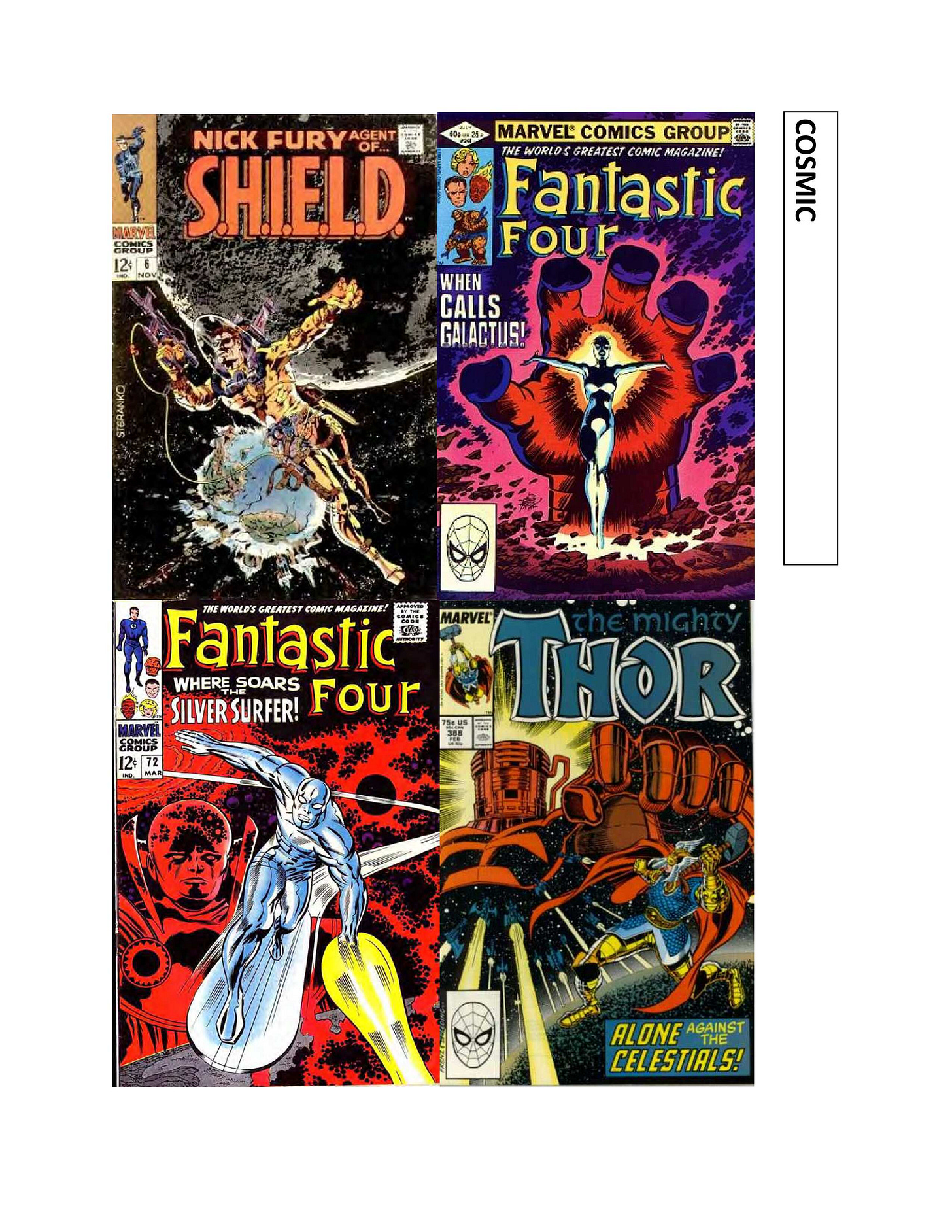
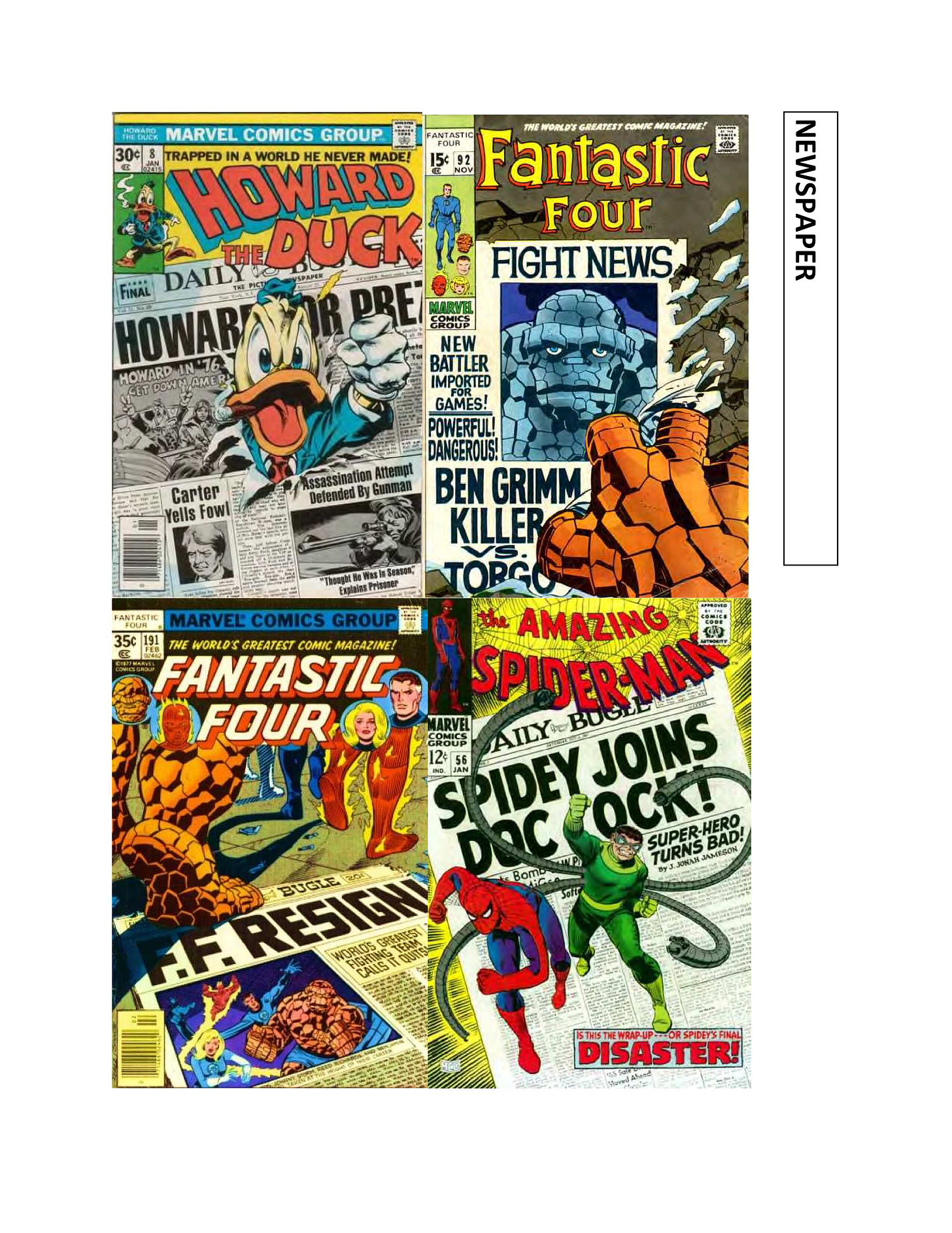
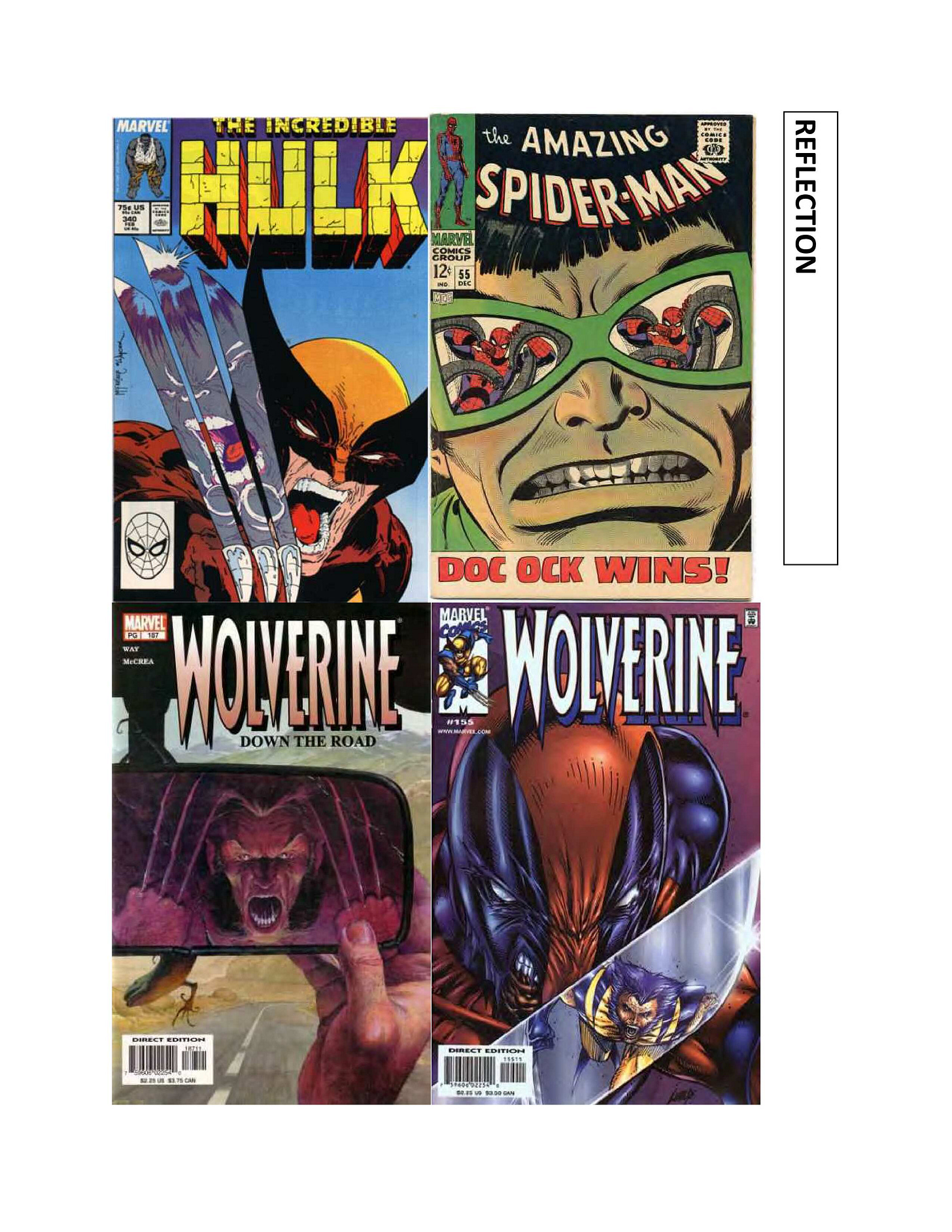
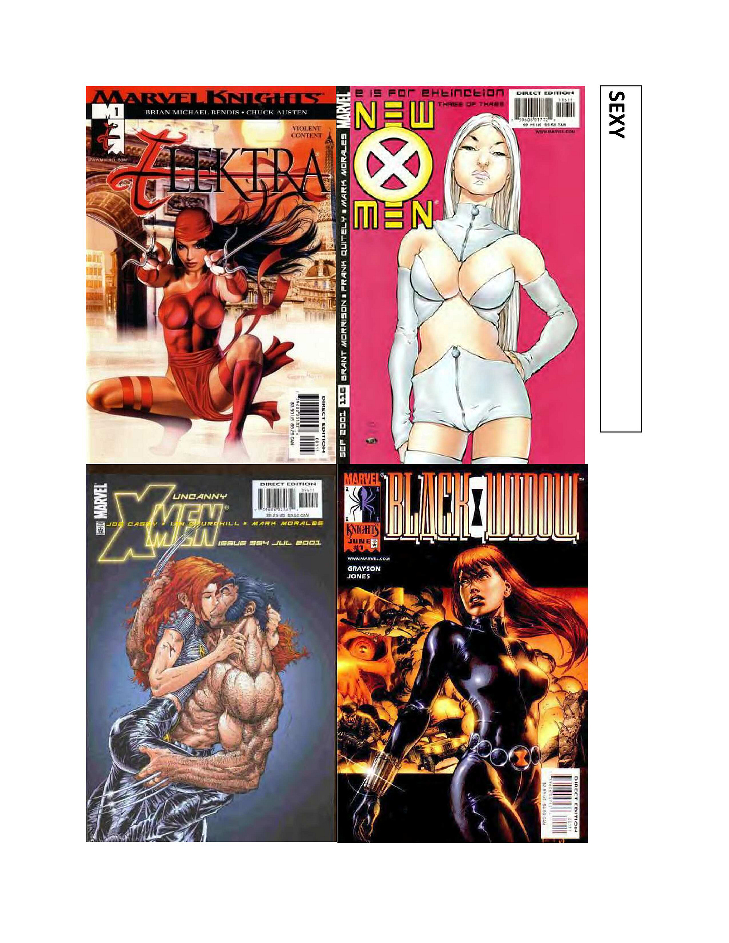
.And speaking of covers, let’s take a look at a bunch more pages from the cover image springboard pamphlet that I put together for the editorial staff as an inspiration in coming up with more striking and diverse cover images. We’ll get through the rest of this eventually!
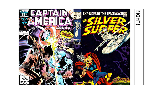
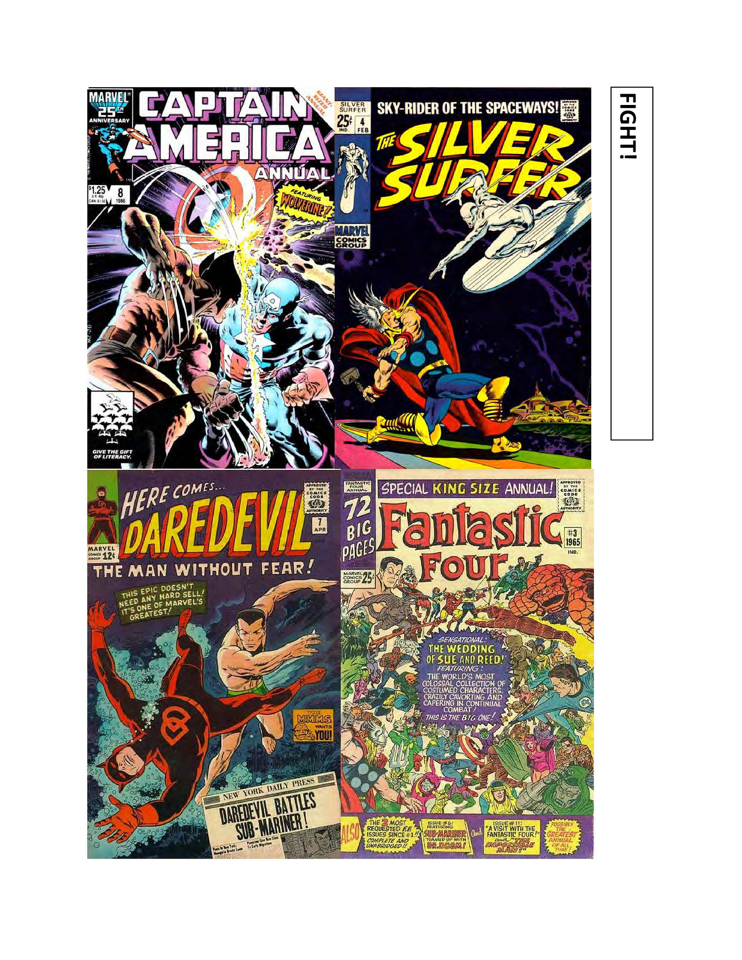
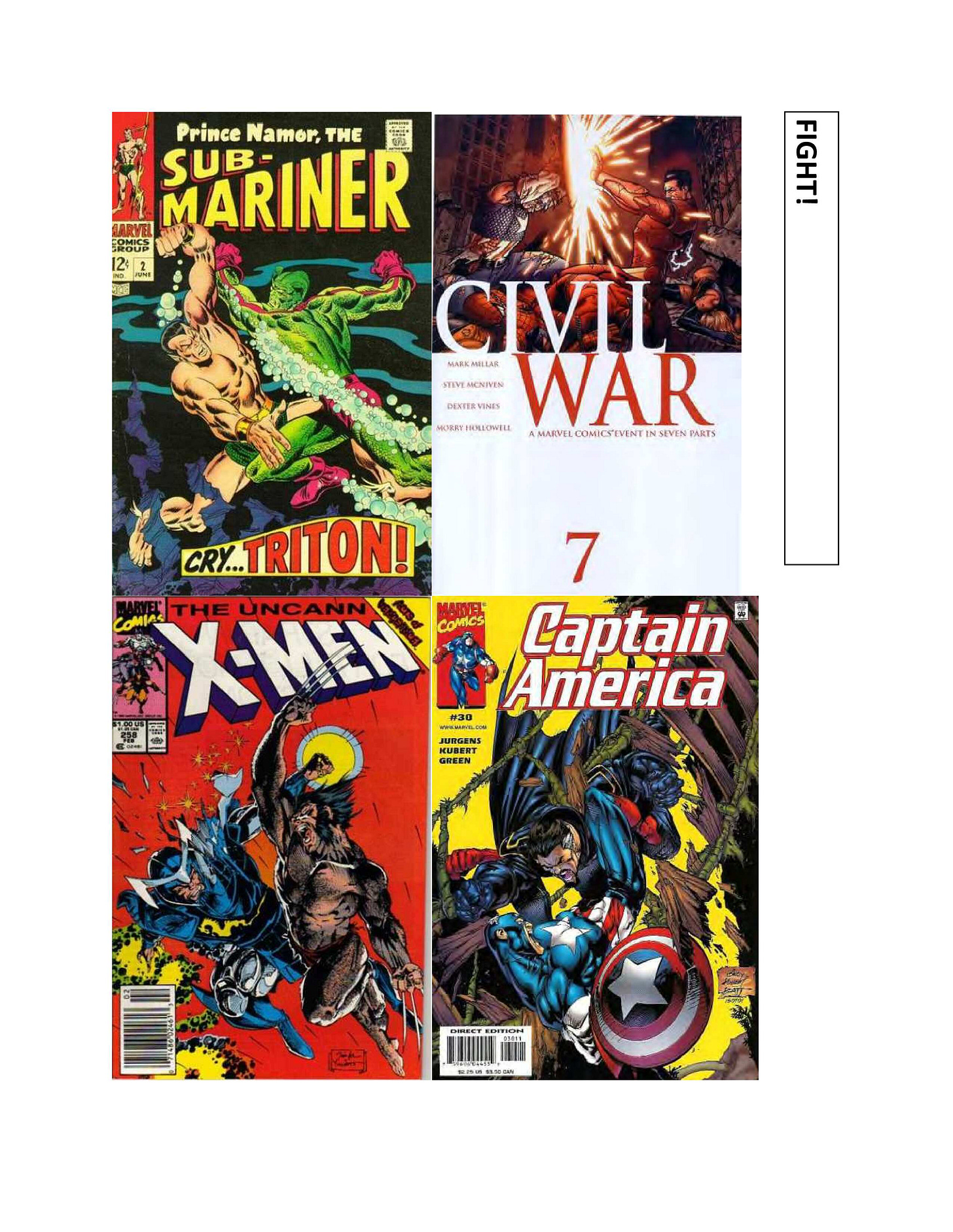
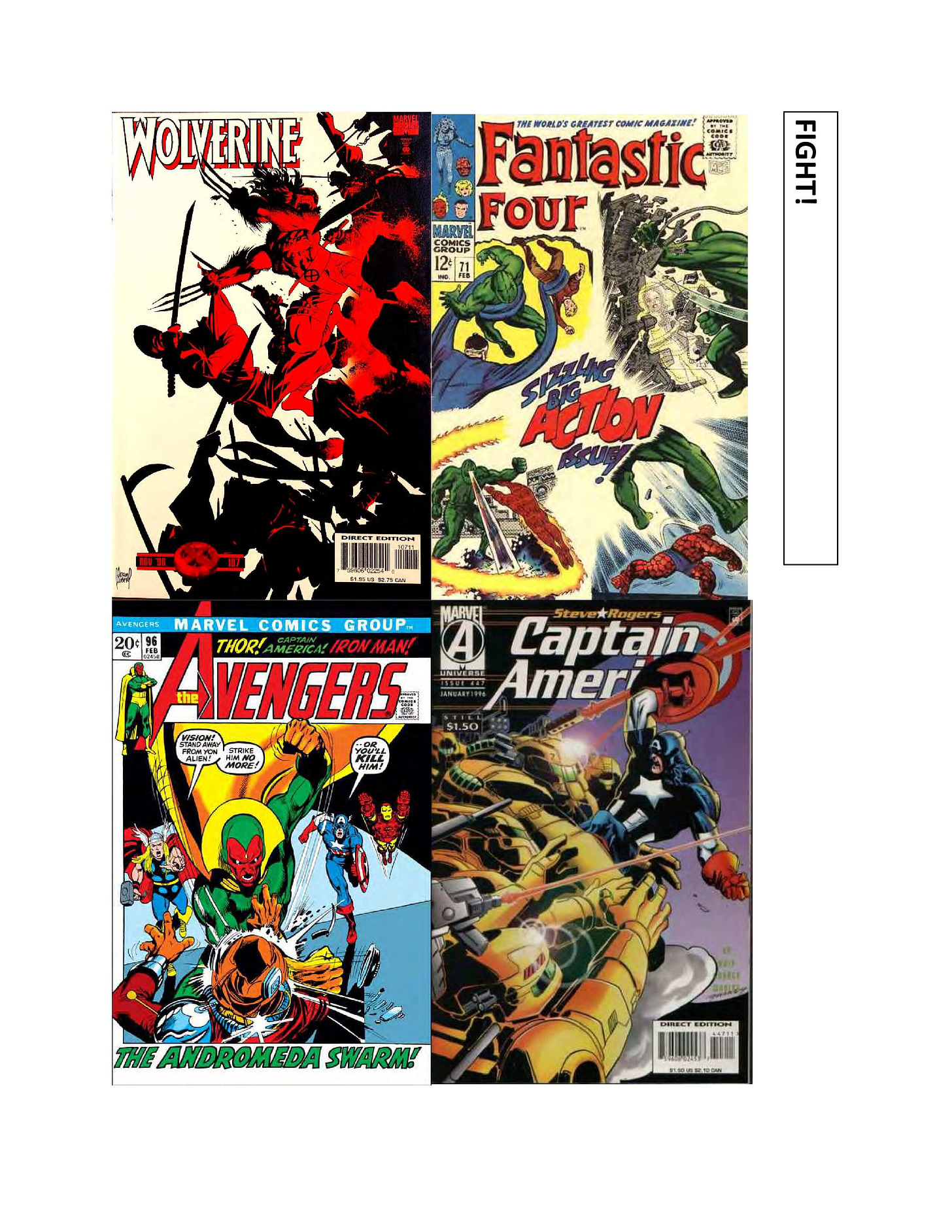
I’d say that a FIGHT cover is the most basic type of super hero cover that there is, and a category that a lot of them fall into. It depicts two or more characters in the act of brawling or just about to brawl, and seeing what the outcome is going to be is what drives prospective readers to pick up the magazine.
COSMIC is an attempt to widen the scale as much as possible, and to make the contents of the issue in question appear galactic and mind-bending in naturel
Tougher to do a NEWSPAPER cover with each passing year, as newspapers slowly vanish from the public consciousness. But for a long while, this was a reliable approach.
On the other hand, the REFLECTION cover has perhaps become overdone in recent years, so often has it been fielded. While this once resulted in novel images, these days it often seems tired and repetitive. it’s still possible to do a novel reflection cover, but it’s not as easy as it once was.
Like it or not, sex sells, and so covers that present the stars of the series in a SEXY manner are also a safe bet. The trick is in keeping things on the right side of the line and not selling out your series by being too exploitative. On that question, though, everybody’s individual line is set at a different place.
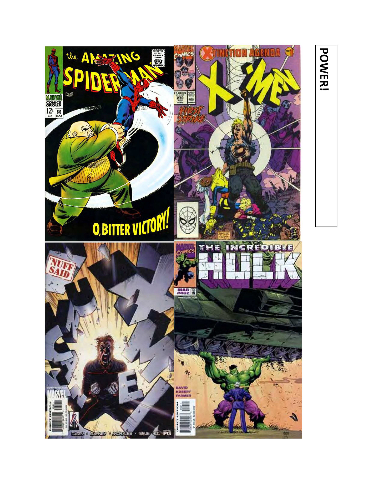
And finally, a POWER cover is about a character displaying their might in a visceral and impactful manner, enough to make an impact. It probably isn’t a coincidence that two of these four examples show the hero shattering the book’s logo—that’s a recurring motif on these sorts of images.
There’s still more to go over in this covers booklet, so we’ll continue to forge on ahead in the weeks to come.
Pimp My Wednesday
I wind up having to write a lead-in for this section every week, and after 84 installments, it just gets harder and harder to do so in a clever manner. so this week, let’s just jump into things.
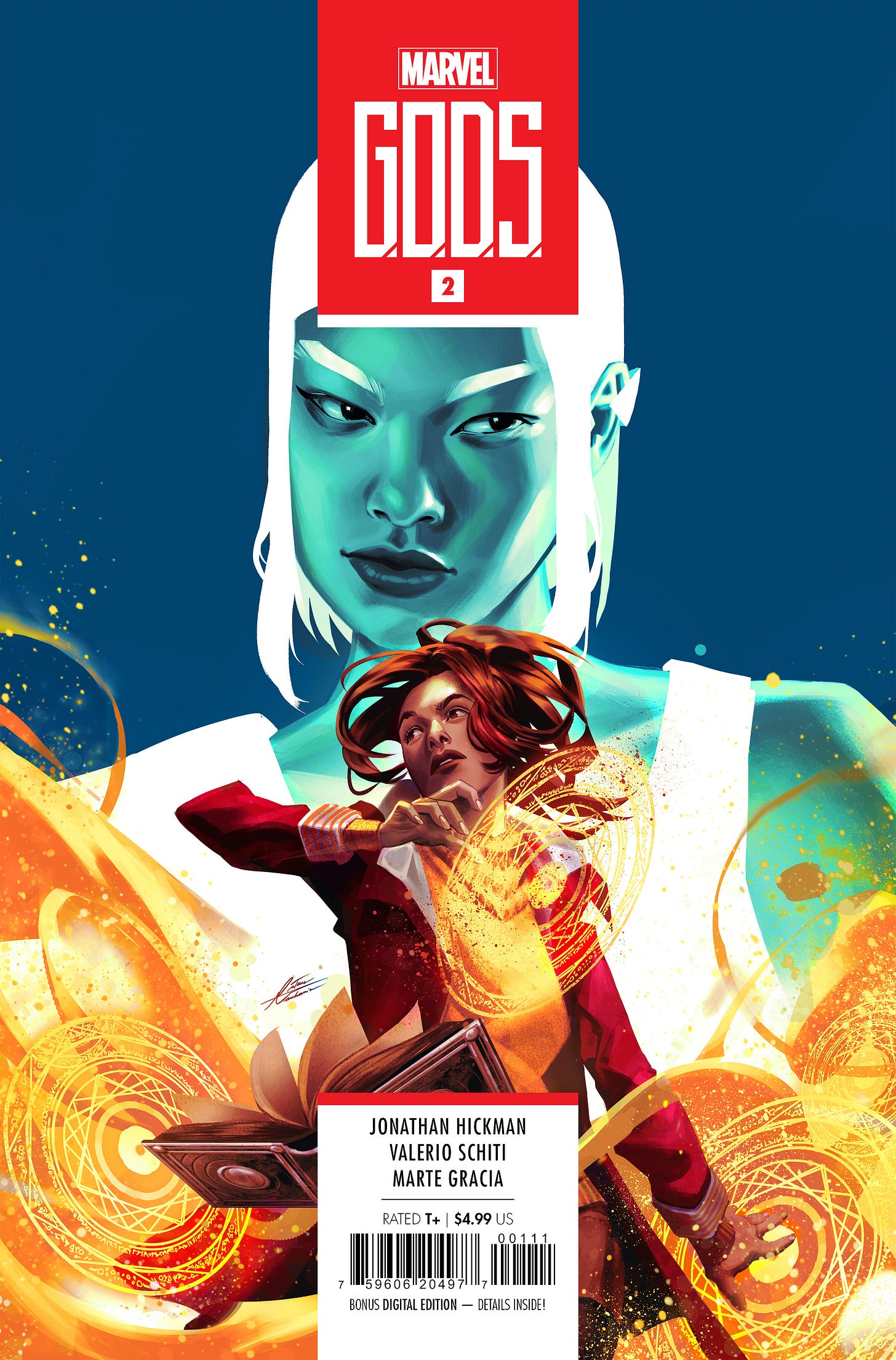
It’s been a month since G.O.D.S. #1 came out, and that means people may have just about finished reading its hyper-dense 55 page story. So time for us to move things along with a second issue! Among other things, this one features the debut of our fourth main character, Mia DeMaria the magic girl. That’s her right at the center of this lovely Mateus Manhanini cover, being watched over by Aiko Maki. What’s her deal? Afraid you’ll have to pick up the issue to find that out, but I promise that it’ll be worth it. It’s the work of Jonathan Hickman and Valerio Schiti, after all.
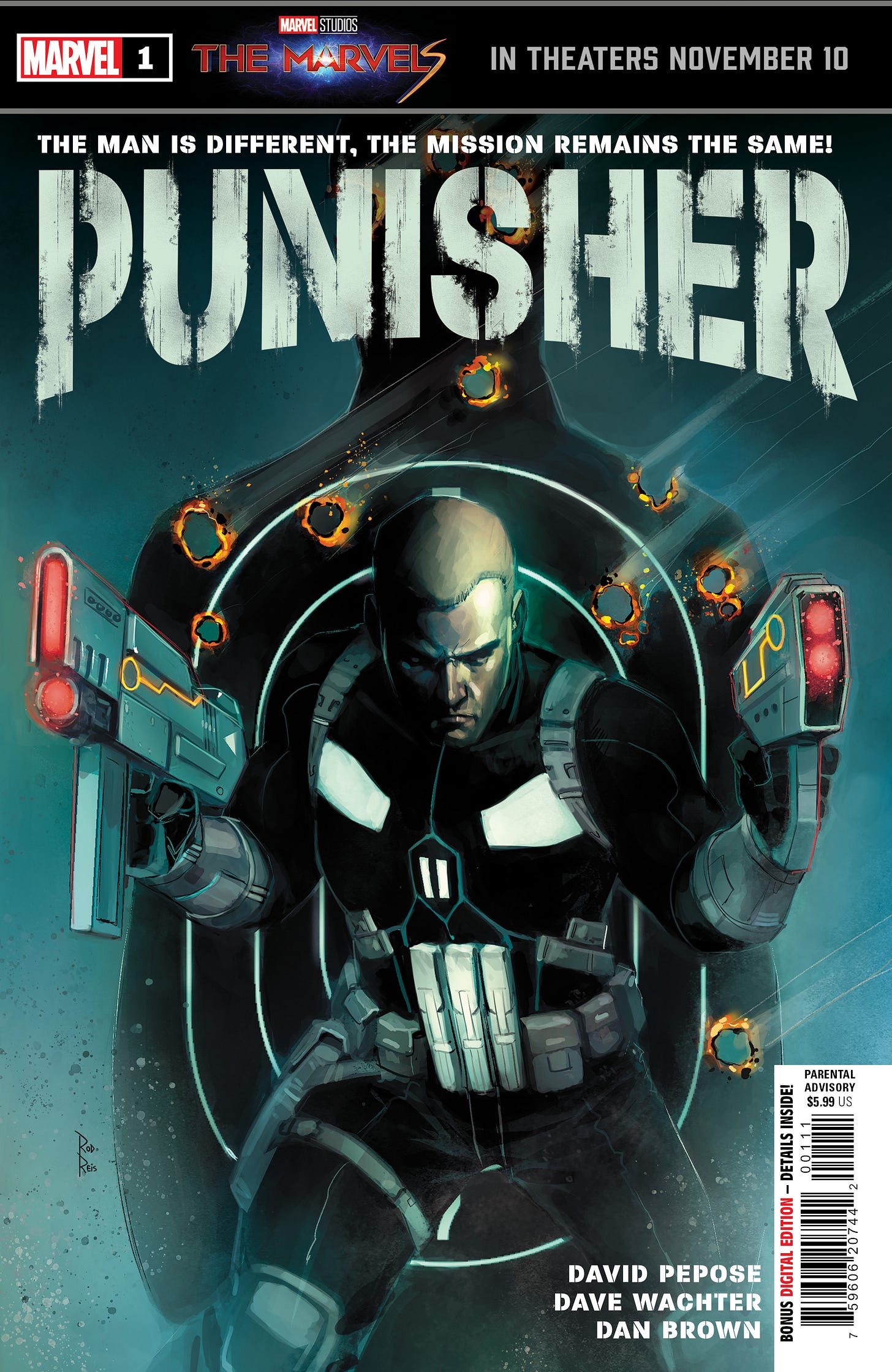
And another book that I’m quietly very excited for, the first issue of our new PUNISHER series also drops this week, sporting this excellent Rod Reis cover of new star Joe Garrison. I know that this is one that people in certain quarters are worried about—with some having already made their minds up about not liking it sight-unseen. But the work that writer David Pepose and artist Dave Wachter have done here is really nice, and for those who can go into the book with an open mind, I expect you’ll really enjoy it—whether you’re a Frank Castle fan or not.
And over in AVENGERS UNITED, Earth’s Mightiest Heroes have rallied against the alien Brute that’s been attempting to murder an alien ambassador. But the defeat of this creature is only the beginning as our heroes get sucked into a story rife with interplanetary intrigue. This installment finishes out the first chapter of what will be a 25 part tale and it’s told by Derek Landy and Marcio Fiorito.
A Comic Book On Sale 55 Years Ago Today, November 5, 1968
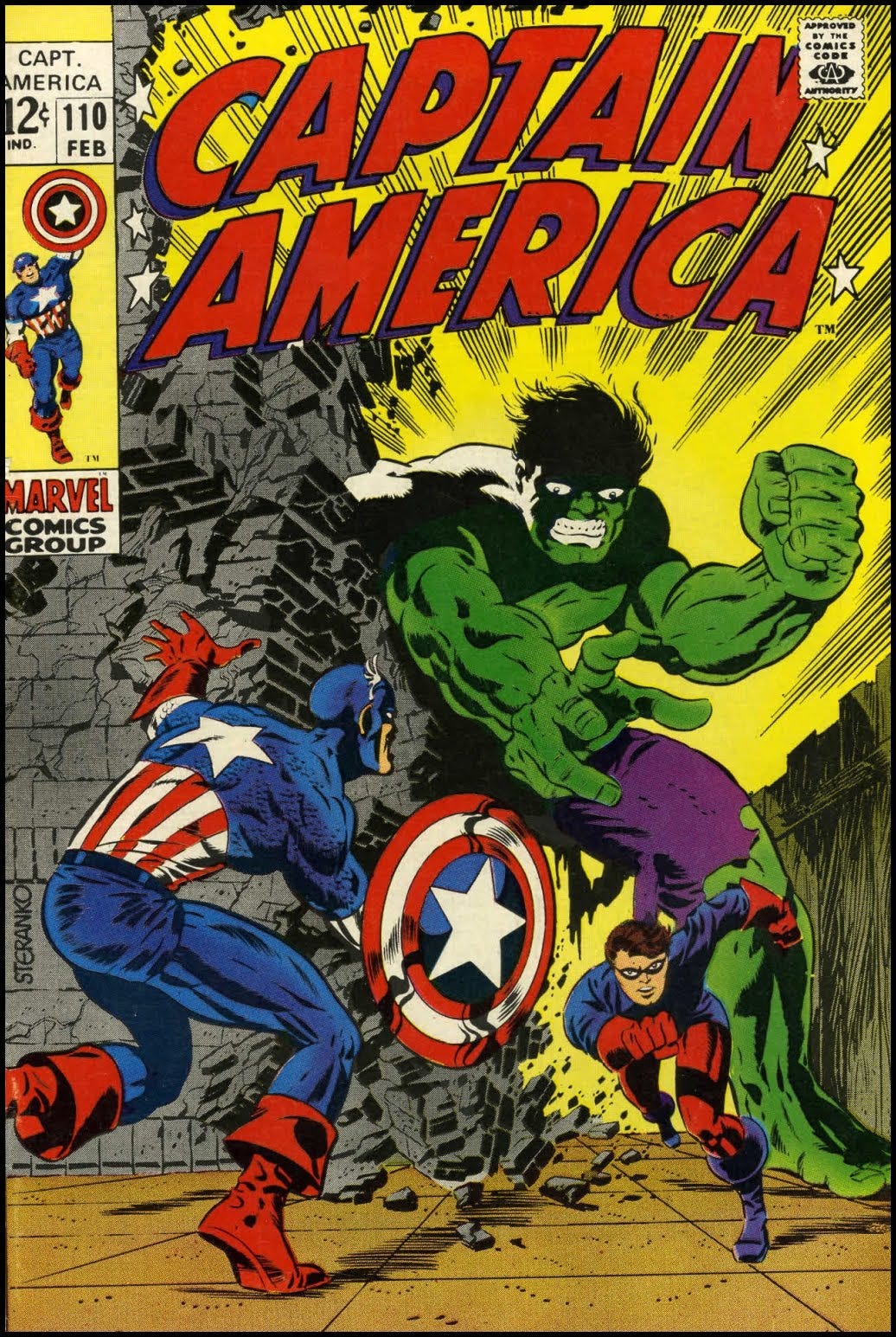
It’s safe to say that Jim Steranko made a huge splash when he came on the comic book scene in the mid-1960s. Jim was a multi-position player, who could do almost any aspect of comic book production except perhaps lettering. But it was his art that people responded to the most strongly. Influenced by past creators such as Will Eisner and Wally Wood, Steranko stressed a graphic approach to storytelling that was light years ahead of anything else that was being done at the time. His actual drawing wasn’t always that great—the Hulk on this cover must be 15 feet tall, for example—but his storytelling expertise and graphic showmanship made his comics a visual roller coaster ride. He was one of the first artists who made the audience think about the fact that what they were reading were images composed by some artist’s hand—and while that would seem to be a negative in that it breaks the spell of the narrative, the fact is that each page, each moment became like a little masterpiece to be pored over and studied. Like Neal Adams who followed close behind him, Steranko was used to working for real businesses, ad agencies and the like, and not only did he have a strong command of what the printing technology of the time could and could not do, but he was also secure in his confidence in his own ability and utterly unafraid of fighting for what he wanted. He wasn’t a person to sit back and take it in order to keep a job like so many of the veterans had to be. Steranko innovated constantly, and he was quickly granted greater and greater latitude to do so as fans responded to his work. Within a few months, he was writing his stories as well as illustrating them, and he was exercising influence over how they were colored and lettered as well. he was a bit of a one-man show. Stan Lee began to stop telling artists to look at Kirby as an example of what to do and instead told them to examine Steranko and his bravura approach. Steranko was not only an artist but he was something of a comic book fan, having grown up with the medium—he claimed that he had learned to read from comic books. One of his favorite characters from the Golden Age was Captain America, and so it was a big deal to be given the reins on the series. He replaced Cap’s co-creator Jack Kirby in doing so. As he was a fan of the Cap of the past, Steranko’s first move was to introduce a new Bucky in the person of Rick Jones. Rick had been angling to become Cap’s partner virtually since the super-soldier had been thawed out of the ice, and Steranko let him live that wish. The gig didn’t last all that long after Jim’s departure, but for this short stint, Rick Jones got to be Bucky. Jim also reinvented and reinvigorated Hydra, the villainous secret cabal from the Nick Fury, Agent of SHIELD series. He innovated a new leader for them in Madame Hydra, a classic femme fatale with a scarred face who brandished a cat-o’-nine-tails. The stories were steeped in the iconography of the 1960s while referencing the mile-a-minute action of the 1940s Simon and Kirby efforts. Steranko’s run would only last for three issues, though. One of the other changes he wanted to make was to restore Cap’s secret identity, which had been made public some time before. He did this by having Cap shot to pieces as he leapt into the river in order to avoid enemy fire. All that was recovered were pieces of his tattered costume and a lifelike face mask of Steve Rogers’ features. Captain America was dead, and his identity was unknown. That’s how Jim’s second issue ended. His third was intended to finish up the plotline, but he’d begun to turn his work in later and later so as to give editor Stan Lee less of an opportunity to mess around with it. In this case, Jim waited too long, and a panicked Lee had Jack Kirby knock out an album issue over the weekend, which George Tuska inked in a few days. So when Steranko turned up with the next issue, he was told that it wasn’t going to be the next issue but rather the one after that. Incensed, Steranko quit the title. Those three issues were the only Captain America stories that Steranko ever drew, but they were so far ahead of their time graphically that they still hold up brilliantly fifty-five years later.
A Comic I Worked On That Came Out On This Date
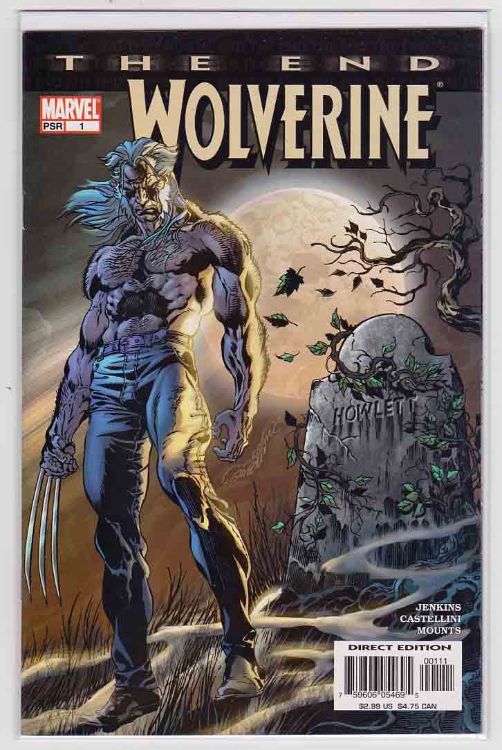
I’m pretty sure that I’ve covered the creation of the THE END line of projects at some point in the past, but just to make sure that nobody feels left out: I came up with the idea for the series after reading an essay by Alan Moore. In it, Moore compared comic book mythology to actual mythology, and he said that the thing that prevented comic books from attaining the same level as the classic myths of yore is that their storytelling was eternally open-ended. We know how Camelot falls and King Arthur dies, we know where Robin Hood is buried and how he meets his end. But Spider-Man is eternal, and Batman will go on forever. I thought this was a great point, and it inspired me to pitch a new line to EIC Bob Harras called THE END. And the concept was right there in the title: we would prevail upon different creative teams to tell the final story of whichever character or property they were working on, liberated from the need to continue to publish new adventures month after month. In essence, this would allow the creators involved to resolve each myth in the manner of the classics. The end result of the THE END books varied depending on the creators and the characters involved, but there were enough good ones that they made the entire effort worthwhile. WOLVERINE: THE END, the first issue of which was released on November 5, 2003, was an entry that I don’t think really lived up to the promise of its premise. In essence, the story got away from us, to the degree that I was disappointed in the final issue. At the end of the day, the fault is mine for not making the necessary moves to prevent that failure. Spinning back to the beginning, the initial idea behind doing WOLVERINE: THE END was to create a bookend to the at-that-time recent and extremely popular ORIGIN series, in which Paul Jenkins and Andy Kubert along with a bevy of other kibitzers revealed at long last the secret beginnings and history of the most popular X-Man, including his actual given name, James Howlett. The story had set up a number of elements that could (and would) eventually be picked up in the present, but at the time that WOLVERINE: THE END was started, largely hadn’t yet been. So Paul and I started to talk about the story and what he wanted to accomplish with it, and he eventually laid out a very nice outline with a dramatic and final conclusion to it that I really liked. Needing an artist who wouldn’t pale in comparison to Andy Kubert, I thought about Claudio Castellini, who was extremely popular in Italy but who had never quite exploded in the American market despite having been involved in a number of beautiful projects over the years. Claudio was meticulous in his work, but the THE END books could have greater lead time as their release wasn’t tied to any other events in the present. Still, we wound up eating through what lead time we had eventually, and then really being up against a deadline wall as we worked up the last two issues or so. And that’s where we mis-estimated things. As Paul had written the story, it had expanded somewhat—incidents needed more room to be properly fleshed out, new ideas had come as the series was worked on. Now, facing the ending, we found that we weren’t going to have enough pages to do it all justice. I seem to recall that Paul produced two versions of an outline for the final issue—one in which he squeezed in the ending that we had spoken about that I loved so much, and the other in which he used that space to more properly resolve the plot. I hated having to make the choice, but in the end, I told him to move ahead with the one he wanted to do, the second outline. And it was perfectly fine, but it lacked the conclusiveness that the best THE END books had. It didn’t so much end as stop, and I don’t know that any of us, Paul, Claudio or myself, were completely satisfied by the results of our efforts. But unfortunately, that’s the way it happens sometimes. There weren’t any bad guys here, nobody was to blame per se. The story just got away from us, and so the ending paid the price. But more than anything else, I suspect that’s why WOLVERINE: THE END has been largely forgotten over the years.
Monofocus
It’s difficult these days to be a fan of RICK AND MORTY given the manner in which a portion of the fandom for the series chooses to conduct itself. But it’s continued to be the sharpest and most daring animated series of its type—at least up until this series. It might just be me, maybe I’ve just overdosed on the whole premise, but the three episodes that I’ve seen so far have felt sluggish and tired and repetitive of other, earlier episodes. It’s felt, in other words, like one of the shows that followed in the wake of RICK AND MORTY’s success rather than the thing itself. It’s still fine enough, entertaining for thirty minutes at a clip for the most part. And the problem isn’t the new voice actors for the title characters, whom I was able to get used to within an episode or so. No, the series just seems to be running on fumes, remixing its best characters and ideas from previous seasons into theoretically new configurations. I hope that the balance of the season improves, but I’m not entirely sure that’s going to happen.
I mentioned finishing JUSTIFIED a week or so back, and now I’ve made my way through its recent sequel, JUSTIFIED: CITY PRIMEVAL. And it was…all right. As i said earlier, it’s really a different show completely that just happens to have one character in common, Raylan Givens. And even there, the Raylan of PRIMEVAL is a lot more subdued than his earlier incarnation. He moves through the story but doesn’t seem to impact it very much at all—I often felt as though if you took Timothy Olyphant out of the story, it wouldn’t materially change (except, of course, that it wouldn’t have been made without him.) And then, in the final episode, almost like it was an apology to those who tuned in to see a familiar cast go through familiar moves, the show pivots to Walter Goggins’ Boyd Crowder breaking out of prison, setting up a potential sequel to the sequel. But even that felt perfunctory and a bit lifeless to me somehow. Like RICK AND MORTY, that final crowd-pleaser felt like a bad remix of earlier, better sequences. Of course, it may have worked more effectively for viewers who had watched the original show years before rather than days, as I had.
On the other hand, I’m almost through my rewatch of the first season of MAD MEN, and I had forgotten just how much of that show was glued together through the course of that first year. It’s pretty amazing given how central a character she became that Peggy Olsen almost seems like an afterthought for the first half of the season. I’d also forgotten how sparsely John Slattery was used early on as Roger Sterling, or just how nasty Joan Holloway was until the writers began to explore her in a bit more detail. But with all that, it’s addictive television—all of its conflicts being almost entirely non-physical and the period ambiance coming across so pronouncedly. And the cast is great end-to-end, especially in just how unlikeable they all are, yet how they somehow keep the audience’s sympathy. The whole show feels like a magic trick that just should not work, but somehow expertly does. I’m looking forward to remembering how the series develops in subsequent seasons.
Elsewhere, on Amazon Prime, the second season of INVINCIBLE has started, and it remains a very good adaptation of a very good comic book series. The fact that it’s so uncompromisingly bloody is likely the take-away that most people will have from it, and that will seem like the real appeal of the show. But it does a very thorough job of making the viewer connect with the character on a personal and human level. There’s a lot of Spider-Man DNA there, for all that Robert Kirkman updated it for the time. Like the comic, it also feels like a show where any crazy thing could happen unexpectedly, and that gives it an electric feel that’s lacking in most other similar super hero productions. It’s a nice bit of work all around.
Finally, like so many, I finished reading the recent book MCU: THE REIGN OF MARVEL STUDIOS by Joanna Robinson, Dave Gonzales and Gavin Edwards. While I was at Marvel for most of the events covered, I was enough at a distance from them that I can’t really say how accurate the account given in the book might be or not. But it feels thorough even just as an overview of everything that was built, and it underscores just what a massive and unlikely accomplishment it all has been. It’s not impossible that somebody else will be able to build an interconnected universe of films and television shows the way Marvel Studios has done, but it sure doesn’t seem likely. Good to be reminded of that.
Posted at TomBrevoort.com
Yesterday, I wrote about my expectations for the upcoming DOCTOR WHO 60th ANNIVERSARY SPECIALS
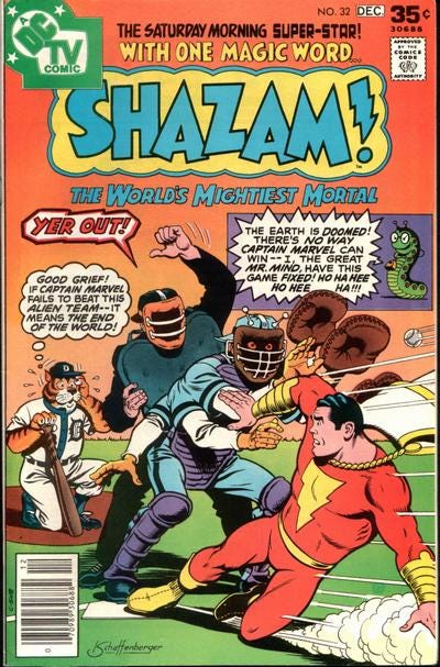
And five years ago, I wrote about this baseball-themed issue of SHAZAM that was given to me by my Aunt.
It’s now three weeks until the first of the new DOCTOR WHO Specials drops on Disney+, and so that’s how I’m going to be measuring the time until we get there. But we’ll have a few more Newsletters to work our way through before we get to that point. So thanks for being around, and I hope to see you all in another week!
Hat’s All, Folks!
Tom B





Hey Tom. This is one of my must-read newsletters each week.
When a creator pitches a big status-altering storyline (like the Krakoan era) does that pitch include how to undo it or move to the next era? Are there pieces of Fall of X that were included in the original Hickman pitch?
Thanks, as always, for this newsletter. It's always a joy to read on a Sunday evening.
Following on from this issue's opener, I'm curious if there have ever been examples of negative sentiment changing a story?
You've spoken about series like Spider-Girl being saved time and again by overwhelming fan positivity, but have people writing in with criticism ever changed a story that is otherwise successful (it's selling fine, for example).