There’s been a lot of chatter this past week concerning the state of the comic book marketplace following a column written by one prominent retailer. And let’s face it, forget about comic books, retailing of any sort is an extremely difficult vocation in 2023, following on the heels of a global pandemic and lockdown that disrupted regular buying patterns. Everybody wants to move on and pretend that nothing happened, that everything is back to normal, but it isn’t—the time that will take is a lot longer, if it ever happens. By this same note, I can recall similar conversations as this one taking place all the way back to my entry into the business in 1989. No doubt, they were going on before that, particularly in the 1970s and the 1950s, and so on and so on. For whatever reason, the comic book field has a stronger pull towards its own mortality than other areas. We somehow delight in predicting the demise of the very thing that we enjoy so much. Maybe that reveals a poor sense of self-worth or something, but also, in any endeavor, if you bet in favor of failure you’re going to be right sooner or later. Nothing lasts forever, entropy wins. Still, those folks who were predicting the demise of the field ten or twenty or thirty years ago would no doubt be shocked to learn that it is still here. The diversity of material new and old that is readily available today is astounding, and shows no genuine sign of abating. What is likely happening is that the market is changing. And change is almost always scary. But it doesn’t have to be the end, it just means that some things are going to be different now, and it falls to us to adjust to those changes. People hoping that the comic book industry will somehow revert to being the way it was when they were kids are definitely in for disappointment, but I feel confident in saying that the medium will survive. It continues to grow in all sorts of interesting directions. But the days of a spinner rack in every Mom and Pop Candy Store are likely gone forever—mostly because that type of store no longer exists. This all comes back to a slogan that I’ve been threatening to put onto a T-Shirt for many years now, but have never actually bothered to do: COMICS: DYING SINCE 1935.
Okay! Now that that’s out of the way, let’s take a look at what you guys were thinking about this week.
Jeff Ryan
Non-editors are able to spot some of the more obvious errors in a comic -- big ones likes pages upside down, and smaller one like a font not loading so "Blüdhaven" becomes "Bl?dhaven," or a character's costume is miscolored. What are the more subtler mistakes that may have crept in, that we usually don't notice because we're happily reading along?
The one that immediately comes to mind, Jeff, would be pages not positioned on the page correctly. I ran into a situation like this earlier this week, where we had to re-size a bunch of pages for an upcoming issue that would have printed smaller than intended in the finished book, causing all of the digital lettering to appear slightly out of position. While you would think that such a thing would be obvious to readers, the truth is that there’s a basic belief that whatever appears on a given page is meant to be that way, regardless of how much sense it makes. In years past, there have been covers printed with color holds missing, this eliminating a portion of the image, books where artwork was meant to bleed off of the edges on all sides and didn’t, leaving ragged edges to the color, even books where pages ran out of order and most readers didn’t notice it. That presumption that what you see is what is meant to be there covers a lot of difficulties.
Zach Rabinoff
back in the days of yore, the Marvel Bullpen (such as it actually existed) consisted of the in-office art and production staff: in various eras, John (and Virginia) Romita, Marie Severin, Herb Trimpe, Sol Brodksy, Morrie Kuramoto, et. al. What, if anything, does that staff look like in 2023? Is there still a staff department that makes, say, last-minute artistic corrections on a book, or is that all done solely with individual freelancers these days?
Well, the Bullpen is all digital now, Zach, but most of them still work in the offices, with only a couple being remote. And they can still be called upon to make art and lettering changes as well as setting up and compositing the various digital files that make up the pages these days. It isn’t as in-depth as when there was a full group of Romita’s Raiders expected to make all sort of art adjustments at the whim of the editor, though—that sort of treatment has fallen by the wayside over the years. These days, for most of those tweaks you’d go back to the artist to make the fix. Since pages can be transmitted to Marvel virtually instantaneously, there isn’t any delay involved in doing so any longer.
JV
what characteristics do you think make a great issue 1 of a comic?
There’s always going to be a bit of a range, JV, depending on what sorts of books you’re talking about. But in general, I think the best first issues provide an experience that feels complete, even if the story is not self-contained, and which showcase the aspects of the characters and world and story approach that make the title unique and different from everything else. For, say, IMMORTAL HULK, while that series became very canon-heavy over its run, the first issue was really about one thing, and that was conveying that this was a monster series again, rather than a super hero series with a monster in the lead. The Hulk was intended to be scary. This can be a tough ask, but the books that have the best chance of long-term success are the ones that are able to pul it off. In this regard, issue #2s are almost as important—it’s not enough to do the trick once, you need to convince readers that this is a particular flavor that you’re going to be able to deliver on a regular basis.
Tom Galloway
It occurs to me that, at least for Marvel, X-Men has probably introduced more new characters who either became part of the team or an adjacent one such as New Mutants or X-Force where it wouldn't surprise anyone if they became an X-Man. In your opinion, who would be the latest X-Man to have broken through and become a core member of the team (other than any Logan clone)? By this I mean when the old order changeth, the creators pretty much have to decide whether to use them or not. Or to put it another way, say the new lineup is Cyclops, Iceman, Wolverine, Storm, Shadowkat, and Eye Boy; it's pretty obvious which one is the unexpected non-core one, even if he has been used before. Offhand, as an X-Man, I think it might be the White Queen, ignoring her time as an adversary.
I’m sure that different X-Men fans would give you different answers to this question, Tom, depending on who their favorites are. The White Queen isn’t a bad pick, except for the fact that we sometimes forget how long ago she was introduced—contemporary with Kitty Pryde and prior to characters such as Rogue or Cable or Deadpool. Magik is another character with a similar pedigree. And Gambit is a later concoction than many of these as well. So I don’t know that I can give you a really accurate answer offhand. I do think, though, that your fellow readers are likely to chime into the comments to remind me of the obvious candidates that I am obviously missing here. (Possibly the underdog option here would be Ms. Marvel now that she lives in this corner of the world.)
Brendan T
Mikel's question got me thinking about foreign editions which got me thinking about the Mexican Spider-man comic diverging plot wise from the main one in the 70s. That made me wonder about something you've brushed on before regarding the Spider-man manga...what goes into the decision making about what internationally licensed released will get localized, what kind of hitches do you run into (art file inconsistencies, etc) and what international original work would you like to see localized if it were solely your decision?
In general, Brendan, we don’t typically allow for a whole lot of localized work these days, except where we’re facing a market and a culture that there isn’t any other easier way to enter. In recent years, that’s tended to be East Asian markets such as Japan, China and Korea, each of which has their own strong marketplace for comics, which are usually produced in a manner a bit different from American comics. But usually, when we do set up opportunities for native creators to produce work for that market, we build in allowances for translating that work back into English for our core demographic that might be interested in it. So I don’t know that there’s some great Marvel series or story out there that was produced for another country which hasn’t been made available in English.
MADMan James
I do have a totally unrelated question about The Cat, of all things. I was reading issue 3, which has art by Paty Greer and Bill Everett. The opening splash page says there's more information about Paty Greer on the letters page...but Marvel Unlimited doesn't reprint the letters page! Any idea what that extra info was? I gather from the internet that she was married to the late Dave Cockrum, but The Cat was published before he started working on X-Men.
Well, I hate to disappoint you, James, but I think Roy Thomas lied to you about that. There isn’t any further mention of Paty on the letters page to that issue (though I’m sure that he intended to do so and it just got lost in the shuffle.)
But Paty was a Bullpenner and production person for many years, and also a practicing witch. She drew an occasional story here or there, notably AMAZING SPIDER-MAN #264. And as you say, she did marry Dave Cockrum, whom she met on staff. Also, that letter above is genuinely from the real Frank Miller, a couple years before he’d make his name known in DAREDEVIL.
Andy T
Is there any appetite at Marvel - creators/editorial/publishing/brass - to get comics out there at a price point that KIDS can afford?
Seems like Free Comic Book Day/Children’s Book Week is a means to get books in kids’ hands, but if no revenue is generated directly for the publisher from those FCBD issues, does the FCBD exercise amount to a promotional or advertising expense?
Don’t know what that expense is in total is or how an ROI is measured against Marvel’s bottom line, but would it help that bottom line if Marvel were to scale back the number of FCBD issues produced/dollars spent and release 12 issues of, say, a new Untold Tales of Spider-Man at $1.99 or $2.99 targeted specifically at young kids and - assuming it sells - get a direct return, however marginal?
Here’s the thing, Andy. While there’s certainly an interest in bringing in new young readers, doing a special book for them that costs less doesn’t seem to be the way to do it. It’s old data, but we tried this back in the 1990s with UNTOLD TALES OF SPIDER-MAN and its other 99 cent brethren. But a lesser cover price means a tighter profit margin and less money that everybody makes all around. And no kid ever wanted the cheap version of a book just because it was cheap. So while well-intentioned, it was a move that just made it more difficult for those books to break even, and which disincentivized retailers from promoting them (since they would have to sell two copies to make the profit they were getting on just one issue of ASM or a similar book.) I think the real feeder market for younger readers is likely the curated collected editions that are put out with them in mind, and which have circulation through Scholastic and other similar book programs.
Chris Sutcliffe
I can do 9 of 12, some of which with the help of the internet. I have:
1 - Justified
2 - ???
3 - Mad Men
4 - Star Blazers
5 - Underdog (thanks Kevin!)
6 - ???
7 - Remo: Unarmed and Dangerous?
8 - Red Dwarf
9 - Doctor Who
10 - Also Doctor Who
11 - ???
12 - Have Gun, Will Travel
You were one of the few to answer this challenge, Chris, even though you used the Internet to help give you an edge. And while you couldn’t source everything, and didn’t really make any stab at articulating why any of these quotes might have made the cut, you still did enough that I will declare you the champion. So if you want to forward me along an address, I’ll see about getting you off some half-baked prize of some sort.
And that reminds me; in an earlier Newsletter, there was a reader who didn’t think they’d be able to get the new MS. MARVEL series, and whom I told I would assist in this venture. They were supposed to get me an address as well, but I never received one. Well, those books are almost all here now, so if you want ‘em as discussed, please get me your particulars and I can see about getting those out to you as well.
William Outlaw
What are your favorite books (or media) about comic book history? "Men of Tomorrow" is excellent even if I had to mentally block out who wrote it. Have you ever considered writing a book about the industry?
First off, that is a great name, William! As opposed to when I was growing up and there were relatively few books available about the history of comic books, today there are scads of them. So in part, this all depends on what you’re the most interested in. In general, though, if I had to select some favorites, they would mostly go back to the days of my youth: Jules Feiffer’s THE GREAT COMIC BOOK HEROES, Jim Steranko’s two volumes of THE STERANKO HISTORY OF COMICS, Don Thompson and Dick Lupoff’s collections of essays ALL IN COLOR FOR A DIME and THE COMIC BOOK BOOK, and THE SMITHSONIAN BOOK OF COMIC BOOK COMICS. In more modern fare, MEN OF TOMORROW is a pretty great tome despite the failings of its author. I also swear by the assorted volumes of THE AMERICAN COMIC BOOK CHRONICLES from TwoMorrows.
Pierre Navarre
A bit of a nerdy question : I noticed several times that the font/logo of your blog (The Tom Brevoort Experience) look VERY much like the one used in 2001 for the Thor: Godstorm limited series, edited by you (at first, it reminded me a bit of the one used for Morrison/Jones's Marvel Boy but that's clearly not it). So is there a reason why (particularly proud of how those three issues turned out ?).
Good eye, Pierre, that is exactly the derivation of that logo. And the reason for that is even simpler than the explanations that you offer up: when we were working on that series, John Roshell created that logo for the project. And while he was revising it, he dashed off that version of my name in the same treatment almost as a joke. But I hung onto it, and started using it thereafter, as it’s a relatively rare thing for anybody to create a logo of your name for you.
Behind the Curtain
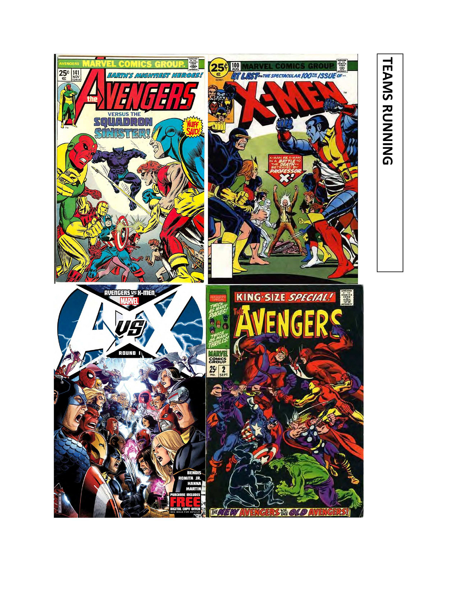
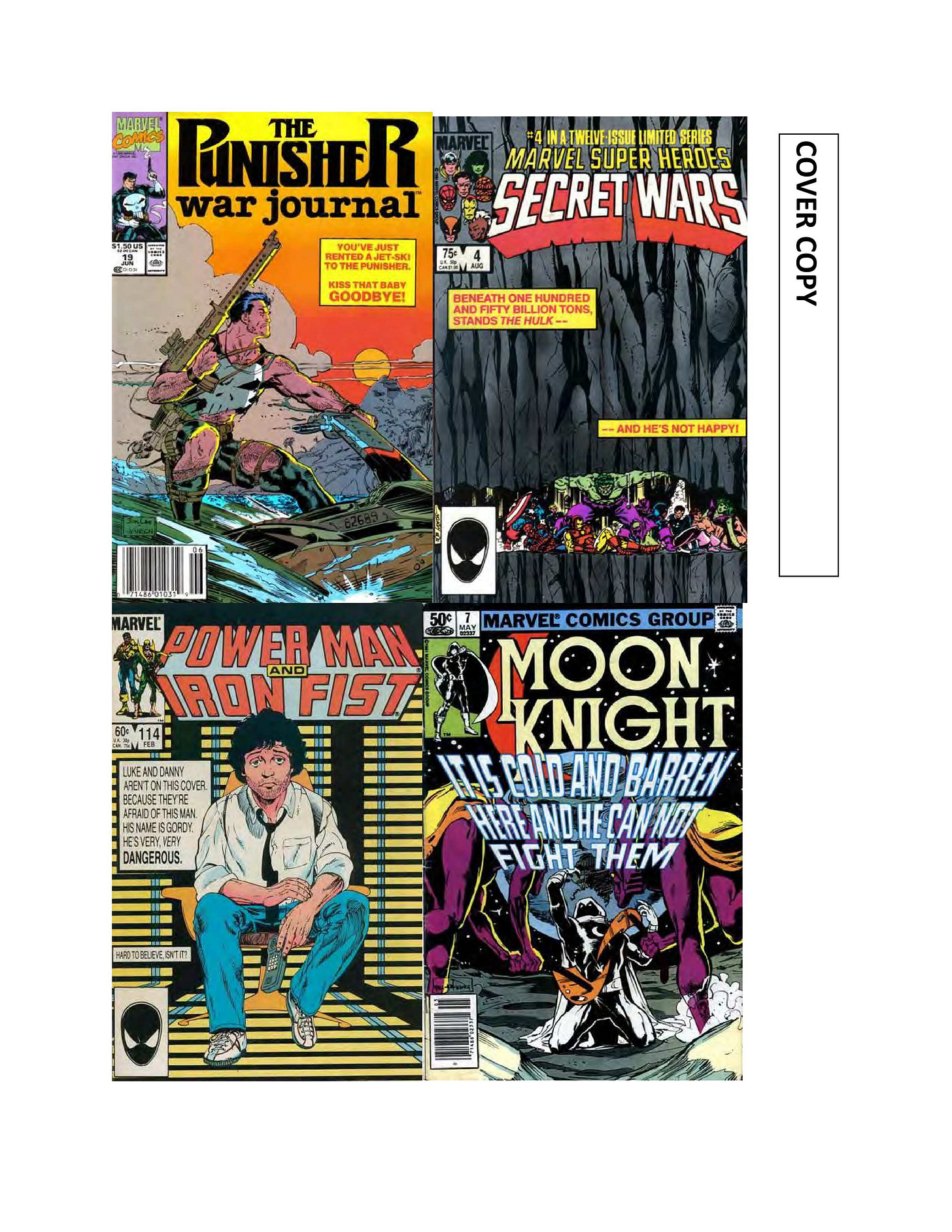
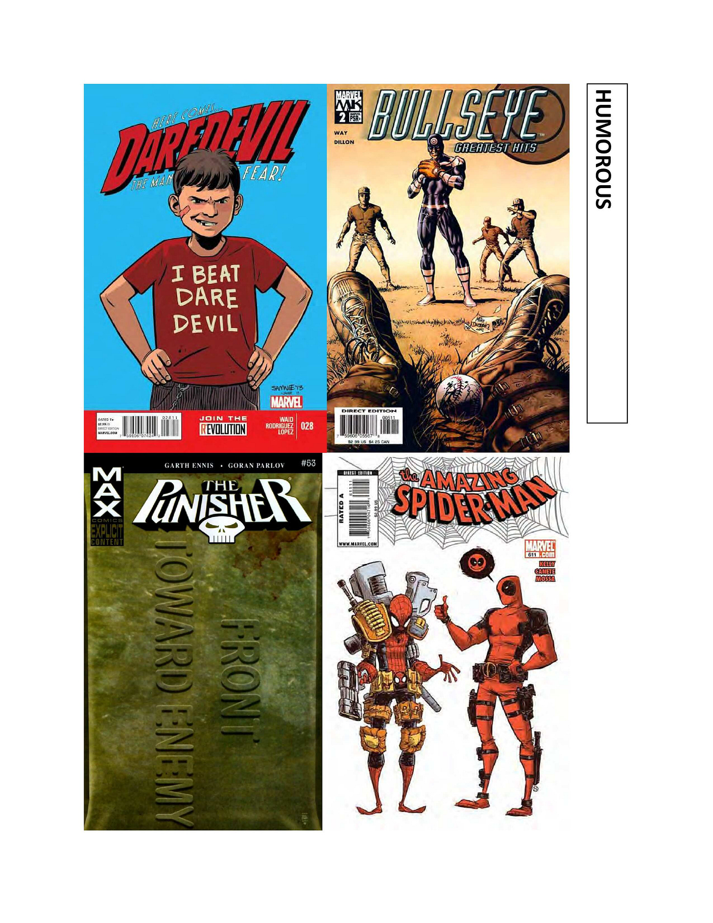
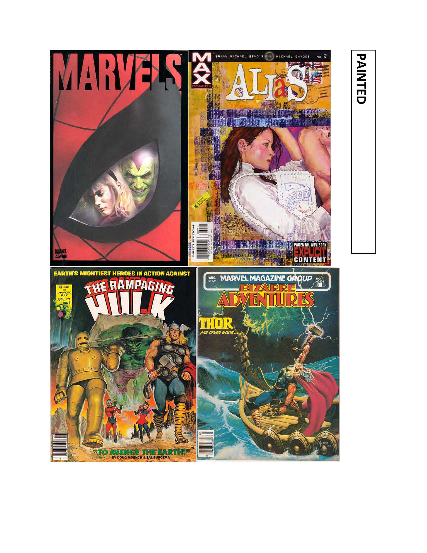
.Time once again to take a look at another section of pages from out of that booklet that I worked up for Marvel editorial as a bit of a thought-starter in terms of cover concepts that work.
TEAMS RUNNING is any classic shot where you have two rival groups of characters lined up on either side of a cover and heading towards one another and a spectacular collision. It’s something of a trope in super hero team comics especially, with the earliest versions having appeared on issues of AVENGERS and JUSTICE LEAGUE OF AMERICA around 1966.
A STORY cover both highlights the specific events that are taking place within that individual issue as a sort of come-on to the prospective buyer: in order to find out how the hero gets out of this situation, you need to buy this comic book; otherwise, your life will never be complete. And in some cases, such as the first AMAZING SPIDER-MAN cover shown above, it still might not, as that cover image depicts the cliffhanger to that issue, a not-uncommon occurrence in the Marvel books of the 1970s.
A COVER COPY cover is one where the image is maybe noting special, but the entire cover is plussed up through the addition of copy, which accentuates the drama or makes a joke out of things or in some manner contextualizes what the viewer is looking at differently, putting forward a particular attitude that makes the book seem attractive.
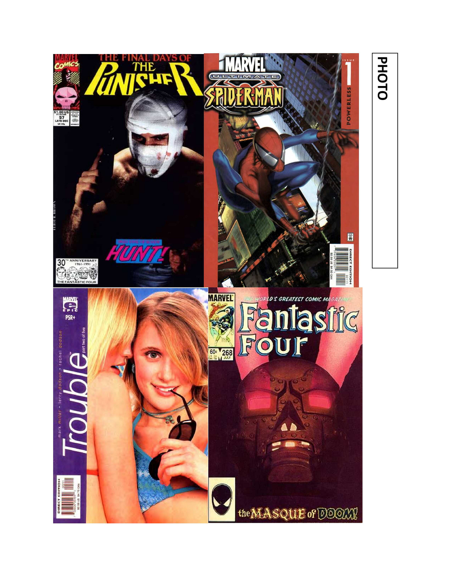
HUMOROUS is just what the name implies, an image that’s got something fun or playful or silly about it. As a side note, i was so impressed with that PUNISHER cover when it came out that I asked editor Axel Alonso about how he’d ever gotten it approved and signed off on. And he told me that he hadn’t done so, he just went ahead and did it. There’s something to be said about that approach sometimes, it’s a great cover.
More and more covers these days are PAINTED, or faux-Painted, as the digital tools available to artists these days allow for a greater easy of creating work in this milieu. But anything that makes these characters seem either more realistic or more sophisticated in terms of the treatment falls into this category.
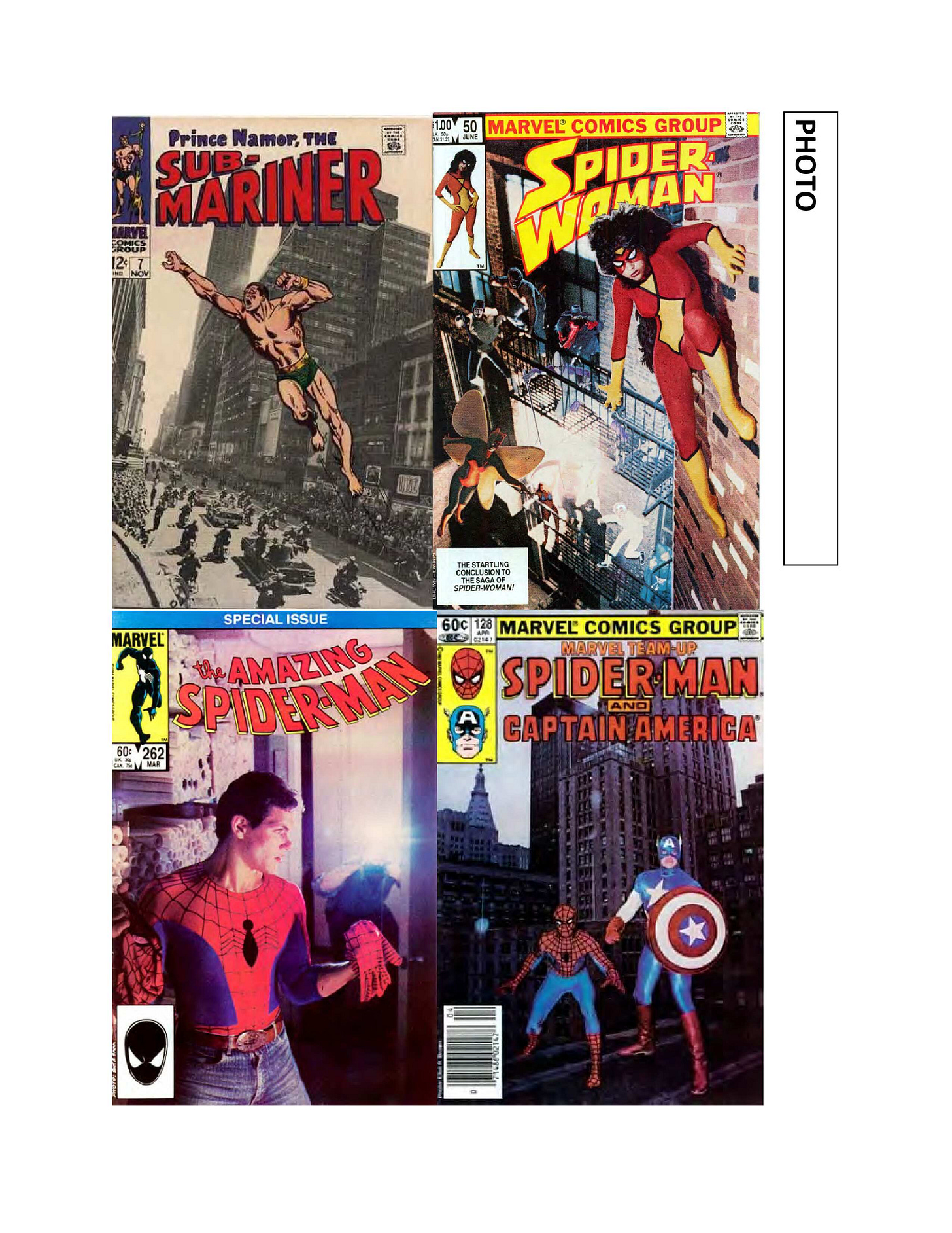
Similarly, a PHOTO cover employs photography as a portion of or the entirety of the image, as in these examples. In earlier days, before the printing technology got better, these sorts of images often had to be heavily retouched in order to make them read properly, as in the case of that MARVEL TEAM-UP cover, which almost defeated the purpose.
Believe it or not, there are still pages from this booklet still to see, so we’ll come back to it once again in the weeks ahead.
Pimp My Wednesday
Hey, Kids! Comics!
The third issue of AVENGERS INC is going to be of interest to readers of IMMORTAL THOR, as the events that take place within its pages will be followed up upon in that series in the months to come. It’s all part of writer Al Ewing’s master plan, and in this case it involves a guest-appearance by Jane Foster, Valkyrie. Don’t say I didn’t warn you. Leonard Kirk provides the artwork here.
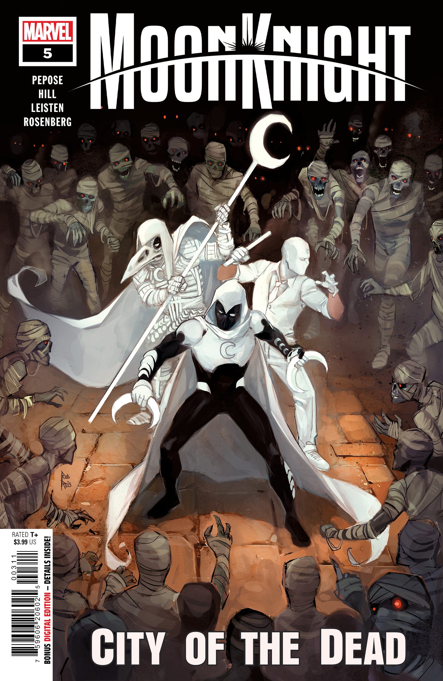
Elsewhere, in a different godly realm, Moon Knight and the Scarlet Scarab finish up their adventure in the afterlife in the concluding issue of MOON KNIGHT: CITY OF THE DEAD. Despite the credit on this cover mock-up, the artwork is by Marcelo Ferreira, with words contributed by David Pepose.
And over in the digital space, THE FEAR TEACHER continues in AVENGERS UNITED #7 by Derek Landy and Phillip Levy, as an injured Captain America tries to find out more about the team’s new foe before his colleagues are all ground to paste by it.
A Comic Book On Sale 55 Years Ago Today, November 19, 1968
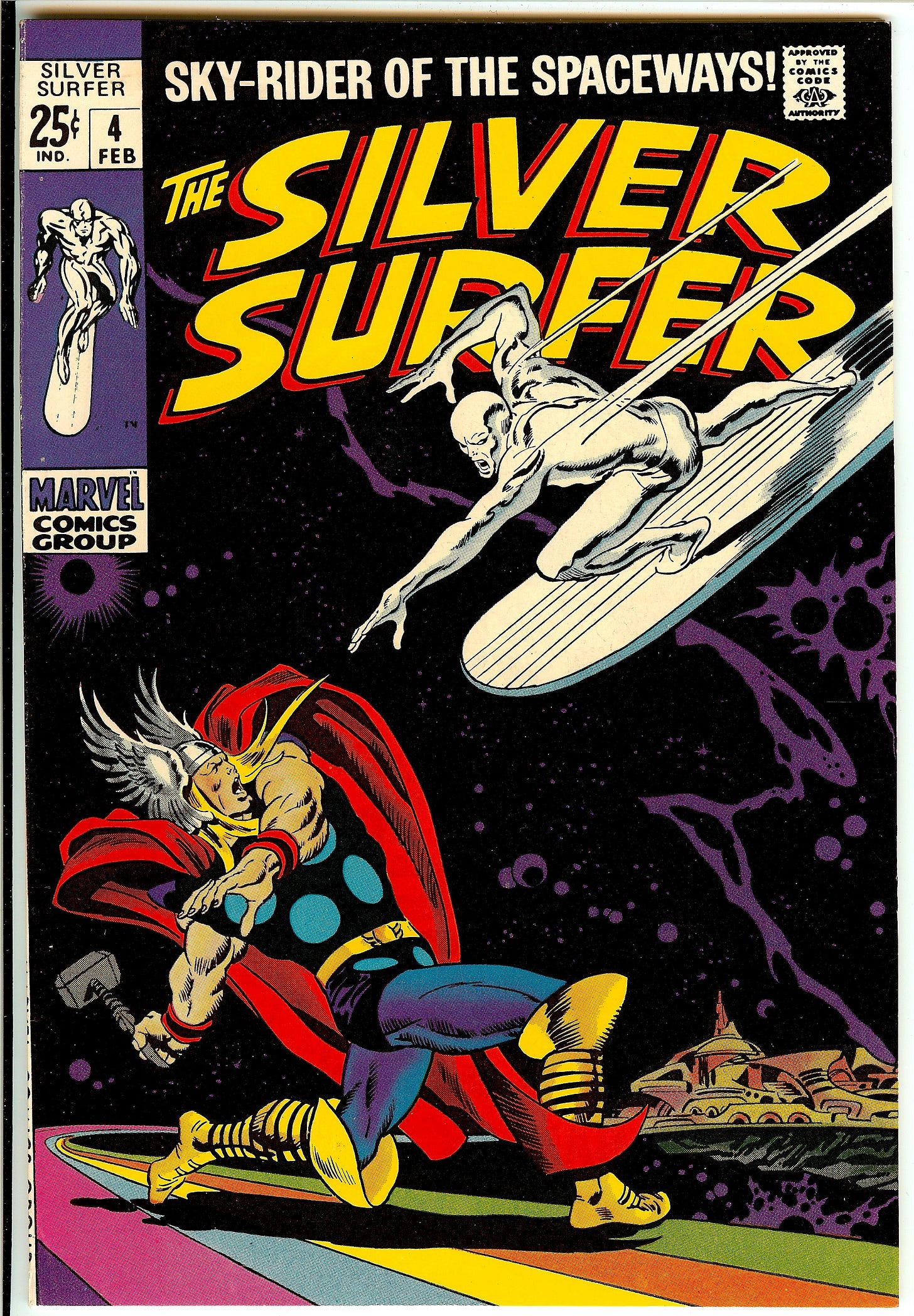
SILVER SURFER was a special book for everybody who worked on it during its launch, and sadly it disappointed just about everybody involved with it. The first one thus struck was Surfer creator Jack Kirby, who had been building up to a storyline that would reveal the character’s origin in FANTASTIC FOUR when he learned that Stan Lee would be doing his own version of such a character in a new book dedicated to the hero—one that Kirby would have no involvement in. The artist, rather, was John Buscema, a world-class draftsman who learned the dramatics of comic book storytelling by following Kirby’s example. Ever since he’d returned to the field following a stint in advertising, Buscema had been instructed by Lee to draw like Kirby, his storytelling approach, his dramatic style. And Buscema was a huge fan of Kirby’s work as a result. But he also wanted to so something that was all his own. His opportunity came in this fourth issue of SILVER SURFER, in which the Sky-Rider of the Spaceways would lock horns with the Thunder God Thor in the latter’s home realm of Asgard. John hated drawing cityscapes, but he was raised on the fantasy artwork of cartoonists such as PRINCE VALIANT’s Hal Foster, and so he saw this as an opportunity to produce a comic book story more in that idiom. John maintained a certain detachment about the work, often claiming that he didn’t care about super heroes at all, but in this instance, he threw himself into it. And the result was amazing, a terrific looking book all around. Everybody was agog when John brought it into the Marvel offices after he’d completed it. Everybody, that is, except editor Stan Lee. Once inside Stan’s office, Lee began to go through the job with Buscema, criticizing his approach for how much it deviated from the typical Marvel style. he reportedly savaged the job, and John left the meeting demoralized. He wandered down the hall to where John Romita was set up with a desk, and asked Romita just how to do comics. From that point on, John never again gave so much of himself to any particular job, though there were certainly many that he did exemplary work on. The punch line, of course, came a decade later, when the story was selected to be included in the Simon & Schuster Marvel collection MARVEL’S GREATEST SUPERHERO BATTLES. Called upon to write up an introduction to the story, Stan rung up John Buscema and proceeded to tell him how, looking back on this job, it was the best thing that John had ever done. Incredulous, John replied to Stan that he had hated it when John had first brought it in, and Stan had no memory of these events at all. But it broke John. SILVER SURFER also broke Stan, though it was later than this issue. At the time, Stan had begun to receive accolades from college-age readers, who likened him to a modern day Homer, spinning myths of the day. Stan liked the fact that his work in what had been considered a juvenile medium was being taken so seriously, and so he set out to produce a comic book that would tackle loftier issues than just the super-villain rampage of the day. No, this book would have something to say about the human condition. And it would feature the Silver Surfer, a character that Stan had fallen in love with in his initial appearances. In order to help separate it from the pack, and to give himself a larger canvas to tell more complex stories across, Stan decided to release the series in the larger 25 cent Annual format. This would also make it less likely that the youngest readers, who would likely be bored by its pontificating, would buy it. That part worked, though almost too well. SILVER SURFER struggled in sales from the get-go, and even reducing it to the size of a regular Marvel book and bringing in popular guest-stars from across the Marvel Universe didn’t halt its decay. In desperation, Lee shanghaied Kirby in to plot and draw what became the last issue, which was intended to set up a new direction for the character. But it was too little, too late. The most personal work that Lee had ever done failed to connect with an audience. For years thereafter, Lee forbade any other writers from using the Silver Surfer without his expressed sign-off.
A Comic I Worked On That Came Out On This Date
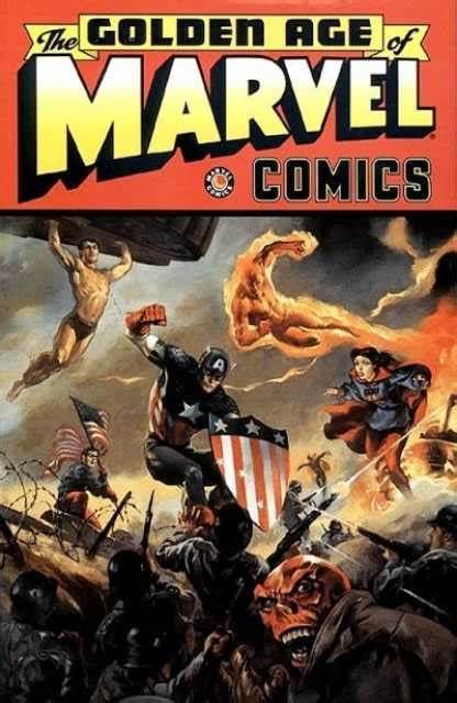
The trade paperback THE GOLDEN AGE OF MARVEL was released on November 19, 1997 and was one of the earliest collections of Marvel’s formative Timely material from the 1940s and 1950s. This was another one of my babies, something that I was hot to do ever since I discovered that there were an assortment of proof roles of some of the earliest Marvel stories still in Marvel’s reproduction archives. Having grown up hearing about this material in books such as Feiffer’s THE GREAT COMIC BOOK HEROES and THE STERANKO HISTORY OF COMICS, I wanted to pull together a reprint collection. While it might not be a massive seller, I reasoned that there must be other readers such as myself out there who would be hungry to sample these early stories. I had always loved it when deadline necessity would cause Roy Thomas, a Golden Age fan if ever there was one, to drop a vintage reprint into the pages of his World War II-set INVADERS series. Even though I was a bit limited in terms of what material I had access to, I’m still pretty happy with the contents of this volume. It was a nice sampler of the era, leaning on characters and artists who still had some relevance to audiences in 1997. Ray Lago produced the cover painting, though we got the colors of Miss America’s costume wrong, Ray having used reference from a miscolored reprint. And I delighted in resurrecting the original 1940s MARVEL MYSTERY COMICS logo and repurposing it for this, as well as including the circular MARVEL COMICS logo that was used for a short time in the 1940s. Most of the interior design material as well as the back cover was reworked from actual Golden Age ads, which was fun. This was a period during which Marvel was only publishing in frequent collected editions, but this volume performed well enough to justify a later sequel. the second volume wasn’t quite as holistically sound, I’m afraid—I was even more limited in terms of what material I could include, and the person who’d been brought on board to design the book had his own ideas as to how things should have been done. It was fine, but not as good as this first collection, in my opinion. Today, of course, a lot more of this material is available to be read by those that are curious.
Monofocus
While the series had had its ups and downs, and this final season had been badly impacted by the frankly baffling decision to hold back the latter half of it for months, I have to say that I really enjoyed the final episode of DOOM PATROL. I’ve been a bit of a sucker for this show ever since it first appeared, the Patrol having been particular favorites of mine ever since I first encountered them in an issue of SUPER-TEAM FAMILY back in the mid-1970s. And this series captured so much of the bizarre nature of what makes these characters memorable. Smartly, the last installment dispensed with plot less than halfway through, so that the back could focus on bringing each of the characters to some measure of finality. It was a surprisingly affecting episode of television, and it made me want to go back an watch the pilot again to see just how far it’d come.
Across the pond, the short vignette that DOCTOR WHO produced for the charity CHILDREN IN NEED special has proved to be somewhat divisive—less for the content of the story than comments made by showrunner Russell T. Davies concerning a new take on the classic villain Davros. Having become aware of how the established depiction of Davros presented a bit of a negative stereotype in terms of the physically disabled, Davies chose to depict the mad creator of the Daleks at an earlier point, before his body was atrophied. In explaining his thinking, Davies indicated that, going forward, this would be how he’d present Davros from here on in, causing the properties change-averse long-term fans to get up in arms. Speaking for myself, while I never made the connection that Davies did, I do appreciate him being thoughtful in the choices he’s making, and I thought this incarnation of Davros worked perfectly well. So I’m not especially bothered by it. The piece itself was a bit of fluff, a light confection, a bit of a cheeky joke, though David Tennant was in his usual fine form and the entire thing had the proper tone and feel to it. It wasn’t quite of-a-piece with what we’ll be getting in the three new 60th Anniversary Specials which begin airing this coming Saturday, but it did help whet the appetite just a little bit more.
Finally, I began watching SCOTT PILGRIM TAKES OFF on Netflix, an anime adaptation of the popular series by Bryan Lee O’Malley. Two episodes in, and it seems a very faithful adaptation in terms of style while also being free enough with the material to push things in some very different directions in terms of the plot and the sequence of events. While the film of a decade-plus ago is regarded as something of a cult classic, animation really is probably the best way to capture the genuine spirit of the original work. Amazingly, virtually the entire cast of the film reprises their roles for the anime, It’s pretty fun so far, helped by the fact that the episodes are only a brisk 24 minutes in length.
Posted at TomBrevoort.com
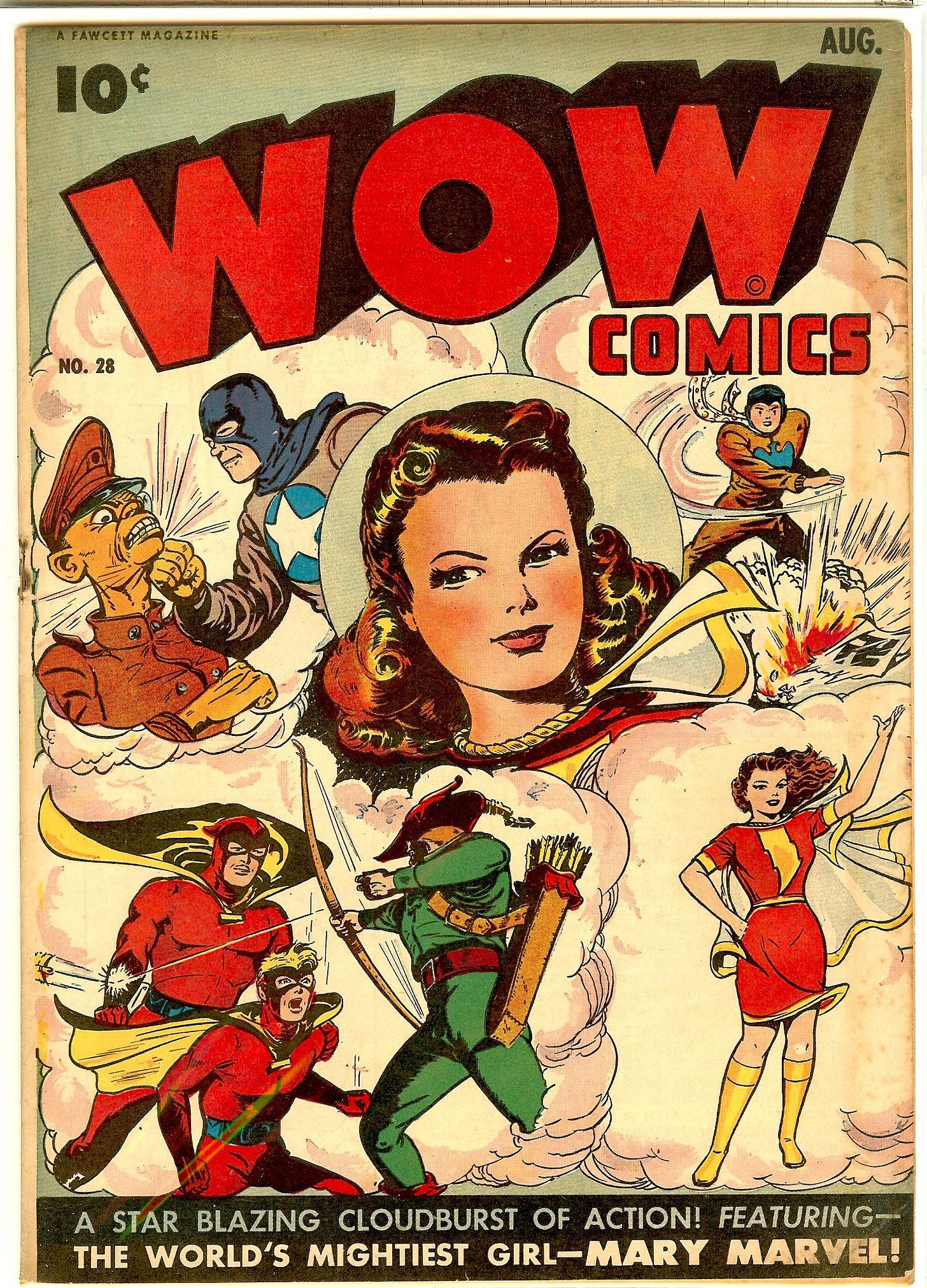
Seems like we have a bit of a Marvel Family theme going on this week. Yesterday, I wrote about the Golden Age team-up between Mary Marvel and Pinky the Whiz Kid in WOW COMICS #28
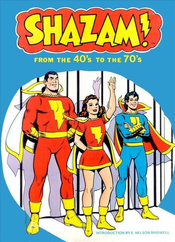
And five years ago, I wrote about the rare hardcover collection SHAZAM: FROM THE 40s TO THE 70s
And that’ll do us for another one of these! For those in the U.S., Thanksgiving’s coming up this Thursday, so take a moment to enjoy with friends and family and to be thankful for what you’ve got. I know that I have plenty to be thankful for, and that I’ve been luckier than many in terms of how my life has turned out. Also, on a more pedantic note, the first of the new DOCTOR WHO anniversary specials will be dropping on Disney+ on Saturday. We’ll definitely be talking about it at least a little bit here next week, so don’t miss it!
Hat’s All, Folks!
Tom B







One other note on Paty: her first Marvel credit is a nifty one! She drew "I Can't Love Anyone!" (written by Steve Englehart as "Anne Spencer") in 1972's My Love #19, and its final panel ends with this note: "A few words about the artist: Paty (rhymes with 'Katy') is a long-time Marvel fan who always decorated her fan mail with pictures. We asked for a whole story, and got this romantic result. We love it, and hope you do, too!" Interestingly, the first two boys named in the story are "Dave" and "Steve"...
Well, what exciting news. Is there an email address I can send the address to, rather than having it out on the internet?
I honestly didn't guess on the reasons behind the quotes because I figured someone out there would get all 20. But honestly, they all felt like good life advice, and mottos to remember.
Would you also be able to share the answers to the ones I didn't get? I've spent literal hours and multiple approaches to find the answers to them.