Hello, everyone! Got a strange and diverse assortment of topics for you this time! So let’s begin!
Even after 35 years of working for Marvel, I sometimes forget that we use live ammo. so recently, upon realizing that my final issue of AVENGERS was coming up, I made a joke as to what we should do as a variant cover to mark the occasion. Now, I wasn’t serious, but everybody was suddenly really enthusiastic about the idea—and so this past week, I got in the final art for what has to be the stupidest variant cover I’ve ever put out, certainly. It’ll be on AVENGERS #13, and I can’t wait to show it to you—though I’ll have to, as it still needs to be put together for print. But it’s a good reminder of a core principle: never throw out any idea that you don’t actually want to do.
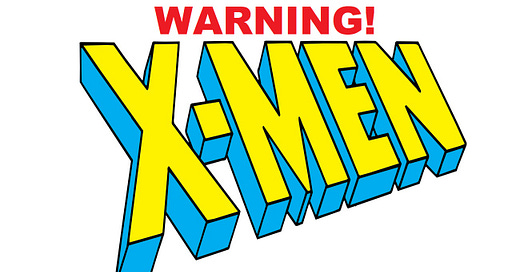
Also this past week, as we begin to get into the genuine hammer-and-nails portion of creating the new X-Line, I whipped together and posted the following sign on my office door, in compliance with all safety regulations.
In retrospect, that probably should have been CAUTION rather than WARNING. Oh well, too late now.
And as the final bit of our preamble, Facebook’s memories feature coughed up the following the other day, a transcript of a dream that I had 12 years ago, which I proceeded to post to Twitter. I couldn’t tell you what it all means, but it certainly is interesting:
Last night I dreamed about Stan Lee . I was at a convention, roaming the floor, and Stan came up to me and struck up a conversation. Stan and I were chatting, and I kind of wanted to get a picture taken with him, but couldn't figure out a way to get my phone out elegantly. So while we talked--and it was a very friendly and convivial conversation--Tom De Falco happened by. Tom seemed a little off, not that I noticed at first. He broke into our conversation wanting to ask Stan about something. Tom and I have a good relationship, so I remarked that Tom should be aware that Stan wasn't a fan of Tom's writing. It was intended as the kind of friendly put-down that we normally would exchange, but Tom took it coldly, and then I realized that something was wrong. Stan and Tom then started to have a conversation about how and why some thing Tom was doing for MoCCA had been cancelled or shut down, and wandered away. I felt badly about my remark. So I went to find Tom to clear the air. By this time, the convention was closing, as it was after 7:00. I made my way back to the Marvel staging area, where I figured Tom might be. When I got there, one of the booth workers asked me if I wanted to get Stan to sign something since he was hanging out at the booth signing stuff while he waited for his ride or whatever. Seizing the opportunity, I pounced and asked Stan to take a picture with me. He was most willing, so I gave my phone to one of the booth guys to shoot the photo. But for some reason, Stan didn't want to do an ordinary picture, but an extreme posed one, like he was raging or playing a character. I played along and the two of us struck exaggerated poses for a few minutes, and I wondered where the guy with my phone was and if he'd gotten the shot. Eventually, this stopped, and I went in search of the guy. I asked him if he'd taken the picture, and he said he hadn't--my phone's case was somehow too large, and it was getting in the way. I took my phone back from him and called him an imbecile. Then, Axel Alonso wandered up, and I began to tell him about what had happened. At that point, Stan's ride had come and he was about to go. I called out to him for a picture, he turned on the spot and struck a perfect model pose, and I snapped the shot. Not a picture with me, but a good photo nonetheless. Stan was wearing a full tuxedo, by the way. At this point, behind us, a room began to let out, and it was a big crowd of DC folks, including Bob Harras. Bob looked as he did years ago when I worked with him. As we were jammed together by the crowd, I greeted Bob, congratulated him on the success of the new DC launches, and remarked that it was like 1998 all over again. But before he could respond, I awoke, and the dream was over.
Whew! And with that, can our regular Q & A session be anything other than a relief?
David Pierce
Were the 1966 Marvel Super Hero trading cards based on the show? I always thought they were, but I dug up my old set and see that among the characters in the cards are Spider-Man and Daredevil
No, David, as far as I know, those Donruss Marvel Super Heroes cards were their own thing, and they featured Spider-Man and the Fantastic Four and Doctor Strange and others beyond the five characters who regularly appeared in the animation.
Zach Rabiroff
There has been an oft-repeated story (from John Byrne, Glenn Greenberg, and others) that during the mid-90's, Steve Ditko had been in talks to make his dramatic, long-awaited return to Spider-Man for a project of some sort, only to drop the discussions after seeing Untold Tales of Spider-Man already in progress.
The story is eyebrow-raising on its face, if only because of Ditko's frequent and consistent refusals to work on his co-creation post-1966, even during periods when he had an active working relationship with Marvel. And even from the distance of time, I'm not sure how much you yourself are free to comment on it. But if I can ask your own recollections of the events, can you describe what happened here, and what you were actually aware of at the time?
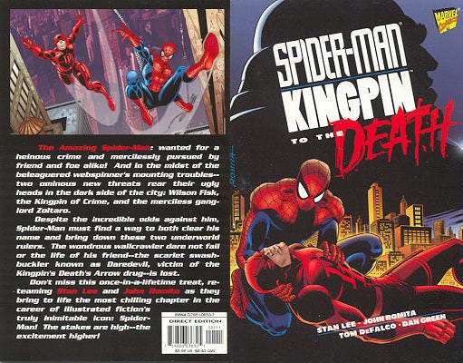
The gist of this anecdote is accurate, Zach, but some of the shading has maybe been ground away. Yes, around 1997 or so, Spidey editor Ralph Macchio had been trying once again to get Stan Lee and Steve Ditko to reunite for one final Spider-Man project. It would have been a squarebound special, in what used to be called the “Prestige Format”. Ralph had known Ditko for a long time and worked with him in the past, so he had a good relationship with him. And he was able to get Ditko to at least consider the idea. Their conversation went deeply enough that the notion was that Ditko would both plot and pencil the story in question, with Stan providing the final dialogue. And Ditko had decided that he’d set the story during Peter Parker’s summer vacation between his junior and senior years, as that was about the last time it would be proper to consider a person of such an age a kid rather than a full-grown adult. And at a certain point, wanting to make sure that Ditko was aware of the lay of the land, Ralph sent him copies of UNTOLD TALES OF SPIDER-MAN, which we were publishing at the time. Ditko’s reaction upon receiving them was pretty funny. He said, “I have collaborators now?” In any event, after some consideration, Ditko passed on doing the project—I don’t know how serious he was about the whole thing to begin with, but it wasn’t specifically those UNTOLD TALES issues that pushed him off of that ledge. And in Ditko’s place, Ralph called in John Romita—the eventual book was SPIDER-MAN/KINGPIN: TO THE DEATH.
Clive Reston
What is the rarest commercially available single issue of a Marvel comic book from the time you've been working there? Note that I don't mean the most desirable or valuable one (and, for the purposes of this question, let's also disqualify variant covers, reprints, giveaways, withdrawn errors, etc.), just the one of which there are literally the fewest copies in circulation.
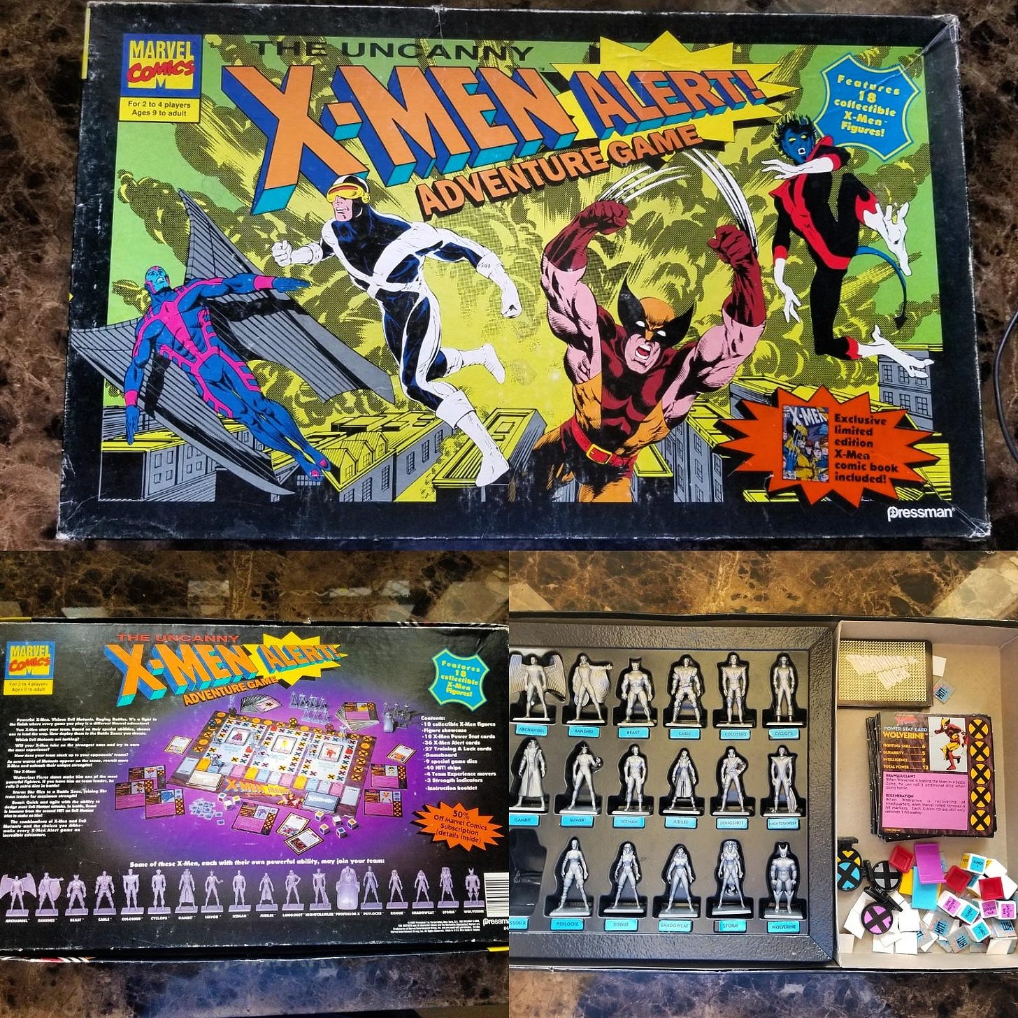
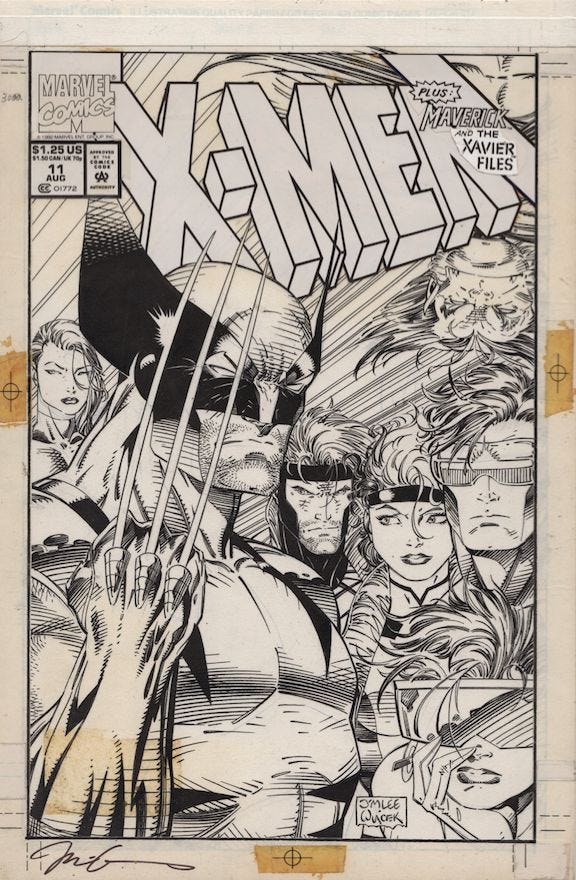
Boy, wow, I’m not actually sure, Clive. But I’ll take a guess, though it violates one of your conditions. Back when I was working with Bob Budiansky in Special Projects, there was an X-MEN board game that was being put together. As a special pack-in to the product, we produced a limited variant edition of the current issue of X-MEN, #11, Jim Lee’s last, with a silver ink background rather than the regular red. I don’t know how many copies of that game were ever sold, but I’ve never seen another copy of that comic since we sent it to press. I did squirrel away a small stack of copies somewhere in my archives, figuring that they might become rare and valuable at some point. But so far, no such luck. I’m not even sure that the price guides are even aware of its existence.
Thom H
Avengers, Inc. seems like something I might have picked up, but by the time I a) knew it existed and b) heard that it was good, it had already been cancelled with issue #3 on the stands. That seems quick even by 2024 standards, so sales must have been terrible right out of the gate.
But here's my question: if someone who's been hooked into comics culture for decades can't hop on a quality new series in time, then how is it supposed to grow an audience? Does a series need a built-in audience before it's even published? And wouldn't it have been better to commission and solicit a project like Avengers, Inc. as a miniseries to begin with? If the entire story was going to be done in 10 issues, then the miniseries format seems perfect for it.
Here’s the thing, Thom: when it comes to this business, nobody knows anything. You can draw on history, on experience, on what worked before. But that’s no guarantee of success. And the really big successes come out of nowhere, from unexpected sources, more often than by concerted effort. So consequently, with every project, it needs to be something that I think has a decent chance of being commercially viable and be a story that I want to tell. In general over teh past two decades, we’ve seldom had any difficulty with an AVENGERS series running for at least ten issues, so from a historical standpoint, teh math was with us. And we were trying something new, so there was always going to be an element of risk. But part of the reason for doing the book was to try to expand the sphere of what an AVENGERS title could be. I always find fans crowing about how they “always knew” that such-and-such a project was going to be a failure a little bit frustrating, in that if you bet on entropy, you’re going to win most of the time. But the game is about hitting those moments when you pull a win out of nowhere. Those same voices would have been insisting that a MOON KNIGHT series couldn’t go the distance either, and the history would have supported that position. But here we are, with a book that ran for 30 issues and which only relaunched as part of a story initiative (and with the same creative team.) Point being, if you think an idea is good, you often take your shot and then teh chips fall where they may. You can do everything right and still not succeed. But if you don’t try, then you’re definitely not going to.
Craig Byrne
Was the Marvel Super Heroes cartoon the reason Namor was given a feature in TALES TO ASTONISH -- maybe in case more material was needed for the show?
No, Craig, not that I’ve ever heard. That Namor strip was in production and in the world well before the show started airing. But the fact that it was so relatively new was teh reason why the animated series had to make up a bunch of completely new Sub-Mariner adventures to fill out their commitment.
Andy T
It really makes me curious how this FF creative team - Ryan North, Alex Ross, and your editors - work together to produce the concepts for all these covers? You’ve mentioned doing quick layouts or mock-ups before for cover artists, have you done any of that with Alex? Does Alex ever get an outline of the plot or a full script and get to choose what he wants to do? As the writer how much does Ryan have a say?
Well, Andy, in general Alex is good enough where he doesn’t need any sketch from me, although I have on occasion sent him a doodle just to get the basic idea of what I have in mind across—pretty sure I did that for his cover on MARVEL COMICS #1000, for instance. But the way it works is that, as he’s working on the script, Ryan comes up with two or three suggestions for what the cover might be, some or all of which I forward along to Alex (leaving out anything that I don’t think would make for a saleable cover and adding in any additional notions I may have.) Typically, I’ll also send Alex the script, assuming I have it, so that he can read through it if he so desires to get a better sense of the context of the image. Thereafter, Alex will come back with one or more tight cover sketches. He’s free to interpolate and to go off-book if he’s got a stronger idea. From there, I go back to him with any thoughts or concerns—usually, this is just a “Looks great, Alex, let’s go!” e-mail, but every once in a while there might be something that he needs to know about or that bothers my eye. And then Alex executes one of his fabulous paintings and we get it by catalog time.
Jeff Ryan
Comics, as the rumors go, are circling the drain and have six months before everyone’s bankrupt. These rumors have been going around for 80 years straight: they probably were around before Superman or Archie. What was the closest you came to believing this was actually going to happen, and the industry was going to collapse like the Bluesmobile?
I’d have to say maybe in the very late 1990s, Jeff, while Marvel was in bankruptcy. I’m sure these posts exist somewhere out there on the internet, but at the time, I would relatively regularly predict the collapse of the Direct Market within five years if something didn’t change. But something DID change, Bill Jemas and Joe Quesada took over running Marvel and turned the entire operation inside out, generating a lot of attention and bringing new and lapsed readers back into the marketplace. Since then, it hasn’t been a thing that I’ve really concerned myself with all that much. Even when we had the full-scale shutdown at the start of the COVID pandemic, I wasn’t ever really worried that this was going to spell the end of the industry. Direct Market Retailers have proven themselves a lot more sturdy and resilient than that over the years.
Jason
With the coming of the new Night Thrasher series I've been going back and re-reading his 1994 ongoing and it's surprisingly good, if messy, with artists bopping in and out with regularity. At that time there was the larger, regular New Warriors series, plus the Night Thrasher ongoing, Nova reboot, and Justice mini-series. I have also heard rumors that there was a secondary New Warriors spin-off planned (New Warriors West Coast, anyone?). But shortly after, these projects ramped up, writer Fabian Nicieza left the Warriors, the solo books faded away and the spin-off never came to be. Do you have any recollection of what caused the implosion of what seemed to be a pretty significant project?
Well, the thing that happened, Jason, was the implosion of the speculator bubble that was driving sales in the first half of the 1990s, leading to a massive freefall in sales. So everything was bleeding readers, and smaller lines such as the NEW WARRIORS books were hit the hardest. I don’t want to speak for Fabian, but I edited his last NEW WARRIORS issue, and he told me at the time that the reason he was leaving was that he felt that the company didn’t put enough support behind the NW titles. But the reason that second NEW WARRIORS book never launched was that the sales on the primary series had tapered off badly, as had the numbers on the existing spin-offs. I wound up presiding over the last issues of NIGHT THRASHER and NOVA, and eventually the last issue of NEW WARRIORS maybe 18 months later. That was a tough moment where the market simply couldn’t support the number of titles that was being released every month, and so tings contracted sharply.
Behind the Curtain
.This week, we have a follow-up to last week’s Editor School Notes concerning John Romita Sr.’s lecture on storytelling. A week later, new Marvel Editor in Chief Joe Quesada delivered a follow-up to what John had said, and the notes from that lecture are presented below. As last time, I had to rescue these from an old file, so they’ve been excavated and cleaned up here, but not altered in any substantive way.
Editor School Notes
11-1-00
Penciling: Joe Quesada
The book's art is what the reader sees first. Whether it is a cover or the first few pages of a comic, the art is what is the most readily visible aspect of the book is.
Joe agrees that, as John Romita, Sr. suggested, it is important to find the "bomb" in the story and build to it.
Joe doesn't feel that it is always necessary to open a scene with a standard exterior establishing shot. Scene can be established in a variety of ways and it is okay to do different things in transitions (close ups, etch) as long as it is clear to the reader that the scene has changed.
Left to right motion in the panels keeps the reader's eye flowing back and forth naturally.
Reversing the motion (right to left) can be effectively used to slow down the motion on a page and to slow the reader down for a moment.
Be sure only to stack panels on the right side of the page. If you stack on the left, you are more likely to miss a panel and have the flow of the page disrupted for the reader.
Having a character breaking the border of a panel can be effective if done right. But save these kinds of things for the story's "bomb." That way, the visual will be more effective and will enhance an important event.
If the artist breaks a character through a panel's border into a panel below, it could cause problems for the flow of the page, breaking the left to right motion.
If the artist has a character break the panel borders more than twice a book, he's doing it too much!
Having to turn the book sideways for a vertical spread is disruptive and removes the reader from the experience.
If a page has too much copy, try to break it up and shift it around. Huge amounts of concentrated text disrupt the art and intimidate the reader. Large balloons should not comprise the majority of the page's white space.
Set up new scenes early on in the story and don't add new elements to a scene without introducing them. If Doc Strange is supposed to drink tea on page three, make sure that you show him getting the tea before he suddenly has it in his hand. Writers should be establishing these intros in their plots.
The eye needs a place to rest. Don't overcramp pages with detail and provide sufficient white space (other than in word balloons).
Make sure to leave room for copy in the panels so that art is not obscured.
It makes life easier if the characters are aligned in the panel in the order that they speak (left to right).
When trying to display a comedic scene, keep the "camera" in one place.
Bleed art can take away from the other panels on the page. An artist can add a gutter around those other panels to help them stand out. If a bleed is used every page, it loses its effectiveness. Bleeds should be used to convey grandeur... like Asgard. Not for common scenes.
Another problem with bleeds is that artists often don't consider how two bleeding pages next to each other will look. When doing a bleed, the page should be compared to the pages before and after it to make sure that bleeds do not disrupt each other.
The last panel of every page should pose a question. The first panel of the next page should be the answer to that. Whether it's "what's behind the door?" or "who is that masked man?" if the question is not asked, the reader has no reason to turn the page.
Lots of people use neat tricks to no avail. Don't tilt the ground if there's no impending danger. Don't use weird panel shapes if nothing cool and different is happening.
Panel structure can be used to generate strong feelings (claustrophobia, vertigo, etc.) if done correctly.
An artist can't make good storytelling choices if he doesn't know anything about storytelling.
COVERS
"Storytelling covers" are overdone and often turn out more confusing than necessary. A "storytelling cover" should be used only if it presents a strong, iconic image.
Covers can still be strong and tell a story even if there is just one character showcased.
The cover should have a centered, vertical focus. By having the focus down the center of the cover, it will make the eye of the viewer stop before it moves on to the cover next to it on the rack.
Klaus Janson suggested that there are three types of covers: the hero in victory, the hero in defeat and everything else. But more from him next week...
Pimp My Wednesday
Comics! Dying since 1935—but not dead yet! So here’s what we have coming your way this week!
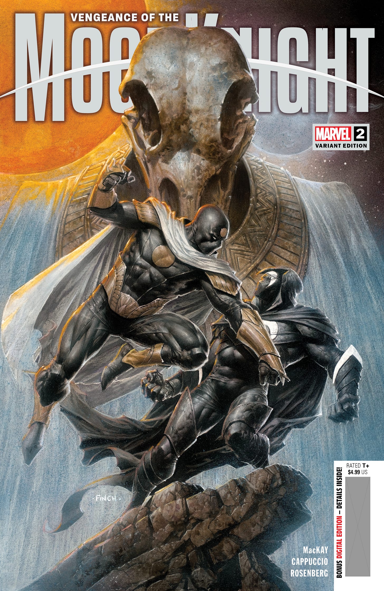
VENGEANCE OF THE MOON KNIGHT #2 is my final issue editing the series, which will pass over into the hands of Devin Lewis starting with #3 (I and my junior editors were given a credit on #3, but we really shouldn’t have been. We didn’t do a single bit of work on it.) Anyway, the mystery of the identity of the new Moon Knight begins to heat up, as Hunter’s Moon has some pointed questions he’d like this newcomer to answer. But the spotlight this issue is really on Tigra. It’s by Jed MacKay and Alessandro Cappuccio, who’ve been the title’s creative team since the very beginning 32 issues earlier (plus a few Annuals and one-shots along the way.) I’m surprisingly tranquil about letting this series go—it was remarkably easy to hand it over and then to stop thinking about it, much as I enjoyed working on it all these months.
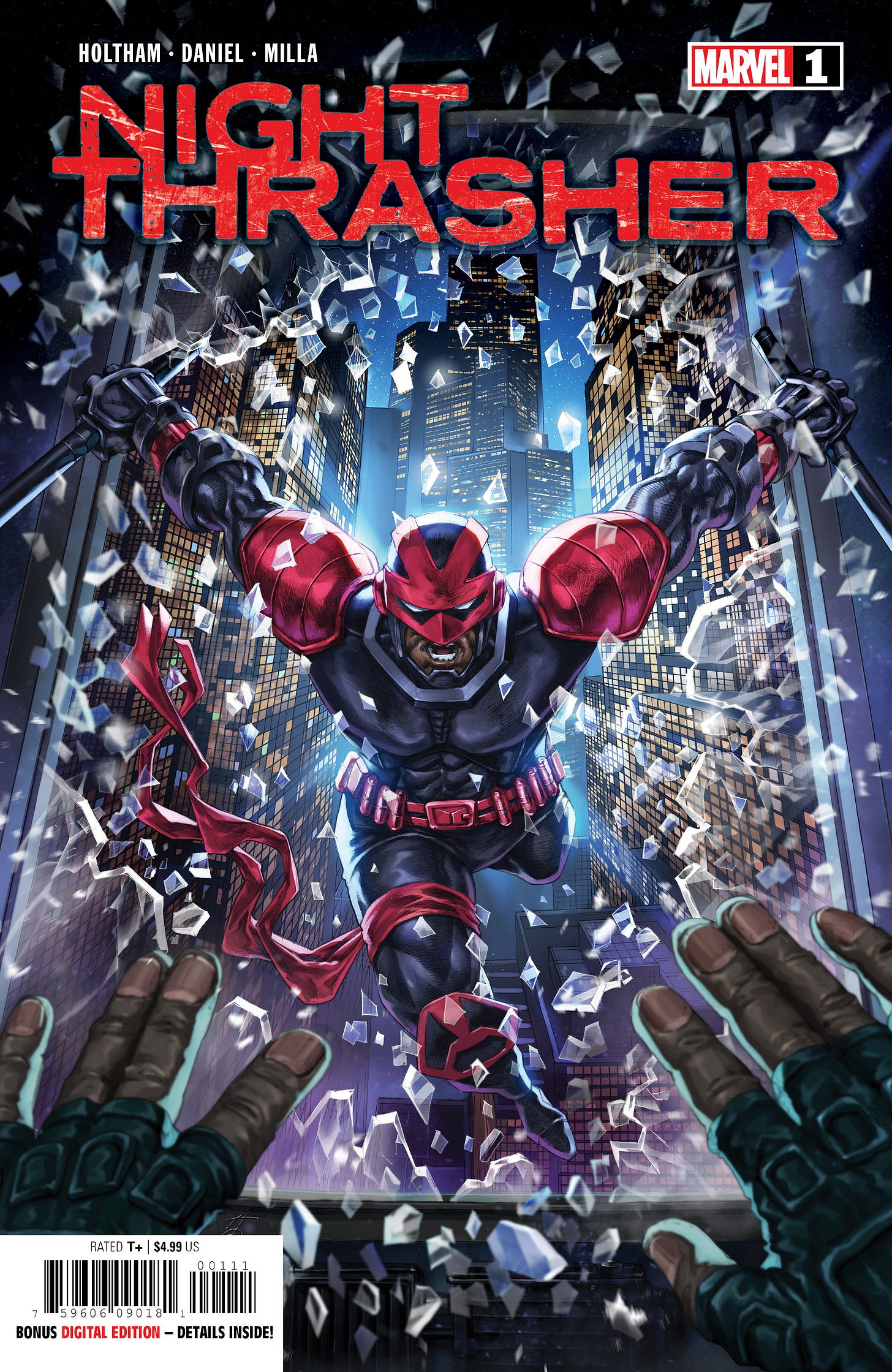
And speaking of NIGHT THRASHER, Assistant Editor Martin Biro is handling this new limited series bringing back Marvel’s primary skateboard-riding super hero. And it’s a really good reintroduction to teh character, at once building on all of the recent events that have happened to him in other appearances but also framing who he is and what he does in a way that a novice can understand and connect with. I was quite pleased with how it turned out. The story is by J. Holtham with artwork contributed by Nelson Daniel.
And in the electronic space, we’re rounding the final corner on Book Four of the 25 part storyline running in AVENGERS UNITED, by Derek Landy and Marcio Fiorito. Here, Captain America has a confrontation with Ambassador Sof concerning the secret of Yun-To—a secret that will be revealed in one short week!
A Comic Book On Sale 20 Years Ago Today, February 11, 2004
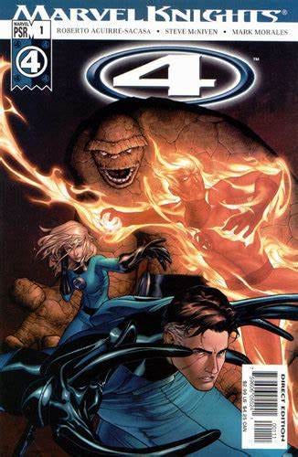
Twenty years ago today, the project that had begun life as Bill Jemas’ WORKING CLASS HEROES finally saw print as MARVEL KNIGHTS 4 #1. This was going to be FANTASTIC FOUR #509, Bill having fired Mark Waid from the series with Mike Wieringo following in solidarity, but a pretty massive fan outcry as well as an overall reversal of Bill’s fortunes and some good luck (and ill tempers from rival company executives) meant that the Waid and Wieringo run on FANTASTIC FOUR would continue. MARVEL KNIGHTS 4 was designed to run alongside FANTASTIC FOUR, and theoretically took place within the same continuity—although, to be honest, Waid, Wieringo and myself didn’t really give it much thought or concern. But it has to be said, writer Roberto Aguirre-Sacasa and artist Steve McNiven did a really fine job with what they were handed. This first issue still reads as clunky and awkward to me, mainly because Sacasa was limited to following the utterly preposterous series set-up that Bill insisted upon. But especially once the title began running, he and Steve produced a number of really fine issues. And even after Steve’s departure with issue #7, Sacasa kept the book rolling along for 30 issues in total. Roberto had a distinctive voice for the characters and brought a unique point of view to their adventures.
Chasing the Dragon
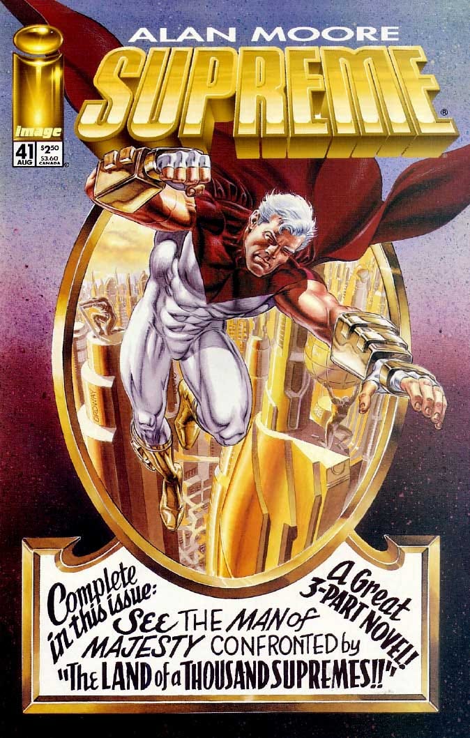
It surprised me as much as anyone. I really wasn’t the audience for much of the Image output of the mid-late 1990s, especially the books put out by Rob Liefeld’s Extreme Studios. They tended to be aggressively action and (forgive the reference) image-oriented, and I needed a bit more substance in my comics. Liefeld’s SUPREME, which had launched a couple of years prior to this, had been an especially dopey and mean-spirited take on a Superman archetype. A perfect book for a teenaged reader who thought the Man of Steel was too much of a goody-goody, but absolutely not what I was looking for. But the truth is, I would show up for Alan Moore pretty much anywhere he’d go, and that included his top-to-bottom reinvention of the SUPREME mythos. But being honest, all Alan really did was to recast Supreme in the image of the Superman he liked best the Mort Weisinger edited version from the late 1950s and early 1960s. But in his typical way, Moore found interesting modern angles to take with all of the assorted iconography and mythology that orbited that version of the Man of Steel. I can remember Mark Waid enthusing about this book specifically—and if Mark gives it a thumbs up, you can be sure you’re in safe territory. The artwork on SUPREME was often a bit of a mixed bag, with Joe Bennett doing a competent job on most issues in delivering in the Image house style of the period while still mostly making the storytelling work. A few issues in, Alan began doing shorter throwback stories in the middle of each issue, each of which was deliberately drawn in a throwback style by one of Moore’s frequent collaborators from the past, such as Rick Veitch. Something of a clear labor of love, SUPREME presaged Moore’s eventual AMERICA’S BEST COMICS line as a callback to the sorts of comic book stories that had fired his imagination as a youth. During the run of SUPREME, Extreme Studios underwent a few colossal shake-ups. The imprint left Image, setting itself up as Maximum Press before finally coalescing into Awesome. But further issues of SUPREME kept coming out throughout the transitions, even if the shipping schedule was sometimes a bit erratic. Liefeld was a big enough fan of what Moore was doing here that he invited Alan to reinterpret his entire catalogue of characters in the colossal JUDGMENT DAY event series—one of the few times when Rob drew an Alan Moore script, a meeting of titans if ever there was one. Eventually, though, Awesome ran out of revenue and issues of SUPREME stopped coming out. Decades later, Rob had Erik Larsen draw Moore’s final SUPREME script as the starting point for a run that Larsen would write. It was a fun momentary blip before the book went back to business as usual. There was a collection of the first dozen or so issues of Alan Moore’s SUPREME run, but the reproduction on it wasn’t very good—it was scanned from printed copies of the comic as I recall, and looked a bit nasty as a result. And the latter chunk of it, which saw print under the title SUPREME: THE RETURN has never been reprinted. But it’s a run that’s worth putting together, whether you’ve got nostalgia for the comics of an earlier era or whether you just appreciate Moore’s ability to put a fresh, modern spin on classic concepts. I’d buy a nice collection of this material in a heartbeat (as well as Moore’s JUDGMENT DAY and short-lived YOUNGBLOOD material.)
The Deathlok Chronicles
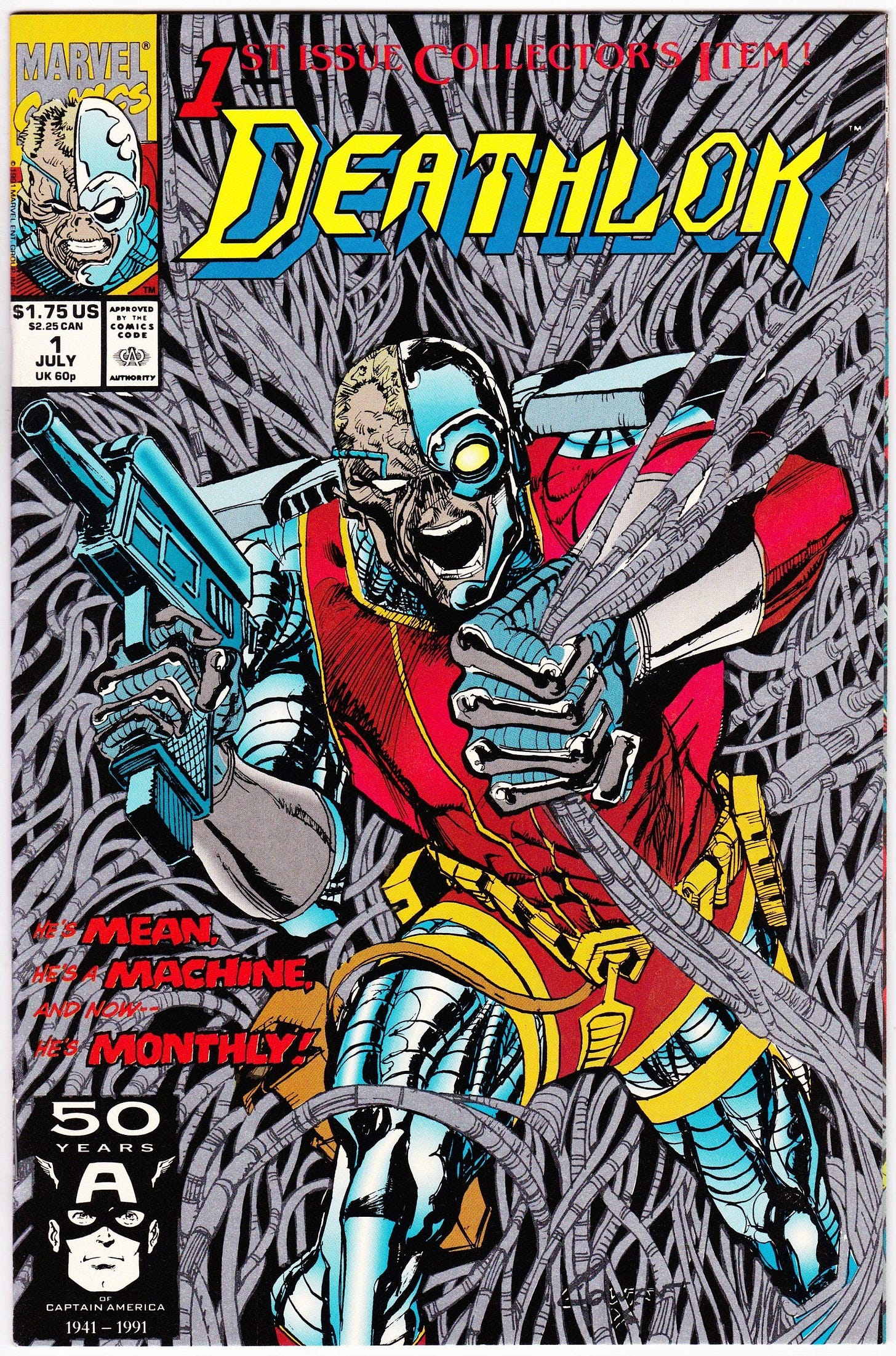
DEATHLOK #1 was the first issue of the ongoing series, and I am credited as the editor on this first issue. Which wasn’t entirely true. I did send the book to print, but only after Bob Budiansky had commissioned the work and done most of the production on it. But Bob suggested that we credit me as editor, despite my misgivings, for a very simple reason: in those days, editors earned incentives based on the sales of their titles just as writers and artists did. But as an Executive Editor, Bob was ineligible to collect that money—his compensation was tied to the Marvel line as a whole. So, figuring that somebody ought to benefit, he insisted that I be listed as editor. It was a very kind thing for him to do, and as this first issue sold 435,000 copies, it wound up putting something like four grand into my pocket. To this day, it’s the best-selling single issue comic book release I’ve ever worked on. So I peaked early.
This issue was co-written by Dwayne McDuffie and Gregory Wright in the manner that the limited series had been. And that too was because of those incentives—the first issue was always going to be a large earner for those involved. But having been faced with the difficult situation of there being a writing team that could no longer function harmoniously together, Bob made a Solomon-like call on the future of the title. Not wanting to favor one writer (and one colleague) over the other, Bob decided that the pair would write the series in four-issue stretches, alternating back and forth. This was a perfectly fine idea in the short term, but it’s probably the bedrock mistake that led to the series’ downfall. Because it meant that the book was constantly vibrating back and forth between to very distinctive points of view. It didn’t have a consistent identity.
We did line up a new regular inker for the series, working over the pencils of returning artist Denys Cowan. Mike Manley, who was simultaneously working on DARKHAWK, agreed to ink the book. Mike’s line wasn’t as finnicky and detailed as Rick Magyar’s had been, but he did a great job in interpreting Denys’ textures and was able to fill in the gaps in any place where Cowan may have gone a bit sketchier and more impressionistic in his work—Denys’ pencils were always a hair impressionistic, so having somebody who could draw well to provide a composed finish was a genuine advantage. It also didn’t hurt that Mike was a hell of a nice guy.
All of that cover copy that you see was Bob’s—I can remember debating with him the fact that needing an A before MACHINE wrecked the rhythm of that alliteration. But he thought it was fine. In the end, I don’t know that any of it mattered, as all of that red cover copy is virtually invisible against teh black and silver background. I think if I was doing this cover today, I would have put the silver ink on Deathlok himself, his cyborg parts, and left the background cables more subdued. But live and learn.
Super Heroes On Screen
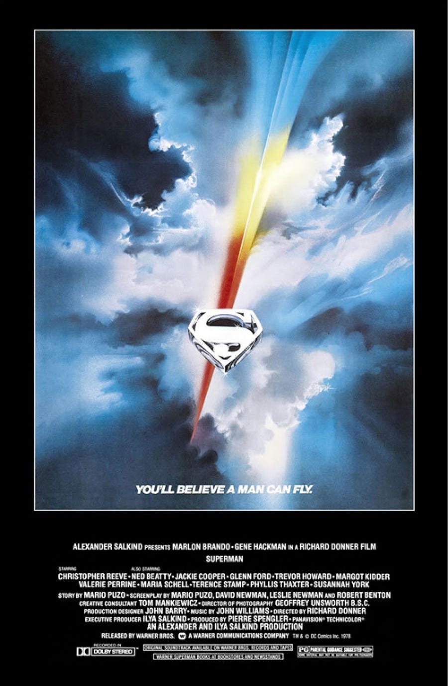
SUPERMAN THE MOVIE premiered in 1978 and is an acknowledged classic, the first (quasi-) serious interpretation of a comic book super hero on the silver screen. I could write huge swaths about this film, what it gets right and why it resonates so strongly even after all these years—and I have in this piece at my website. There really isn’t much more to say here beyond what I outline in that earlier write-up, except to point out that, even in the late 1970s, Superman and the sort of heroism that he represents was seen as being corny, old fashioned, out of step and largely irrelevant. And the key secret of this picture is that it has Superman take that attitude on head-on in the person of the urbane, cynical and world-weary Lois Lane, and win her over. Superman was the hero that people needed in the aftermath of the Watergate scandals and the Vietnam War and all sort of other events that weakened out belief in the systems of power and the goodliness of our fellow man. And I suspect the reason that it went over so well is that it never takes the piss out of the main character or the ideals he represents and tries to uphold. It makes those values feel relevant again, even if they could only truly be embodied by an alien savior from another world. “You’ll believe a man can fly” read the tagline—but the important part, the magic trick, was “You’ll believe.”
Monofocus
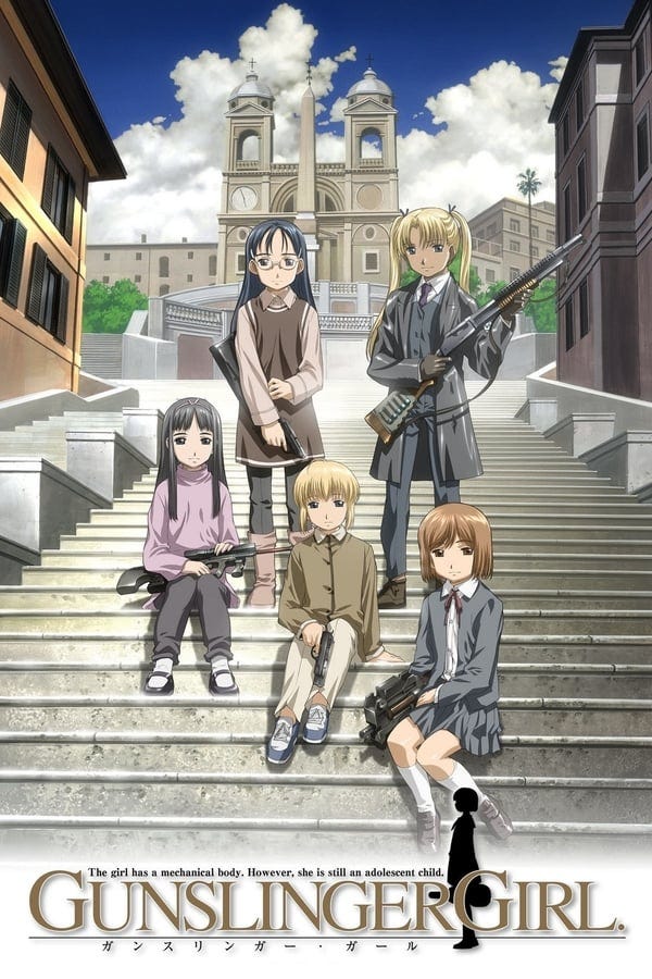
A video retrospective that I came across inspired me to undertake a rewatch of an anime that I had first consumed when it was being released: GUNSLINGER GIRL. I watched the first series but never took in the later unrelated second series nor the OVAs. So went back to it again. And it’s really good, though also incredibly dark, despite the fact that the individual episodes are told with style and restraint and often a lot of stillness and emotional complexity. The show focuses on the Italian Social Welfare Agency, which provides aid and support to critically injured or ill female children, often the victims of violence or abuse. They do this by rebuilding the girls into superhuman cyborg killing machines, who are brainwashed into forgetting their pasts and who are instilled with an unbreakable fealty to their older male handlers, who are referred to as Fratello—brothers. Most episodes focus on one of the five principle girls: Henrietta, Rico, Triella, Claes and Angelica. There isn’t any specific overarching mission—the program is broadly counter-intelligence and counter-terrorism, but it’s as often employed to carry out personal missions for its political supporters. But consequently, each individual episode is a beautiful and disturbing little confection all by itself. I’m told that Yu Aida, the creator of the manga, actively disliked the first version of the show (which was created early on in the run of his manga version) and that the later second series is closer to his vision. But I don’t know, I really like that first series. It had a much more interesting look and a sophistication to its approach that the later series just doesn’t match. As usual, I’m providing you with a link to the opening title sequence, so you can get a taste for yourself. It’s a pernicious, nasty little series, one that sticks with you well after you’ve consumed an episode.
Posted at TomBrevoort.com
Yesterday, I wrote about the first part of the epic Golden Age crossover between PHANTOM LADY and the SPIDER WIDOW.

And five years ago, I wrote about THE FIVE BEST COMIC BOOKS OF 1979.
And we’re out! Thanks for starting your Sunday with us (assuming that’s when you’re reading this—otherwise, any other day will do!) See you next time!
Hat’s All, Folks!
Tom B




One of the greatest aspects of the 2000s-ers Ultimate Universe was it was limited to four books a month. If you had to set up an Ultimate Universe for the Distinguished Competition, what four titles might you initially focus on?
Is it true 70's Bill Mantlo intended that the first Carrion would be none other than Norman Osborn (hence his "Zombie Goblin" look) ?