I’ve said it often enough that it’s become a part of my standard repertoire: I am not a good person, not in the way that I define goodness. I’ve known some good people over the years: my mother is genuinely good, as is my mother in law, both carrying no particular grudge or dislike for anybody and being generally of good spirits and positive outlook. But that isn’t me. Every once in a while, somebody tells me that I’m a good person for having done something-or-other, and I wind up needing to wave the question off. I’m far too selfish and self-interested to ever fit that paradigm, and I’m as apt to do nothing as I am to do something virtuous. For all that, I tend to gravitate to goodness in my entertainment—while there can certainly be something fun about living vicariously through a venal or corrupt anti-hero, as often as not I’d rather consume stories that showcase people being legitimately good, doing the right thing and bringing about needed change through their efforts and self-sacrifice. I’m a Superman guy more than a Batman guy, less interested in punishing bad people (or, really, hurting anybody in general) than in protecting the less fortunate. This seems to be a position that many folks of a younger generation than mine have difficulty with these days. It’s easy to be cynical when the world gives us so many examples of people behaving badly and not only getting away with it but being lauded for it, failing upwards. I long for a balance, for more people who’ll do the right thing because they understand it to be right, who will avoid doing the wrong thing because they realize it to be wrong. In the time when I grew up, this was not an unwarranted expectation, but somewhere along the way, it seems to have gotten lost. And it’s something that I think we need to get back to.
But enough of that. You’re here for the comics and stuff, right, not to hear me babble nonsense (although there’s guaranteed to be a bunch of that as well.) So let’s start out the week by sharing another piece of art that I found in my files.
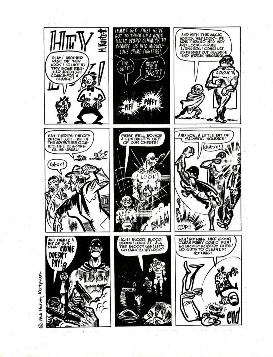
The above is an example of HEY LOOK, a filler strip done by Harvey Kurtzman that appeared throughout the Marvel (then Timely) line throughout the late 1940s. These were often little experimental pieces that presaged Kurtzman’s later work in founding MAD. Apparently, editor Stan Lee was fond of the strip, but not so fond as his secretary Adele, who not only rigged a reader’s poll to show a popularity for the strip that simply didn’t exist at the time but also went on to marry Kurtzman. This one’s condemnation of the simplisticness of the moral questions raised in most super hero comic books is still relevant today, and the cartooning is zippy and fun. Kitchen Sink published a collection of these strips in the late 1980s, but it can be difficult to locate.
We got a couple questions this week, though I’d welcome any more that anybody might have. Steve McSheffrey was short and to-the-point with his query:
Is the Aaron Era on Avengers going to keep on going for some time or are we nearing the end? It doesn't feel like it's running out of steam like some runs do when a writer's initial list of things he has planned are done but you never know when a writer decides it's time to go.
If an ending were in the offing, Steve, I don’t know that I would announce that in a Newsletter such as this one. But we are headed to a big climax next year in both AVENGERS and AVENGERS FOREVER, one that will have both titles interacting directly over the course of some months. A well-known artist is already penciling the kickoff book, which you’ll see in…November, I think? So solicitations will be out shortly that will give you a few more details.
And perennial question-asker Jason Holtzman had another this week as well:
How is the use of symbolism vs outright straightforwardness decided on in story telling when politics/social movements are concerned? Is managing PR a big factor?
For example, I’d consider that Captain America infinity comic was fairly straightforward: A large group of likeminded people with extremist views stormed a government building (e.g. Jan 6). I would also mention Stan Lee’s soapboxes speaking in support of various political movement/social movements at different times like those championing Civil Rights.
On the other hand symbolism could be used to speak about these issues, such as the X-Men serving as an allegory for Civil Rights or using Captain America’s supposed turn to Hydra in the recent “Secret Empire” to commentate on government corruption.
So, perhaps to better streamline my question, why do you think symbolism would be chosen when straightforwardness can present a clearer commentary?
Well, as a general rule, what we do at Marvel is entertainment. It’s not meant to be mindless entertainment, it typically has a point of view and some general soft messages to impart about the state of the world—this is why, as much as anything, the Marvel stories are set against the backdrop of the actual world more often than fantasy realms or fictitious cities—but by that same token, it is meant to be able to be enjoyed by a wide spectrum of people, the widest we can possibly capture. And so, when it comes to specific issues, as there are often to absolute right and wrong answers to a lot of them, it becomes exclusionary to take a hard position on some issue that will alienate a certain segment of the readership. This is why, at Marvel, our stock-in-trade is often metaphor. It can be easier for people on the opposing side of a given issue to accept and absorb the message—to “take the medicine”, so to speak— when it is delivered in a metaphoric context. It’s easier, for example, for any given reader to pick a side in the CIVIL WAR conflict between personal liberty and personal safety as represented by Captain America and Iron Man’s positions in a fictitious situation than it might be for them to select and stand by an analogous position when couched in real-world terms. Nobody wants to pick up a comic book to feel bad about their own closely-held beliefs, and the bully pulpit that is Marvel isn’t the provenance of any one individual creator to espouse their own positions or politics through the mouthpiece of the characters, not directly. On occasion, there is an issue that transcends positions—I think that just about everybody can agree on the fact that bigotry in all its forms is reprehensible (including, ironically enough, many people who are blinded to their own bigotries.) And in those instances, we might choose to tell a story that was more directly about the issue at hand. But it’s not really the purpose of Marvel to change people’s minds, at least not as the primary goal. Rather, we’re here to entertain, to enlighten, to provide a hopefully-welcome respite from the pressures of the day. And if the manner in which we tell our stories can have a lasting long-term influence over the tastes and opinions of our audience, that’s great. But it’s a secondary goal at best, and more like a tertiary effect in total.
I don’t know if that’s a satisfying answer—especially to those who would like to see us use our platform as more of a club in the service to whatever their individual beliefs happen to be. But that’s the way it is.
Behind the Curtain
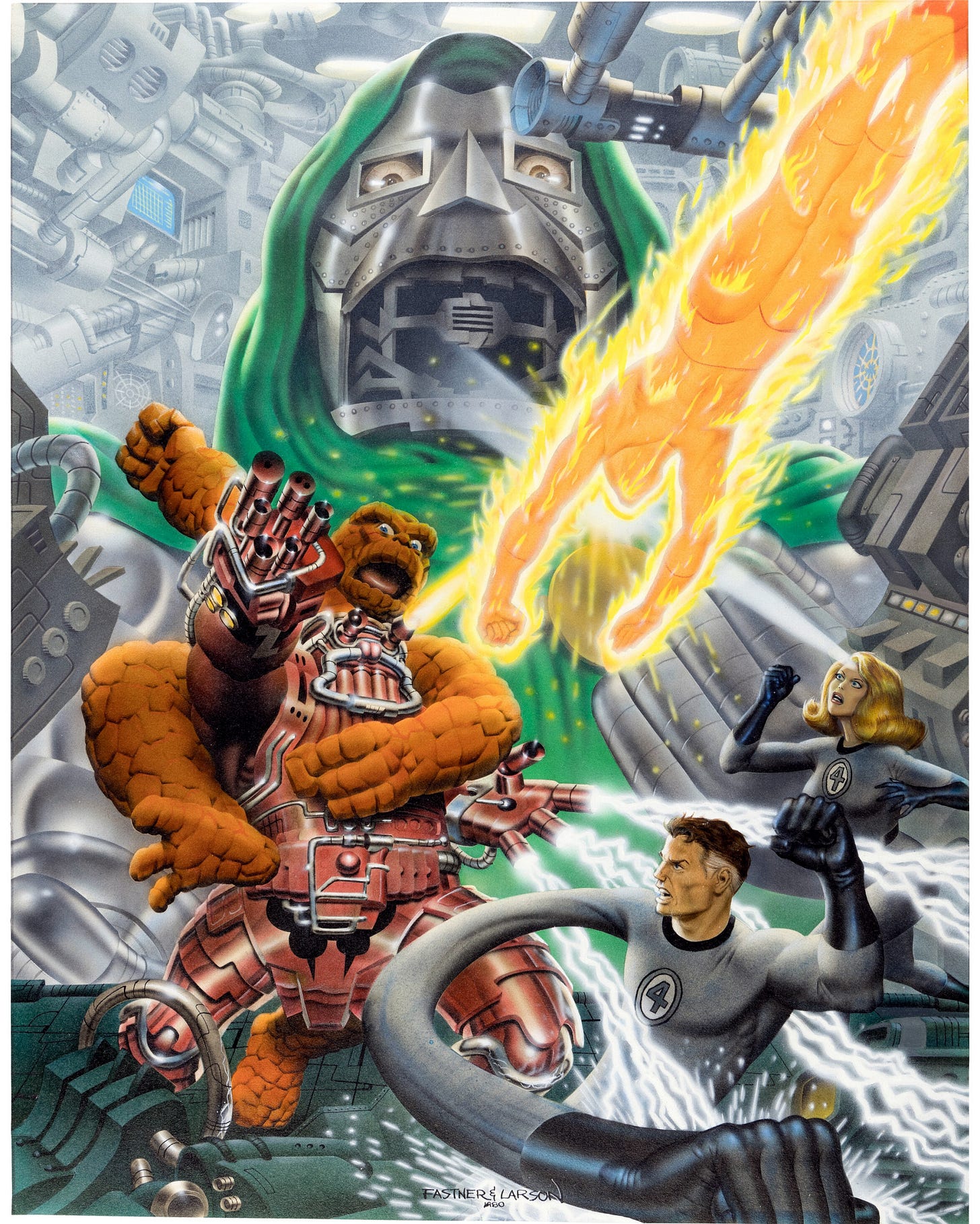
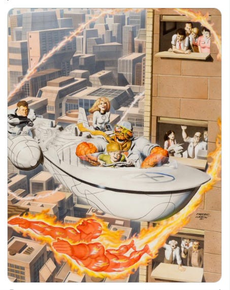
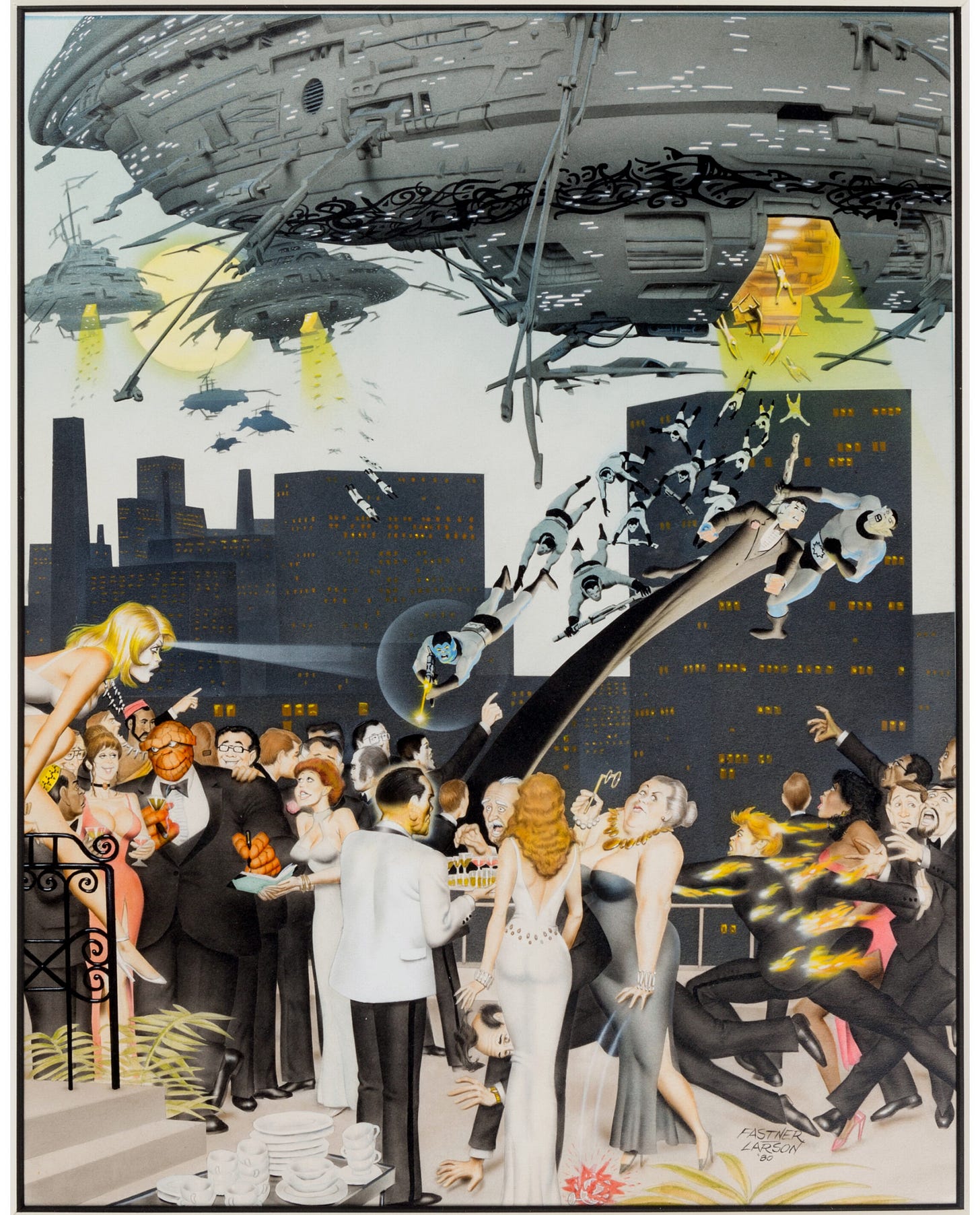
.Came across these three illustrations (or “plates” as they were often called in products such as this) online and thought that I would share them here, since I’d not seen them before.
In the early days of what would become the Direct Sales comic book market, one of the more popular products that small publishers would produce is portfolios. These would contain a number of prints on a certain subject (often fantasy, sword & sorcery or science fiction subjects, but occasionally super heroes as well) printed on nice paper and suitable for display.
Among the artists who found success in this field were Steve Fastner and Rich Larson, who worked in tandem to create such portfolios—Larson penciled them, and then Fastner did the airbrush painting. Back in the day, their work was very popular, and at a certain point they began to work on a series of licensed Marvel portfolios for S. Q. Productions. The did a Spider-Man portfolio of four pieces and worked on an X-Men one as well. (John Byrne penciled two of the pieces in the X-Men portfolio, but Fastner still painted them.) There was also a Hulk portfolio in this line.
These three pieces were apparently intended for a Fantastic Four portfolio that never materialized. And given that there are three completed pieces here, I’d bet that somewhere out there there’s a fourth as a part of this set. These pieces turned up at Heritage, the auction house, at the beginning of the year. And they’re just as cartoonish and bombastic as the other F & L portfolio pieces that saw print. I don’t know why this particular portfolio was never released, but if it had been, I might have picked one up, despite my lack of interest in general in such things. (Then again, I might not have—the $6.95 price tag was nothing to sneeze at in 1980.)
Pimp My Wednesday
We have a massive week of books coming out of my office this time.
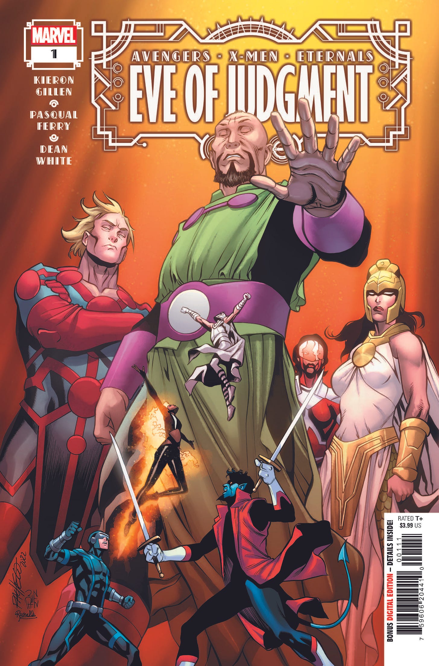
We begin with AXE: EVE OF JUDGMENT #1, the prologue to this summer’s big Avengers, X-Men and Eternals crossover Event series. As you may have been able to suss out, this issue began life as ETERNALS #13, but we we reworked it and rebranded it to more clearly showcase it as the lead-in to the conflict. And as these projects go, this one grows a lot more organically from events that have been building up within the component core series; in particular the revelation that the X-Men and mutants in general have learned the secret of resurrection, in effect conquering death. So this project is going to wind up being a lot more material to the books than maybe some others in the past have proven to be. And yet, don’t we think that every time? Anyway, like the series itself, this kickoff is written by the supremely-talented Kieron Gillen who has the advantage of being instrumental in both the recent ETERNALS series and IMMORTAL X-MEN. Artwork on this lead-in is by the great Pasqual Ferry with some lovely painted colors from Dean White. It’s a good looking book, so I hope you’ll check it out, even if you feel a bit burned on similar large storylines.
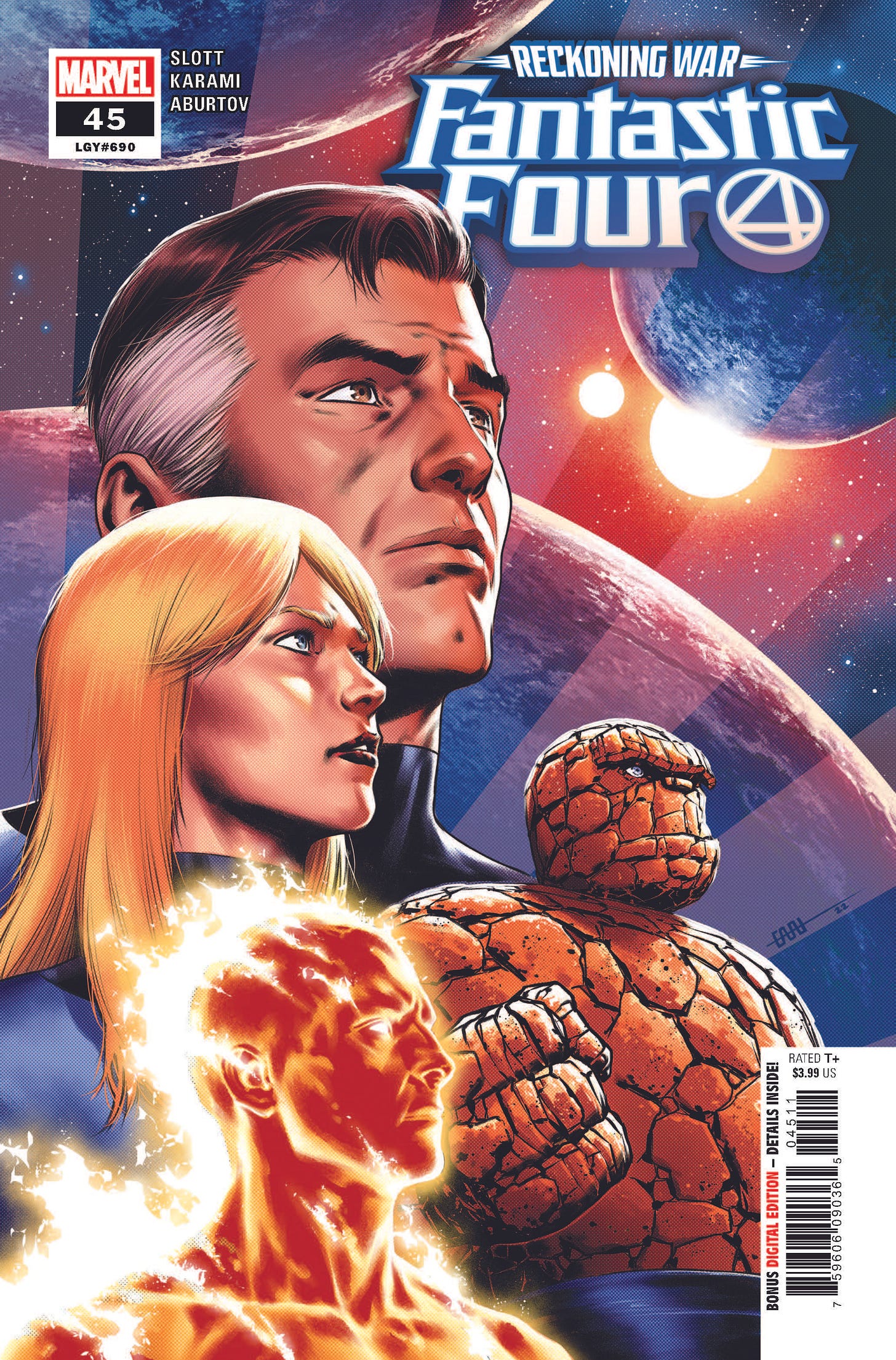
And speaking of monster storylines, the wrap-up to the long-running Reckoning War takes place in FANTASTIC FOUR #45 this week. Being honest about it, I don’t know how well we really stuck the landing on it. There wound up being so much business to take care of in this final issue that I worry that events became a bit too cramped and claustrophobic to really pack the punch that they should have. As always, I suppose you guys will tell me once you’ve had a chance to sample it. It was written by Dan Slott who is rounding third on his time on the book, and illustrated by relative newcomer Farid Karami.
Closer to the ground, we move into the second year of MOON KNIGHT as writer Jed MacKay gets back to some business he set up in the very first issue: The Structure, a new consortium of vampires whose activities are analogous to an organized cult. There’s also a visit from Taskmaster and the introduction of a pair of very cool new villains. Art is handled by the books’ recurring swing artist Federico Sabbatini, giving regular artist Alessandro Cappuccio time to get ahead. The manner and degree to which this series has found an audience has been heartening to us, and we’ve got no intention of taking our foot off the gas as we move forward. (It’s not lost to me that the original MOON KNIGHT series from the start of the 1980s only ran for 38 issues, so that gives me something to shoot for.)
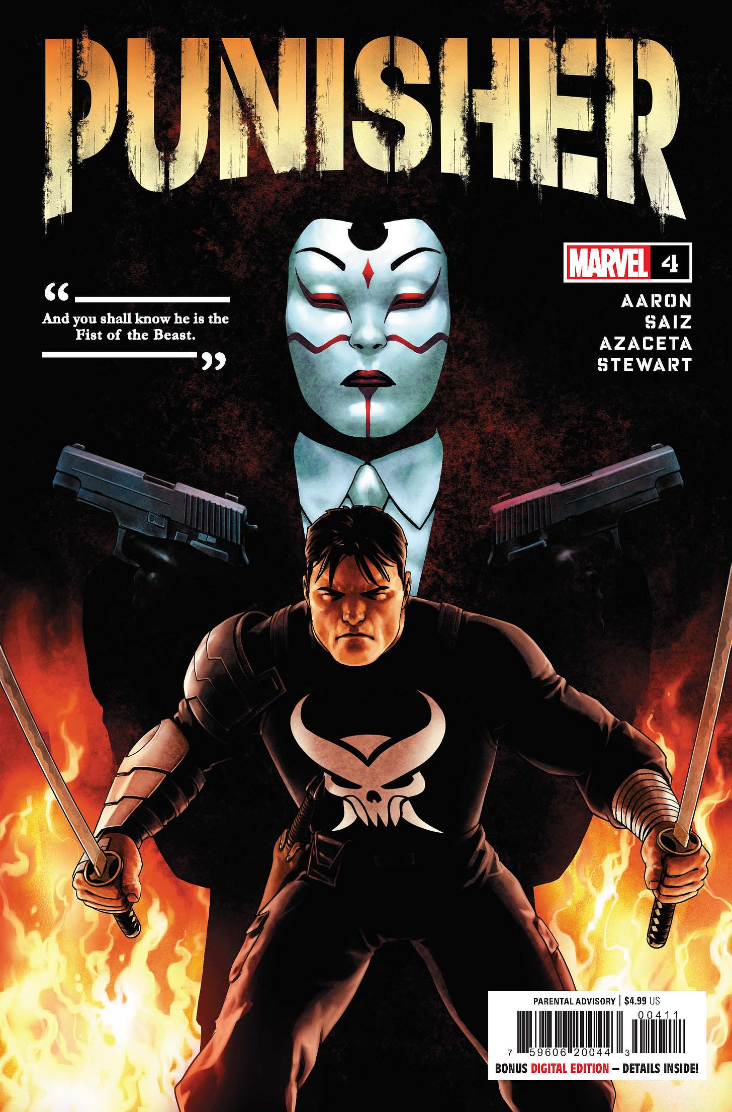
Meanwhile, PUNISHER continues right along with its disturbing look at the beginnings of Frank Castle’s life of murder and mayhem and his growth into his new role as the Fist of the Beast. This one also includes a pair of recognizable Marvel Universe villains, which should be of interest to some. Stellar artwork is contributed by Jesus Saiz and Paul Azaceta, with expert colors by Dave Stewart, while writer Jason Aaron directs the mayhem. And once again, that pull-quote on the cover makes this image for me.
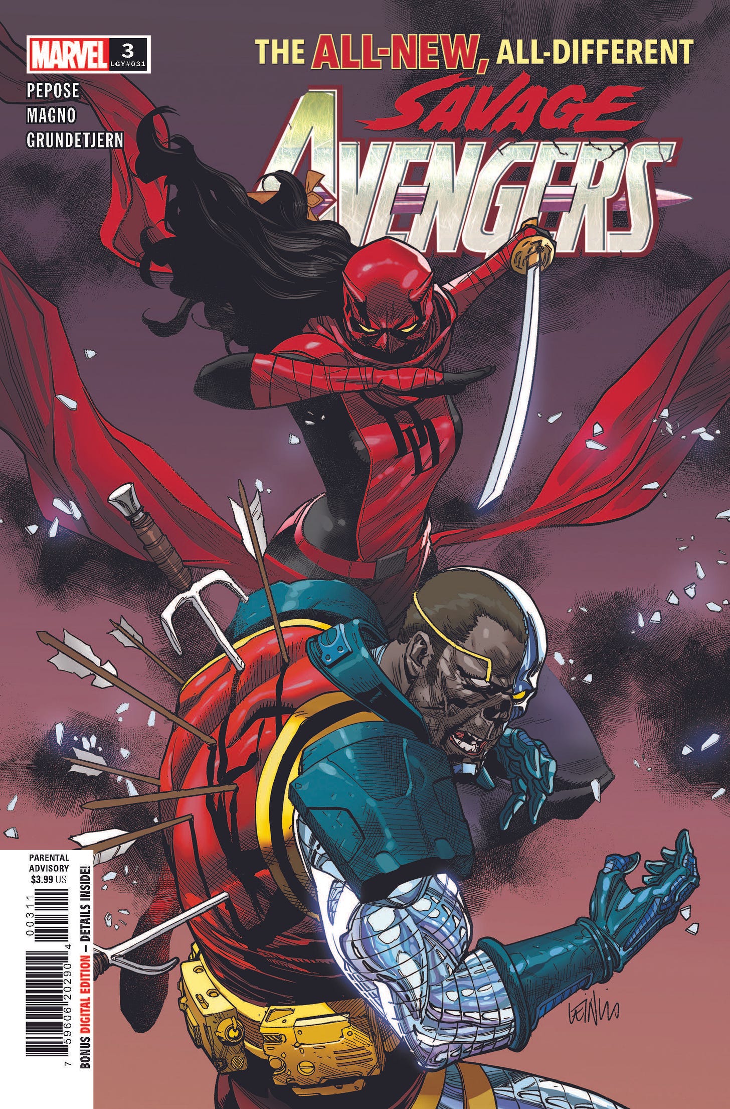
For our final print release of the week, we have the third bonkers issue of SAVAGE AVENGERS, which contains what we hope is a pretty impactful surprise at the end of it, one that will get readers looking back over the first two issues with fresh eyes. It’s definitely a series with a very specific flavor, as writer David Pepose uses narrative captions in a manner not typically seen in many other comics these days. Carlos Magno continues to be a beast, absolutely cramming every panel, every action sequence with an unbelievable amount of detail. Carlos has continued to grow more and more adept since I first hired him to illustrate INVADERS alongside Chip Zdarsky, so it’s nice to see him flourish. This book is unapologetically a 1980s-style action movie.
And finally, in the digital world, we’ll have the release of the third episode of the ongoing AVENGERS UNLIMITED track on the Marvel Unlimited service. This one is also written by David Pepose and focuses on Captain Marvel and She-Hulk taking on Moonstone and Yellowjacket as the secrets of the Black Ledger continue to unfold. Artwork for this installment is provided by Davide Tinto. This initial six-part adventure is a pretty classic Marvel tale, but the further we get into things, the more we’ve been able to mess around with the format and the subject matter, so expect to see some interesting and different things in this slot in the weeks ahead.
Six books in a week feels like the old days to me, and we’ve got a few similar weeks coming up later on this month and next. So my team and I aren’t just messing around, we’re getting things done!
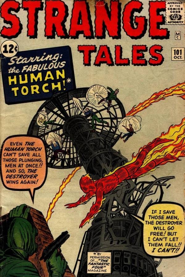
A Comic Book On Sale 60 Years Ago Today, July 10, 1962
This issue of STRANGE TALES, #101, introduced a spin-off of the popular FANTASTIC FOUR series that had been started just about a year earlier (and which is plugged on the cover in hilarious fashion—the idea that the editors of STRANGE TALES needed to get permission from the people responsible for FANTASTIC FOUR given that they were exactly the same people. But I guess it made for nice cover copy.) Giving the Human Torch his own solo series was something of a no-brainer given that the golden age version of the character had held his own titles for years and years. But, alas, turned out that it was the Thing who became the true break-out character of the home series, not Johnny Storm. This Torch series, if you’ll pardon the expression, never really caught fire, and it quickly became a lesser light in the Marvel line, a place to try out potential new talent to see if they could adapt to the new style pioneered by editor Stan Lee. Most couldn’t. There are a couple of interesting choices made in setting this series up. Despite having been very overt about the fact that the Torch’s true identity of Johnny Storm is known to the public across a year of FANTASTIC FOUR stories, this new series attempts to awkwardly put that genie back in the bottle, claiming that it’s only a handful of people who know, and that they have been sworn to secrecy. This is all in the service of giving the Torch fairly stereotypical secret identity drama of the sort that tended to plague Clark Kent and Bruce Wayne and Diana Prince all the time. It’s a bad call, and after four or five issues, Lee dispenses with it in an offhanded fashion. But it was definitely a part of attempting to make this Torch strip, like Spider-Man (which wasn’t yet a series, AMAZING FANTASY having been cancelled), overtly about a teen-aged protagonist with teen-age problems. In doing so, Lee gave himself permission to use a lot of the standard comedy routines that he’d developed after years of working on teen humor strips in the ARCHIE vein. But Lee himself didn’t really think this was all that important an assignment—I suspect that it may have been Marvel publisher Martin Goodman who advocated for a Torch series, remembering the success the character had had years before)—and so even the earliest stories, including this one, were written by his brother, Larry Lieber, though Jack Kirby was prevailed upon to illustrate the launch (and potentially to plot it—though it’s difficult to tell with certainty. There’s evidence of the script being hand-lettered in by Kirby on the original art, which would seem to indicate that Jack was working from a full script of the type Lieber typically generated.) It’s a bit too much to get into now, but there’s some circumstantial evidence indicating that the third Torch story, the one that saw print in STRANGE TALES #103, was produced first, as a pilot of sorts for the series, but that a decision was made to launch the strip in a more traditional manner, with that story held back. It’s another bit of history that I should do a deeper dive into when I have the opportunity.
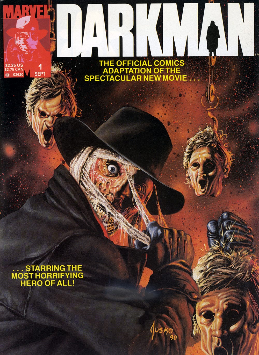
A Comic I Worked On That Came Out On This Date
One of the many things the Special Projects editorial office of Bob Budiansky worked on when I came into it at the top of 1990 was movie adaptations. There was still an audience for these, especially in the more mainstream newsstand marketplace. So in my time in the office, we put out a bunch of them—including this one, dedicated to Sam Raimi’s film DARKMAN. A decade before he’d get involved with Spider-Man, Raimi made this low-budget ode to the comic books of his youth that he enjoyed, with Liam Neeson in the starring role as a disfigured scientist who is able to operate as a master of disguise with synthetic replicas of other people’s visages. Raimi was an old-school filmmaker, and he preferred to do as many of his stunts and special effects “in the camera”—that is, without any or much manipulation of the images after they were shot. (Artist Denys Cowan, then drawing DEATHLOK for us, was a friend of Sam’s, and talked about having worked on set with Raimi, who brought a comic book artist’s eye to his direction, storyboarding out most sequences by hand himself. ) It’s a loopy film, one that can’t quite take itself seriously, but it was perfect B-picture fodder at the time. For the comics adaptation, we worked from a draft of the screenplay and a bevy of reference photographs provided by the studio. One of the tricky bits about the adaptation was that it had to be flexible enough to work in a number of different formats. What you see here is the black and white magazine version of the book, which was released on July 10, 1990. But it was also serialized as a three-issue full color comic book series that went to both neighborhood spinner racks and comic shops. So the 60 pages needed natural break-points every 20 pages or so where a new splash page could be dropped in. (For some of these adaptations, we also had to worry about other formats, such as paperback books, but DARKMAN wasn’t released that way, and so it’s not applicable here.) The script for the adaptation was written by Ralph Macchio, who was on staff and could be depended upon to do a solid if not transformative job. The book was penciled by Bob Hall, who was a student of John Buscema’s (as well as an occasional Broadway director) and who broke down the storytelling in a clear, direct manner. But the person who really elevated the final product was inker Mark Texiera, who brought the sort of bold, scratchy inks that he’d come to use on GHOST RIDER, WOLVERINE and THE PUNISHER to the project, really playing up the horror roots of the property. Unfortunately, Tex got too busy on GHOST RIDER, which had then launched and was a massive hit, and so he wound up leaving the adaptation after the first (comic book) issue. Bob brought in Tony DeZuniga to pinch-hit. Tony was another strong stylist who could be counted upon to bring some lushness to the final art. But his work wasn’t as bombastic or horror-orients as Texiera’s was, and so the latter two issues were a bit more staid in their execution. (And in the magazine, the switch-up of the inkers is unfortunately readily apparent, making the final reading experience just a little bit more choppy.) Joe Jusko did his always-reliable best on the magazine’s painted cover—it looks like he may have enjoyed the assignment a little bit. I seem to recall that he had to make changes to the mask in Darkman’s hand, either to make it look more like Liam Neeson or less (sometimes there were likeness rights on these things, sometimes there weren’t.) So I don’t know that this is a comic book that much of anybody has thought about for the past thirty years, but it was another step on my road to learning just how to do this job, and how to deal with unexpected misfortunate and keep a project on the rails. It’s no masterpiece, but the DARKMAN movie adaptation magazine gives you exactly what it says on the outside: a Marvel-style adaptation of the film.
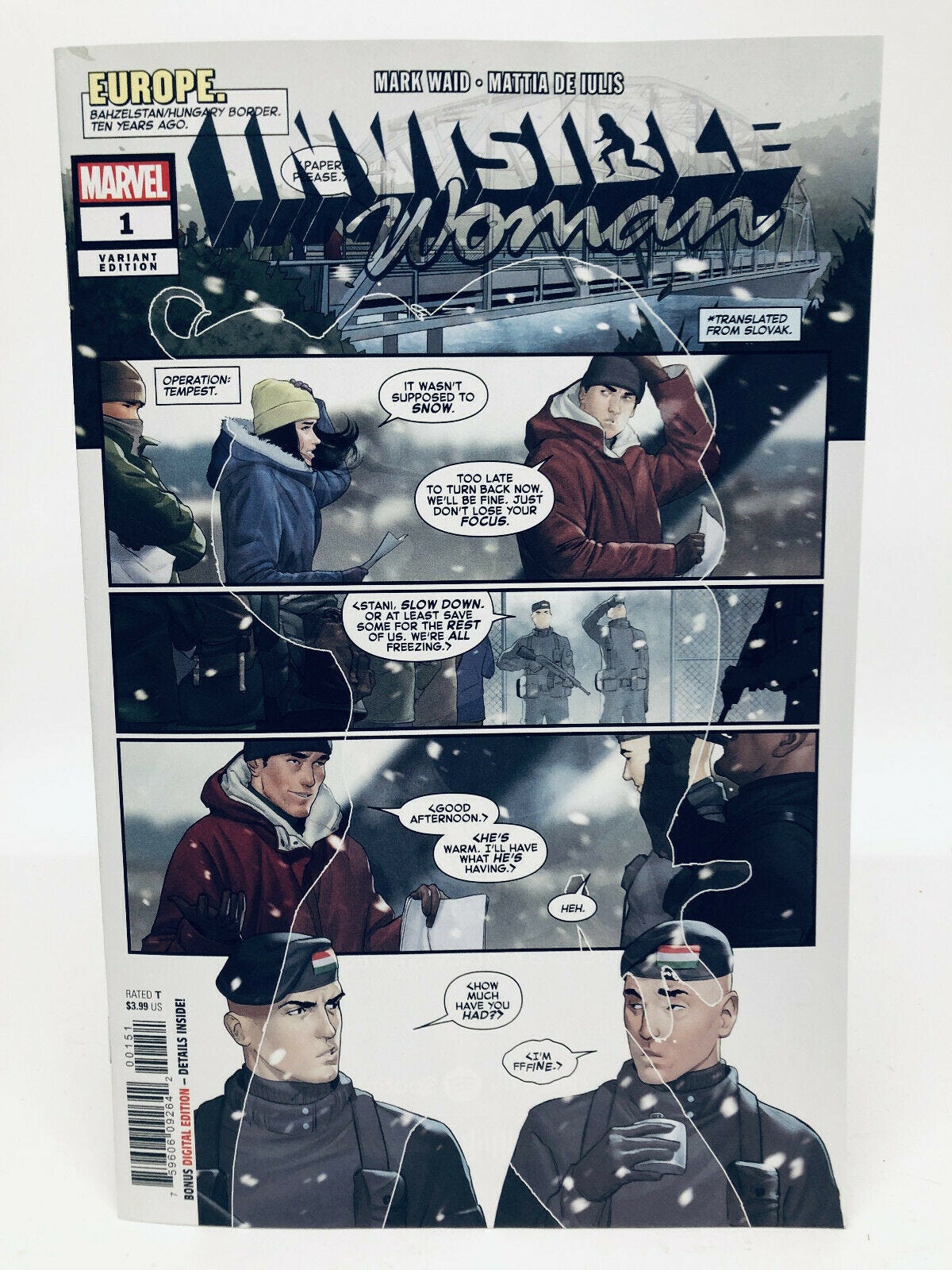
Another Comic I Worked On That Came Out On This Date
I included this one as well solely so that I could talk about this little-seen exclusive variant cover.
This was released only a few years ago, on July 10, 2019, and was the first time that Sue Storm had ever headlined her own title. It was also the payoff on an idea that writer Mark Waid first had years earlier when we were working on FANTASTIC FOUR. He’d come up with the notion that Sue would occasionally take on assignments for Nick Fury and S.H.I.E.L.D. without the rest of the family knowing about it, but we never had the opportunity to do anything with it during that run. Many years later, when we were both working on a later S.H.I.E.L.D. series, we devoted the fourth issue towards exploring that idea, with Chris Sprouse providing some excellent art. But it felt like there was still more that could be done with it. So when there was a need to do an INVISIBLE WOMAN project for trademark purposes, I reached out to Mark and got him on board by revisiting that same concept. And the book was beautifully illustrated by Matia De Iulis. But as I said at the start, the reason I included it this time was really to show off this super-cool San Diego Comic Con Retailer Exclusive cover that most won’t have seen. I'm pretty certain that it was Marvel Sales Manager David Gabriel’s idea to do an invisible cover, where Sue is making the main cover transparent so that you can see the first page underneath through it. And I love how this turned out, and only regret that we didn’t do it as a main cover. It’s clever and graphic and attention-getting on the stands, and it wouldn’t work as well with any other character.
Monofocus
To start with this week, a special shout-out to STAR TREK: STRANGE NEW WORLDS for what was just about a perfect freshman season. Seriously, I think this is may favorite TREK show period, including all of the older ones. It simultaneously does all of the things that classic STAR TREK is known for: episodic storytelling, focus on a single ship on detached duty, while still having enough serialization baked in through subplotting and character-building to feel contemporary and satisfying. The entire cast is great, no one more so than Anton Mount picking up the baton of Jeffrey Hunter’s Captain Christopher Pike. And that final episode, which goes back into a story from the classic series in a new way while propelling the series’ central conflicts forward, was sublime. It even made the suggestion that the more Cold War-style politics and storytelling of the original series’ time were on occasion necessary palatable—a bit of a fine card trick, as this depends on making your current cast seem less relevant and able. I’ve felt somehow just a little bit sorry for THE ORVILLE, which has been doing some nice work as well in their faux-STAR TREK TNG homage quasi-comedy world, because their episodes drop on the same day as SNW, and they’ve been getting constantly blown off the screen by comparison, despite their own improvement. Now that SNW has wrapped up for the moment, I may be able to bring a bit more appreciation to Seth MacFarlane’s show.
Otherwise, the other thing that I’ve been watching is a bit more of a dark horse. I’ve been enjoying the hell out of EXTRAORDINARY ATTORNEY WOO on Netflix, buoyed by the fact that new episodes are released twice a week, on Wednesday and Thursday. But during the break between episodes, I sought out other earlier shows that star Park Eun-bin had been in. And that brought me to HOT STOVE LEAGUE, a sports drama that aired back in 2019. It’s very much of a familiar kind, but so far, in the three episodes I’ve consumed, it’s been well done, and so I’m hooked to watch the remainder of the 16-episode run. (No small thing, as Korean shows typically have episodes that are 75-90 minutes ong without commercials.) The premise is familiar, revolving around a Baseball team, Dreams, that hires a new General Manager to shake up their operation as they have been the most-losing team in the sport for several years running. The new guy, Baek Seung-soo, in Ted Lasso tradition, has no experience with baseball, but he’s previously taken wrestling, ice hockey and handball teams and turned them into champions. However, in each instance, due to circumstances beyond his control, his teams were all disbanded after their big win, which is the very reason he’s been brought on board: to give Dreams one final successful season before the owners disband it. Park Eun-bin plays Lee Se-young, the Operations Manager of the team, who initially butts heads with Baek due to his distant manner and analytical personality but who swiftly becomes his one ally within the organization. I really have no interest in baseball as a sport, but as the backdrop to a story, I’m all over it (PRIDE OF THE YANKEES was a favorite film growing up.) So this show hits the sweet spot really well.
All right, I guess that will finish me for this week. I’m feeling the need to change things up so that this doesn’t all grow stale, though I’ll be damned if I’ve come up with any worthwhile ideas for alternative subjects. But we’ll see if inspiration strikes within the next seven days. In the meantime, thanks as always for your support and attention, and I’ll be back here again before you know it.
Tom B




Hey, Tom! Love your column— always entertaining and insightful. I'm just amazed how much you can cram into a week! Out of curiosity: what's your schedule look like? And I mean including how you fit in time to watch the shows and read the comics that you do— in addition to your job! Have you given up on sleep? Do you ever see your family?
I knew Carlos would flourish without me holding him back!!