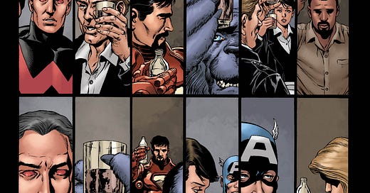
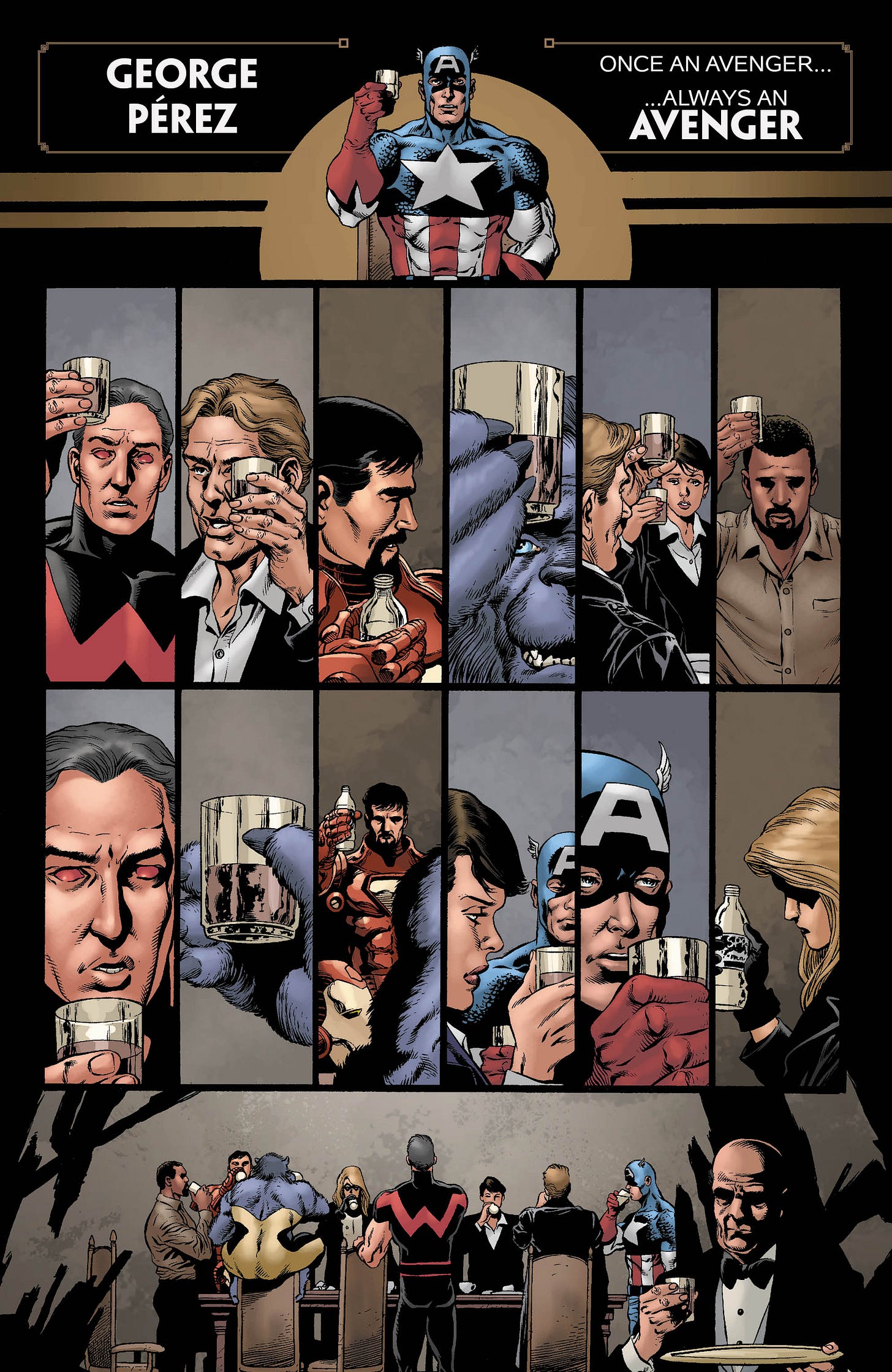
This caused a little bit of chatter over the week, so let’s talk about it a little bit. In AVENGERS #55, which came out this past Wednesday, we (and by we, I mean I) ran the page below as a tribute to storied AVENGERS artist George Perez. As most of you probably know, George was diagnosed some time ago with inoperable and terminal pancreatic cancer. Since they, he and his family have been working to make the most out of the time George has remaining to him, and we’ve seen all sorts of people turning up to express what his work over the years has meant to them. In fact, DC Comics just unveiled a terrific jam piece that depicts George among many of the characters from that company whom he either helped to invent or refurbish. It’s a pretty great piece.
In terms of the page below, while some have characterized it as “Marvel’s statement”, it’s really not that at all. While folks at Marvel were made aware of it, the creation and execution of this salute was all me and my guys—the editorial team working on AVENGERS. I wanted to get something into print while George could still see it and appreciate it (and I’m told he was touched by it by the people I know showed it to him prior to publication.) It was built from a page of AVENGERS FINALE from 2004, originally scripted by Brian Michael Bendis, one of six pages in that issue that George did as a favor to me, and which made up his last time drawing the Avengers for publication. It struck me that, without the copy, this page could represent Earth’s Mightiest Heroes raising a glass to one of their own—at Marvel, George’s home, his strongest association, was always with the Avengers, going back to the 1970s. I can’t think of many others with such a similar strong connection to the title—Roy Thomas, perhaps, or Steve Englehart. And it felt right to me, on some level: only George Perez could properly memorialize George Perez and wordlessly convey what he brought to all of the stories that he worked on.
I know that it confused some, who thought that George might have passed. (He didn’t—at last word, the prognosis for how much time he has remaining to him had to be positively revised, which is wonderful news.) And I know that some found it morbid, or too sad and downbeat, or even thought that it was a mistake, printed too early. And I’m sorry for all of those feelings. But I’d do it again. I’m not just a fan of George’s, but also an editorial collaborator for a long time, and a friend. So there’s really only one person whose opinion I care about in this matter. But by all means, if you’ve got a different idea for a fitting tribute, bring ‘em on, I’m sure that George would love to see them.
Behind the Curtain
These days, thanks to advances in computer technology, comic books are colored and separated for print entirely within a computer, one that provides the color artist with a nigh-infinite number of colors with which to work. But it wasn’t always that way.
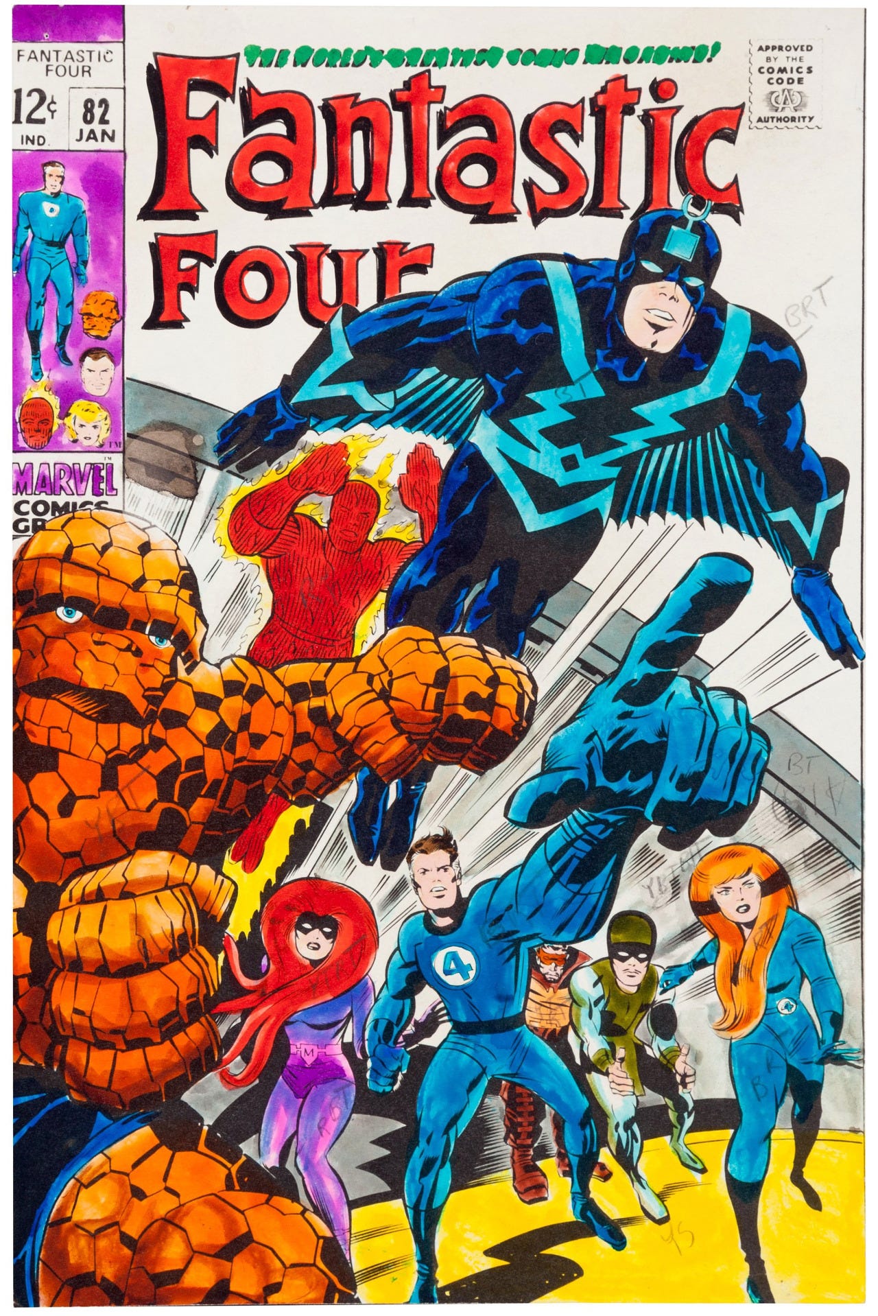
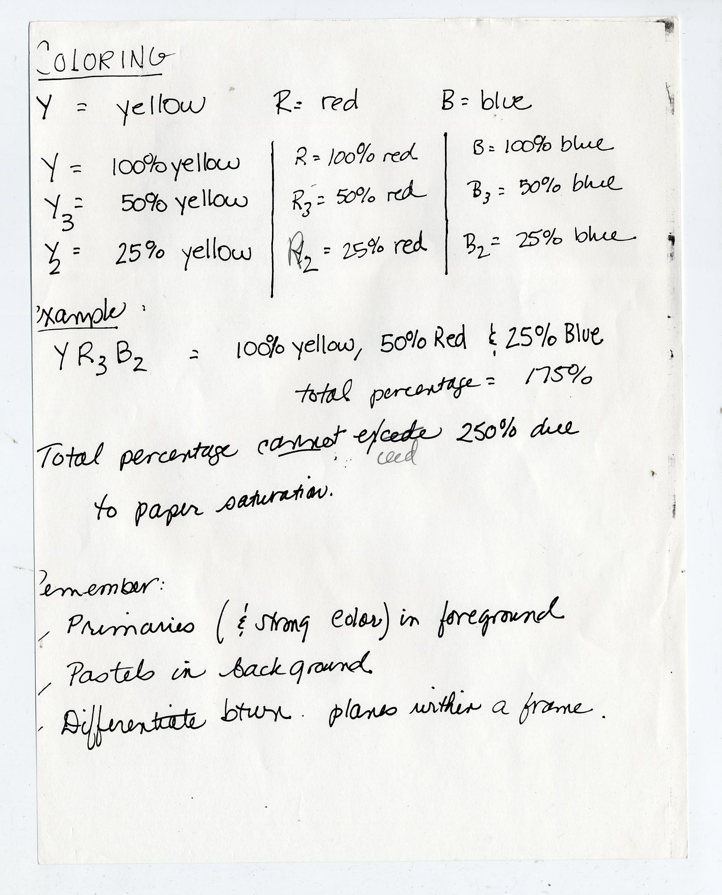
Until the 1990s (and, really, it wasn’t until the 2000s that it became completely a thing of the past) comic books were hand-separated, and had a limited number of colors available, each of them increments of the four primary colors: cyan, magenta, yellow and black. Above is the color guide for the cover to FANTASTIC FOUR #82. I’m not sure who colored it—it might have been Stan Goldberg, or Marie Severin, or Bill Everett, or any of a number of other people. And what it is is a copy of the cover artwork that has been colored using Dr. Martin’s Watercolor Dyes. Each color needed to be “coded”—written on with the combination of colors necessary to made up that color. This guide is a bit faded, but you cam make out a number of the codes if you look closely. Y, for example, stood for 100% Yellow, while Y2 was 25% yellow and Y3 was 50% yellow. And so forth.
The sheet above was given to me in 1989 in an informational packet when I started as a Marvel intern. It indicates how the colors would be broken down. But rather than the colorist having any fine control over the end product, in those days the pages would go to a separations house, where they would create a film plate for each of those four primary colors, which in combination would produce the desired effect when the inks were printed one atop the other. The work of creating these separations were usually carried out by low-paid technicians rather than artists, who were often more concerned with quantity than quality. This is why so much of the coloring of that era is so primitive—the end result wasn’t always in the colorist’s hands, but they’d be responsible for it in the eyes of the readers.
But really, this was all just an excuse to show off that vintage color guide.
Pimp My Wednesday
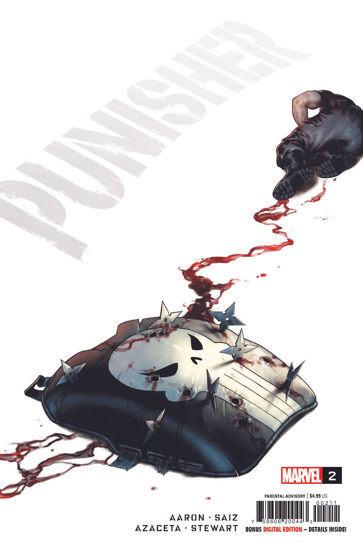
Coming up from my office this Wednesday is the second issue of our new PUNISHER series, by Jason Aaron, Jesus Saiz and Paul Azaceta, and Dave Stewart. It’s a bit of a strange thing for me to be working on a PUNISHER project, truth be told. I’ve never really been a huge fan of the character, and I’ve also been vocal about my concern about what the Punisher has to say in a world where public shootings are an almost daily occurrence. (My own nephews were present for one of the Colorado school shootings.) But in essence that’s why I’m involved with this one. The creative team is putting Frank Castle through a crucible, one that he will emerge from in a somewhat different place than where he started. As a shorthand, I’ve been likening it to what Frank Miller and David Mazzucchelli did with Daredevil in “Born Again.” I don’t know that we’ll be able to equal that classic story—pretty much nobody has since it first came out—but we’re definitely going to try. And if nothing else, Jesus Saiz is doing career-best work here. It’s a story idea that Jason has had percolating for a number of years, it’s intense as hell, and it’ll hopefully be a story that can find support among both regular PUNISHER fans as well as those who haven’t enjoyed the character up to this point.
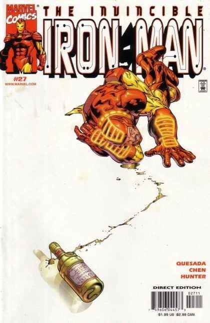
And yes, the idea for this cover originated with me, and yes, it was inspired by this IRON MAN cover that Joe Quesada did twenty years ago. I steal ideas from the past all the time.
Also, I’m not going to show it here because it’s not one of mine, but AMAZING SPIDER-MAN #1 by Zeb Wells and John Romita Jr. which is on sale this week is the real goods. I read it earlier this week and it gave me exactly what i wanted from a modern Spider-Man comic. So keep an eye out for it as well.
A Comic Book On Sale 60 Years Ago Today, April 24, 1962
I feel like maybe the character who best encapsulates the Silver Age of Comics is, strangely enough, the Atom. The Tiny Titan earned his own series on this date 60 years ago. It was written by Gardner Fox, illustrated by Gil Kane and Murphy Anderson, and edited by Julie Schwartz. In those days, publishers like DC were still a bit shell-shocked from the Senate Investigative Hearings into comic books and juvenile delinquency that led to the creation of the Comics Code, and so even as super hero comics came back into vogue, they worked like hell to keep any whiff of undue violence out of them. This resulted in a ton of super hero stories that weren’t about two guys fighting with one another with their awesome powers, but rather the hero using his abilities and his brains to solve some puzzle or to get to the bottom of some mystery, with nary a punch thrown. The Atom embodies this approach more than just about anybody else, because on the surface of it, his powers aren’t really useful in a fight. He gets small. But in terms of unleashing a certain recognizable degree of wonder and awe about the world around us and the ordinary objects that make it up, the Atom was a top draw—whether riding a hand grenade, about to be run over by a car tire or, as here, in the midst of being consumed by a venus flytrap. If you look closely, you’ll see that this first issue carried no issue number, which is true of many of the DC launches of this period. The thinking was that retailers were almost looking for reasons to send comics back undisplayed and unsold, and a new comic was untried enough that it made that more likely. So rather than displaying a #1 on the cover, the first issue would go without. By the second, there was at least a little bit of a track record that a retailer could feel safe with. (This is also why, when the Flash came back in his own series, the numbering, #105, was picked up from the earlier FLASH COMICS.) The success of the Atom and the sell-through of the strip’s tryouts in SHOWCASE inspired Marvel publisher Martin Goodman to suggest that his editor Stan Lee revisit a character from a recent one-off fantasy story, transforming him into Ant-Man.
A Comic Book I Worked On That Came Out On This Date
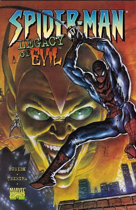
SPIDER-MAN: LEGACY OF EVIL wound up being my entry in the great race to replicate MARVELS after the surprise success of that original series. In its aftermath, despite the fact that Alex Ross had been given two years to paint MARVELS, editors were expected to turn out similar painted books in six months. The outcome was obvious. And even when a particular painter was astong and accomplished, none of them had the specific blend of technical talent and fannish enthusiasm that Alex did. There were a lot of lukewarm painted projects released back then. LEGACY OF EVIL started out as DYNASTY OF EVIL, a book that Daily Bugle reporter Ben Urich was said to be researching and writing in the pages of the heroic GREEN GOBLIN series. This was during Marvelution, that year when Marvel Editorial was divided up into five smaller units, each one with its own Editor in Chief. The Spidey EIC was Bob Budiansky, and he took very seriously the mission to increase Spider-Man sales by 10% that was given to him when he was hired. So he was looking for anything that could be spun up and spun off. So I was given the task of making an actual DYNASTY OF EVIL painted project that would represent Ben’s book. Together with my assistant editor at the time, Glenn Greenberg, we reached out to Kurt Busiek to write it. This was before we approached Kurt to write UNTOLD TALES OF SPIDER-MAN, but Kurt had written MARVELS and knew the history of Spidey, and we figured that he’d be a good person for the job. Hiring Mark Texiera to do the painted artwork feels like a Glenn idea to me, something that he may have suggested. Tex was good, but he was also slow, especially when it came to painted pages, and he wasn’t always all that focused on telling the story so much as creating beautiful images (a chronic problem in the Image-focused 1990s.) So this book was late—it didn’t wind up coming out until April 24, 1996, four months after Marvelution was over and Bob Budiansky had been laid off in favor of unified EIC Bob Harras. And in fact, my strongest memory of this project is of the day of the layoffs, the first week of January back from the Holiday break. The way it worked is that, as the day went on, different editors would get a call from Bob’s office to come down and see him—whereupon he, publisher Jim Sokolowski and an HR representative would tell them they were being laid off and give them their severance information and so forth. We in editorial became aware that this was happening relatively quickly, so every time the phone rang in an office, the expectation was that somebody’s number was up. (More that a third of the staff was let go that day.) So Glenn and I were trying unsuccessfully to get work done amidst all of this chaos and impending doom—and then my phone rang. But it turned out that it wasn’t Bob, but rather a reported from Wizard Magazine, who’d been assigned to do a promotional story about the upcoming LEGACY OF EVIL. (Kurt had lobbied to change the title—he felt that Legacy was a more apt word for the story being done than Dynasty.) All while I half-heartedly talked to the guy and tried to promote the book as best I could, I was thinking that Bob H must have been trying to call my office right at that moment and getting a busy signal. As it turns out, somehow I survived that purge (Sokolowsi once told me that it was a coin-flip between me and editor Joey Cavalieri, and that it was thought that I’d be more of a team player. I interpreted that to mean that I was making a lot less money than Joey was.) So I was still around when SPIDER-MAN: LEGACY OF EVIL came out. It represented more than a year of work, and it sank like a stone—nobody paid any attention to it, and it’s been largely forgotten today. One more bit of driftwood for the post-MARVELS painted comic book bonfire.
Monofocus
If there is a better, more consistent and more entertaining creative partnership in the field than Ed Brubaker and Sean Phillips, I don’t know who it is. They’ve been working in tandem for years, and their latest project, a series of RECKLESS original graphic novels, has been a high water mark for them. The series combines their noir pulp sensibilities into something that plays like a cross between The Rockford Files and a men’s paperback series, following the cases of Ethan Reckless, a freelance troubleshooter in 1980s California. Their latest release, the fourth in the series, is THE GHOST IN YOU, and it’s terrific. Their entire canon of work is worth seeking out, but these RECKLESS books are a nice, easy point of entry into what they do. So good.
I wasn’t at all prepared for BETTER CALL SAUL to make its comeback on AMC this week, let alone for the runtime on the two back-to-back episodes that aired to be two and a half hours—it really put a big dent in my Monday night. But SAUL remains one of the best shows of all time—personally, I think I’d rank it higher than its mothership BREAKING BAD (blasphemy, I know.) What can I say, Bob Odenkirk is tremendous, and he’s surrounded by a terrific cast of performers. This is the last season, and all along everybody has been wondering about what becomes of Kim Wexler (Rhea Seehorn), Saul/Jimmy’s partner and wife who is never seen or mentioned in BREAKING BAD. Based on the opening two episodes of the season, and the manner in which she’s swiftly becoming more Saul Goodman than Jimmy is, I’m guessing that we’re building to an unexpected showdown between them with tragic results, as Kim chooses to cross some line that Jimmy refuses to cross. We’ll see.
And by far the scariest show I’ve encountered recently is the Japanese import OLD ENOUGH on Netflix. It has a simple premise: every episode, a young child is sent out to run an errand in the neighborhood, and they’re followed by the camera. But these are exceedingly young children—in some cases, younger than three years old. So watching them try to cross dangerous intersections and journey kilometers away from home is positively harrowing (for all that we know that events must turn out all right. After all, there’s a cameraman right there.) I can remember making such a foray into the center of our town when I was in first grade, to see a school friend of mine, and I can recall my Mom screeching up in the car as I was making my way back—I hadn’t told her where I was going, you see. Today, I’m entirely too aware of just how dangerous this world can be. I’m not sure I’d allow my son to go on some of these errands, and he’s 20!
Maxed out the length again—see you next week! Send questions!
Tom B.





I'm really enjoying these Newsletters and I really appreciate the insights from the past and present editorial shenanigans. Thanks for writing these!
Really enjoyed the Behind the Curtain section. Never knew that’s how coloring was done back in the day! Love learning more of the history.